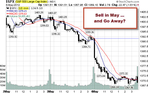
A close look at trading in May shows a pretty clear negative bias. Here is a 10-minute bar chart of what's happened since May 1st on the S&P 500 Index.
May 1 marked the beginning of a 6-month period of unfavorable seasonality. Research published by Yale Hirsch in the Trader's Almanac shows that the market year is broken into two six-month seasonality periods. From May 1 through October 31, seasonality is unfavorable, and the market most often finishes lower than it was at the beginning of the period.
The period from November 1 through April 30 is seasonally favorable, and the market most often finishes the period higher.
... While the statistical average results for these two periods are quite compelling, trying to ride the market in real-time in hopes of capturing these results is not always as easy as it sounds.
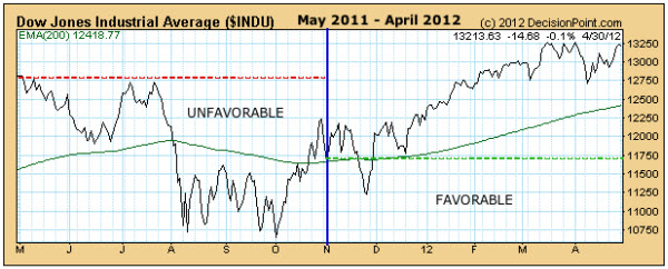
Below is the one-year chart that that shows the most recent two six-month periods. It begins on May 1, 2011 and ends on April 30, 2012.
The left half of the chart shows the unfavorable May through October period, and the right half shows the favorable November through April period. The green line marks the beginning of the favorable period. The red line marks the beginning of the unfavorable period.
Historically, the seasonality expected by 'Sell in May' has provided a trading edge.
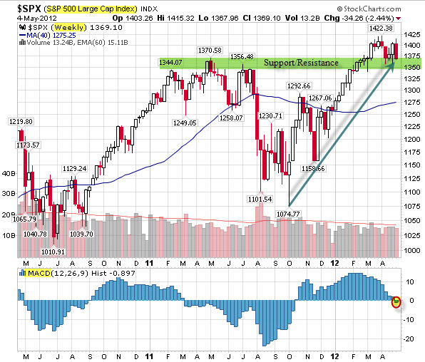
However, scale and perspective do matter. For example, here is a weekly chart of the S&P 500 Index. From this perspective, the markets are arguably in an up-trend - and sitting on top of a pretty strong support.
While the MACD is testing a move beneath the zero line, price is the primary indicator ... and is in a reasonably defensible buying area.
If the bulls hope to push things higher, this is where you would expect buying to occur.
We'll see.
Comments
Should You Sell in May and Go Away?
What you choose to look at ... matters.
Not everything that can be counted counts, and not everything that counts can be counted.
A close look at trading in May shows a pretty clear negative bias. Here is a 10-minute bar chart of what's happened since May 1st on the S&P 500 Index.
May 1 marked the beginning of a 6-month period of unfavorable seasonality. Research published by Yale Hirsch in the Trader's Almanac shows that the market year is broken into two six-month seasonality periods. From May 1 through October 31, seasonality is unfavorable, and the market most often finishes lower than it was at the beginning of the period.
The period from November 1 through April 30 is seasonally favorable, and the market most often finishes the period higher.
... While the statistical average results for these two periods are quite compelling, trying to ride the market in real-time in hopes of capturing these results is not always as easy as it sounds.
Below is the one-year chart that that shows the most recent two six-month periods. It begins on May 1, 2011 and ends on April 30, 2012.
The left half of the chart shows the unfavorable May through October period, and the right half shows the favorable November through April period. The green line marks the beginning of the favorable period. The red line marks the beginning of the unfavorable period.
Historically, the seasonality expected by 'Sell in May' has provided a trading edge.
However, scale and perspective do matter. For example, here is a weekly chart of the S&P 500 Index. From this perspective, the markets are arguably in an up-trend - and sitting on top of a pretty strong support.
While the MACD is testing a move beneath the zero line, price is the primary indicator ... and is in a reasonably defensible buying area.
If the bulls hope to push things higher, this is where you would expect buying to occur.
Should You Sell in May and Go Away?
What you choose to look at ... matters.
A close look at trading in May shows a pretty clear negative bias. Here is a 10-minute bar chart of what's happened since May 1st on the S&P 500 Index.
Is that a warning sign or a buying opportunity?
'Sell in May" is a pretty well known trading concept. Here is a brief explanation from Carl Swenlin of DecisionPoint.
Here is a Dow Jones Industrial Average chart illustrating that phenomenon.
Historically, the seasonality expected by 'Sell in May' has provided a trading edge.
However, scale and perspective do matter. For example, here is a weekly chart of the S&P 500 Index. From this perspective, the markets are arguably in an up-trend - and sitting on top of a pretty strong support.
While the MACD is testing a move beneath the zero line, price is the primary indicator ... and is in a reasonably defensible buying area.
If the bulls hope to push things higher, this is where you would expect buying to occur.
We'll see.
Posted at 03:51 PM in Current Affairs, Market Commentary, Trading | Permalink
Reblog (0)