Football season came just in time. The economy, health-care, and wars were starting to harsh my mellow.
Watching football is like a national meditation technique; it helps
quiet the noise and is a great distraction from the daily grind.
The Markets seem to be doing a good job of avoiding what's going on around them. Price going up despite seemingly bad news is bullish. Sometimes it seems hard to remember that.
Where Do We Stand on a Longer-Term Chart of the Markets?
This chart of the S&P 500 Index goes
back to 2002. The thick horizontal red line marks the naturally occurring support and resistance line
going back to 2003 and 2004. Just above
that is the 50% retracement level of the recent decline. So, while price has rallied nicely for more than five months off the recent lows, overhead resistance may soon come into play. Click the chart to see a bigger version.
The chart above also shows that Volume has
been a little light; but some of that is seasonal. I expect volume to
pick-up soon. The question, of course, is whether prices will trade
higher or lower when that happens.
Average Daily Change Plummets.
Bespoke reminds that one of the most remarkable characteristics of last year's market crash was its daily volatility. At its peak, the 50-Day Average Absolute Daily Change of the S&P 500 surpassed 4%. That means that the Market gained or lost 4% to 5% of its total value on a daily basis for two months.
In contrast, the 50-Day Average Absolute Daily Change of the S&P 500 is now under 1%. This is the lowest level since July of last year. Markets fall much faster than they rise, so it's no surprise that this number has gone down significantly as the S&P rallied off of its lows.
Shorter-Term, The Market Looks Strong.
The next chart overlays the NASDAQ's Net New Highs on top of the index
itself. This measure counts the number of NASDAQ Components making new
52-week highs, and subtracts the number of NASDAQ components
making new 52-week lows . So, we get more Net New Highs when the markets
are doing better. As it stands, A lot of NASDAQ Components are making highs for the year.
Yet, there are slightly less Net New Highs than we saw in mid-July. So,
while this is a little picky, it does constitute a negative
divergence. Consequently, I'm watching for a drop-off in this measure
as a potential early warning indicator of impending market weakness.
It's been easier to make money on the long side for a long time. I sense a lot of the smart money is daytrading long exposure. In other words, they're happy to trade long, but they're not as happy to take that risk home overnight.
Capitalogix Commentary 09/13/09
Let's Get Ready to Rumble.
Football season came just in time. The economy, health-care, and wars were starting to harsh my mellow.
Watching football is like a national meditation technique; it helps quiet the noise and is a great distraction from the daily grind.
The Markets seem to be doing a good job of avoiding what's going on around them. Price going up despite seemingly bad news is bullish. Sometimes it seems hard to remember that.
Where Do We Stand on a Longer-Term Chart of the Markets?
This chart of the S&P 500 Index goes back to 2002. The thick horizontal red line marks the naturally occurring support and resistance line going back to 2003 and 2004. Just above that is the 50% retracement level of the recent decline. So, while price has rallied nicely for more than five months off the recent lows, overhead resistance may soon come into play. Click the chart to see a bigger version.
The chart above also shows that Volume has been a little light; but some of that is seasonal. I expect volume to pick-up soon. The question, of course, is whether prices will trade higher or lower when that happens.
Average Daily Change Plummets.
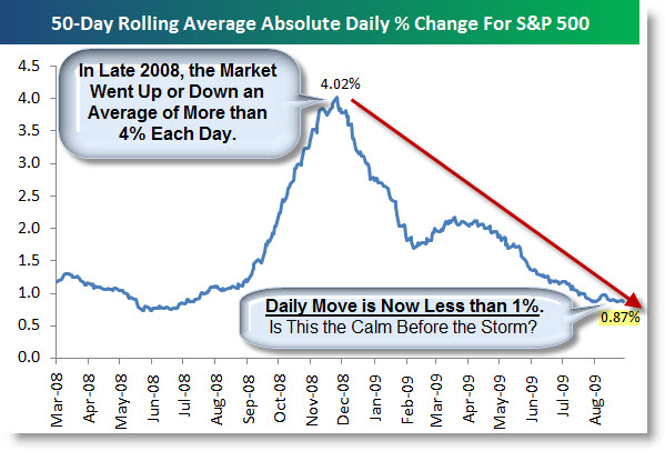
Bespoke reminds that one of the most remarkable characteristics of last year's market crash was its daily volatility. At its peak, the 50-Day Average Absolute Daily Change of the S&P 500 surpassed 4%. That means that the Market gained or lost 4% to 5% of its total value on a daily basis for two months.
In contrast, the 50-Day Average Absolute Daily Change of the S&P 500 is now under 1%. This is the lowest level since July of last year. Markets fall much faster than they rise, so it's no surprise that this number has gone down significantly as the S&P rallied off of its lows.
Shorter-Term, The Market Looks Strong.
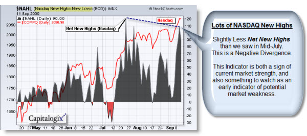
The next chart overlays the NASDAQ's Net New Highs on top of the index itself. This measure counts the number of NASDAQ Components making new 52-week highs, and subtracts the number of NASDAQ components making new 52-week lows . So, we get more Net New Highs when the markets are doing better. As it stands, A lot of NASDAQ Components are making highs for the year. Yet, there are slightly less Net New Highs than we saw in mid-July. So, while this is a little picky, it does constitute a negative divergence. Consequently, I'm watching for a drop-off in this measure as a potential early warning indicator of impending market weakness.
It's been easier to make money on the long side for a long time. I sense a lot of the smart money is daytrading long exposure. In other words, they're happy to trade long, but they're not as happy to take that risk home overnight.
Business Posts Moving the Markets that I Found Interesting This Week:Lighter Ideas and Fun Links that I Found Interesting This Week
Posted at 06:12 PM in Current Affairs, Market Commentary, Trading | Permalink
Reblog (0)