In the past, I've shared various "indicators" for markets that just don't make sense — like the Superbowl Indicator. The lesson to learn from those indicators is that we crave order, and look for signs that make markets seem a little bit more predictable even where there are none.
Wall Street is, unfortunately, inundated with theories that attempt to predict the performance of the stock market and the economy. More people than you would hope, or guess, attempt to forecast the market based on gut, ancient wisdom, and prayers.
While hope and prayer are good things ... they aren’t good trading strategies.
Today, I want to talk about a still "out there" index, but one that's a bit more practical from an economics standpoint (remember economics ≠ markets). I don't believe it should influence trading decisions, but I do believe it can teach you something about the practical realities of economies.
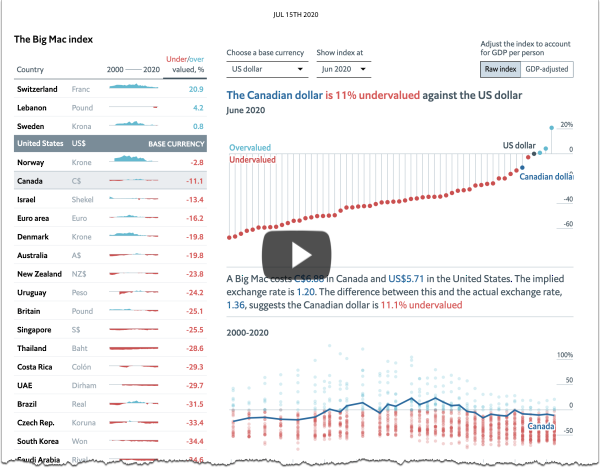
The Economist's Big Mac index seeks to make exchange-rate theory more digestible. They say it is arguably the world's most accurate financial indicator (based on a fast-food item).
The Big Mac index is based on the theory of purchasing-power parity (PPP), according to which exchange rates should adjust to equalize the price of a basket of goods and services around the world. For them, the basket is a burger … a McDonald’s Big Mac. The difference the disparity in price between Big Macs, and the actual exchange rate lets you know whether the currency is over or undervalued.
According to this measure (as of July 15th, 2020), the most overvalued currency is the Swiss Franc at 20.9% above it's PPP rate. In Switzerland a Big Mac costs 6.50 francs. In the U.S. a Big Mac costs $5.71. The implied exchange rate is 1.14, and the actual exchange rate is 0.94 — thus 20.9% overvalued. For contrast, South Africa Rands are the most undervalued (67%) with a Big Mac costing 31 rand and an actual exchange rate of 16.67.
Click the image below to see the interactive graphic.
 via The Economist
The index is supposed to be a guide to the direction in which currencies should, in theory, head in the long run. It is only a rough guide, because its price reflects non-tradable elements such as rent and labor. For that reason, it is probably least rough when comparing countries at roughly the same stage of development.
It is not meant to be the most precise gauge, but it works as a global standard because Big Macs are global and it's lighthearted enough to be a good introduction for college students learning more about economics.
You can read more about the Big Mac index here or read the methodology behind the index here.
The State of Democracy
I feel very lucky to live in America and lucky to live in a democracy ... but democracy is a term that encompasses a wide spectrum of activity and governments. In the same way that Republics and Capitalism also represent a wide spectrum of activity.
America has adopted a form of all three of those underlying structures, but it changes with each regime change, and as we adapt to the complexities of modern-day civilization.
It's worth understanding the nuances of what brand of democracy you live in - and what would make it ideal (in your opinion).
That's a much too complicated question to answer in the scope of this article, but a great starting point is understanding the world spectrum of Authoritarian -> Full Democracy, and how the different countries score.
Luckily, visualcapitalist put together a great interactive graphic based on the Democracy Index global ranking (as of 2019). Click the image to see the interactive version.
via visualcapitalist
Before I get into the rankings, a quick look at the classifications within the Democracy Index. It bases the score on 60 questions that cover things like the electoral process, civil liberties, government functions, and political culture.
Topping the list is Norway, and the most Authoritarian regime is North Korea.
Unfortunately, based on this metric, the U.S. (which is one of the oldest democracies in the world) was downgraded to a flawed democracy as of 2016, after teetering for many years. Some stated reasons for this shift are the growing distrust in public institutions, an upshot in ideological purity, and less bipartisan efforts.
Since 2006, when the Index was created, Democracy has actually been decreasing globally. Today, around half of the world's population lives in a democracy of some sort, with only 5.7% living in a "full democracy".
Posted at 05:06 PM in Business, Current Affairs, Ideas, Market Commentary, Trading, Trading Tools | Permalink | Comments (0)
Reblog (0)