Markets are not the economy, but it's still important to understand and follow economics.
One of the unfortunate "trends" of 2020 was the increase in debt at various levels. Now, debt can be a good thing ... it greases the international wheels and can be an important part of long-term financial plans for countries (in the same way you or I might use it.)
But too much of a good thing is a bad thing, and doing that math gets pretty complicated on the national level.
To help put it in perspective, I want to look at the U.S. debt on different scales.
First, you can look at this US Debt Clock for a staggering interactive visualization of the inflows and outflows in America. Click the image to watch it update in real-time. I encourage you to look at some of the components tracked. It made me think about our future differently.
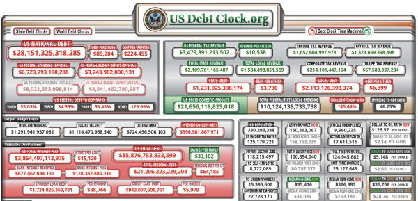
The U.S. has the largest percentage of the world's debt, but Japan has the worst debt-to-GDP rate at over 224% (compared to America's approximately 127%)
During 2020, debt held by the US public increased by $4.2 billion - the largest dollar increase in history. A large part of that increase in debt was due to the federal deficit which was reported at $3.1 billion
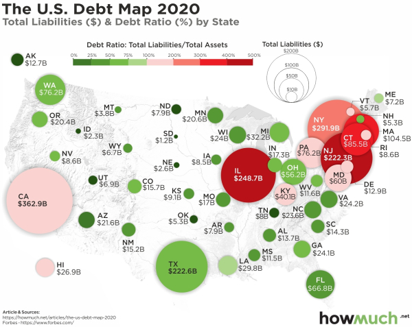
To help understand the image, Texas is actually a great case study. Texas's bubble is big because it has one of the highest total debt levels, but is green because its debt ratio is pretty good at 62.5%.
California has the highest total debt, but is very light pink, stating that its debt ratio isn't bad. Some states' liabilities outweigh their assets by a factor of 4x or 5x which is scary.
This is a helpful illustration of the delicate balance of taking on debt. It's okay to take on large amounts of debt if you have a reasonable belief that revenue outstrips interest. To contrast that, some of these states have unsustainable debt levels - and only survive because they're a part of a bigger whole - the U.S. - and have an extra safety net.
What about Consumer Debt?
Most of America's debt is Federal - but consumer debt accounts for a non-trivial portion as well. Here's a chart that shows the change in U.S. Household debt since 2003.
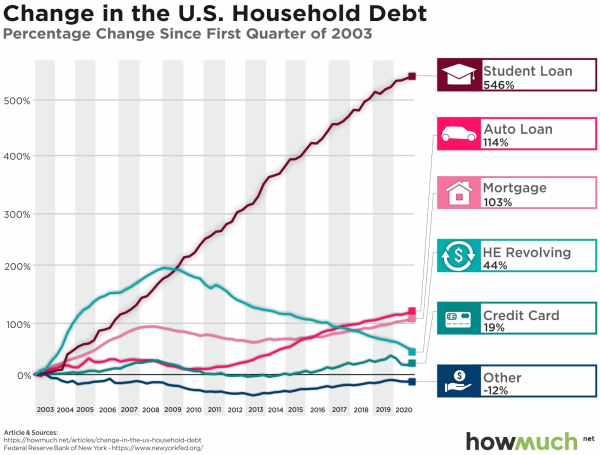
Student, Auto, and Home Owner loans have all increased substantially - with the cost of student loans raising over 500%. Almost every category of consumer debt has increased.
While our country has gotten richer, and the standard of living has increased, we also have more people living in large amounts of debt.
Things To Consider
These charts are startling. Debt is a powerful tool ... but comes with risk as well. The question is, are we as a country and individuals managing the risk appropriately?
It's hard to look at these charts and say that there isn't an issue. The hope is that the government stimulus packages will make a difference - but Band-Aids won't fix the root of the problem and can even lull people into a false sense of security.
What do you think the solution is?
Comments
A Quick Look At American Debt
Markets are not the economy, but it's still important to understand and follow economics.
One of the unfortunate "trends" of 2020 was the increase in debt at various levels. Now, debt can be a good thing ... it greases the international wheels and can be an important part of long-term financial plans for countries (in the same way you or I might use it.)
But too much of a good thing is a bad thing, and doing that math gets pretty complicated on the national level.
To help put it in perspective, I want to look at the U.S. debt on different scales.
First, you can look at this US Debt Clock for a staggering interactive visualization of the inflows and outflows in America. Click the image to watch it update in real-time. I encourage you to look at some of the components tracked. It made me think about our future differently.
The U.S. has the largest percentage of the world's debt, but Japan has the worst debt-to-GDP rate at over 224% (compared to America's approximately 127%)
During 2020, debt held by the US public increased by $4.2 billion - the largest dollar increase in history. A large part of that increase in debt was due to the federal deficit which was reported at $3.1 billion
To help understand the image, Texas is actually a great case study. Texas's bubble is big because it has one of the highest total debt levels, but is green because its debt ratio is pretty good at 62.5%.
California has the highest total debt, but is very light pink, stating that its debt ratio isn't bad. Some states' liabilities outweigh their assets by a factor of 4x or 5x which is scary.
This is a helpful illustration of the delicate balance of taking on debt. It's okay to take on large amounts of debt if you have a reasonable belief that revenue outstrips interest. To contrast that, some of these states have unsustainable debt levels - and only survive because they're a part of a bigger whole - the U.S. - and have an extra safety net.
What about Consumer Debt?
Most of America's debt is Federal - but consumer debt accounts for a non-trivial portion as well. Here's a chart that shows the change in U.S. Household debt since 2003.
Student, Auto, and Home Owner loans have all increased substantially - with the cost of student loans raising over 500%. Almost every category of consumer debt has increased.
While our country has gotten richer, and the standard of living has increased, we also have more people living in large amounts of debt.
Things To Consider
These charts are startling. Debt is a powerful tool ... but comes with risk as well. The question is, are we as a country and individuals managing the risk appropriately?
It's hard to look at these charts and say that there isn't an issue. The hope is that the government stimulus packages will make a difference - but Band-Aids won't fix the root of the problem and can even lull people into a false sense of security.
A Quick Look At American Debt
Markets are not the economy, but it's still important to understand and follow economics.
One of the unfortunate "trends" of 2020 was the increase in debt at various levels. Now, debt can be a good thing ... it greases the international wheels and can be an important part of long-term financial plans for countries (in the same way you or I might use it.)
But too much of a good thing is a bad thing, and doing that math gets pretty complicated on the national level.
To help put it in perspective, I want to look at the U.S. debt on different scales.
First, you can look at this US Debt Clock for a staggering interactive visualization of the inflows and outflows in America. Click the image to watch it update in real-time. I encourage you to look at some of the components tracked. It made me think about our future differently.
via US Debt Clock (4/9/21)
The U.S. has a GDP of about $22 Trillion and our national debt is currently over $28 Trillion, but our net worth is still approximately $120 trillion.
For more perspective:
What about on the state level?
As a result of snowballing debt, President Biden's $1.9T economic stimulus package promised $350B in direct aid to states.
Forbes via HowMuch
To help understand the image, Texas is actually a great case study. Texas's bubble is big because it has one of the highest total debt levels, but is green because its debt ratio is pretty good at 62.5%.
California has the highest total debt, but is very light pink, stating that its debt ratio isn't bad. Some states' liabilities outweigh their assets by a factor of 4x or 5x which is scary.
This is a helpful illustration of the delicate balance of taking on debt. It's okay to take on large amounts of debt if you have a reasonable belief that revenue outstrips interest. To contrast that, some of these states have unsustainable debt levels - and only survive because they're a part of a bigger whole - the U.S. - and have an extra safety net.
What about Consumer Debt?
Most of America's debt is Federal - but consumer debt accounts for a non-trivial portion as well. Here's a chart that shows the change in U.S. Household debt since 2003.
Federal Reserve Bank of NY via HowMuch
Student, Auto, and Home Owner loans have all increased substantially - with the cost of student loans raising over 500%. Almost every category of consumer debt has increased.
While our country has gotten richer, and the standard of living has increased, we also have more people living in large amounts of debt.
Things To Consider
These charts are startling. Debt is a powerful tool ... but comes with risk as well. The question is, are we as a country and individuals managing the risk appropriately?
It's hard to look at these charts and say that there isn't an issue. The hope is that the government stimulus packages will make a difference - but Band-Aids won't fix the root of the problem and can even lull people into a false sense of security.
What do you think the solution is?
Posted at 06:37 PM in Business, Current Affairs, Ideas, Market Commentary, Trading, Trading Tools | Permalink
Reblog (0)