A Series of S&P Charts to Help Put the Market in Perspective
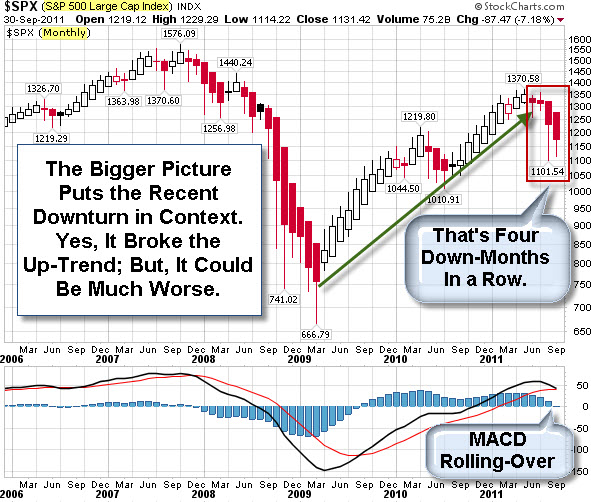
The recent doom and gloom can make it seem like the Market has suffered potentially fatal setbacks. However, a glance at a monthly chart of the S&P 500 Index shows a pretty normal-sized correction, based on recent swings.
It is worth noting, however, that the market has had four down months, and the MACD Indicator looks like it is rolling over. So, a move up here would certainly help Bulls feel more confident.
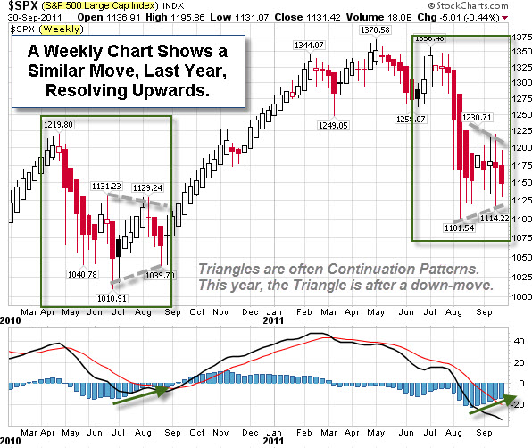
Moving down to a weekly chart of the S&P 500 Index, it is easy to see that a similar pattern occurred last year. At that time, the Triangle pattern resolved upwards. However, Triangles are often considered continuation patterns ... and last year's Triangle came during a big move up. Arguably, this year's Triangle comes after breaking last year's up-trend. As a result, some traders will assume that it is more likely for the pattern resolve downwards.
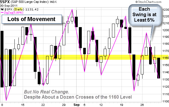
Zooming in a little closer to a daily chart ... it shows a lot of movement with little real change. The magenta zigzag indicator highlights moves of at least 5%. Moreover, price has crossed the 1160 level about a dozen times during September.
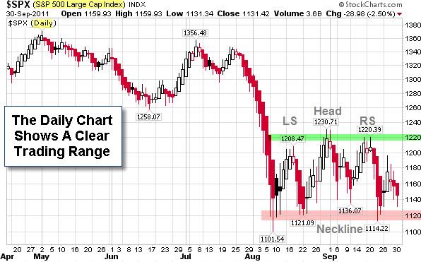
That kind of price action can create whipsaws. However, the next chart shows that there is a clearly defined range; and when price finally makes an extended move beyond it, traders will likely look for an entry.
In technical trading, price is the primary indicator. The market will tell you what's working.
Comments
A Series of S&P Charts to Help Put the Market in Perspective
The recent doom and gloom can make it seem like the Market has suffered potentially fatal setbacks. However, a glance at a monthly chart of the S&P 500 Index shows a pretty normal-sized correction, based on recent swings.
It is worth noting, however, that the market has had four down months, and the MACD Indicator looks like it is rolling over. So, a move up here would certainly help Bulls feel more confident.
Moving down to a weekly chart of the S&P 500 Index, it is easy to see that a similar pattern occurred last year. At that time, the Triangle pattern resolved upwards. However, Triangles are often considered continuation patterns ... and last year's Triangle came during a big move up. Arguably, this year's Triangle comes after breaking last year's up-trend. As a result, some traders will assume that it is more likely for the pattern resolve downwards.
Zooming in a little closer to a daily chart ... it shows a lot of movement with little real change. The magenta zigzag indicator highlights moves of at least 5%. Moreover, price has crossed the 1160 level about a dozen times during September.
That kind of price action can create whipsaws. However, the next chart shows that there is a clearly defined range; and when price finally makes an extended move beyond it, traders will likely look for an entry.
In technical trading, price is the primary indicator. The market will tell you what's working.
Posted at 12:43 AM in Current Affairs, Market Commentary, Trading | Permalink
Reblog (0)