Companies are spending more time, money, and resources analyzing data and creating meaningful visualizations.
With so many more examples, it shouldn't come as a big surprise that there are a lot more crappy infographics on display.
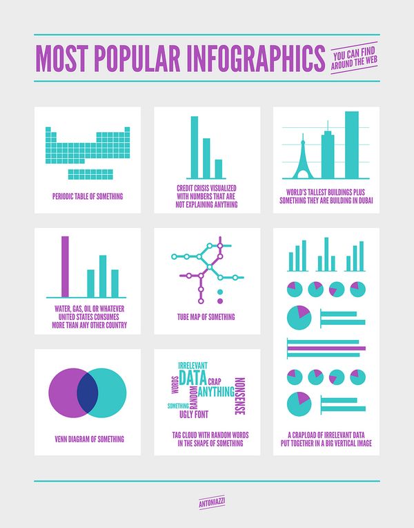
Here is a chart showing the most popular infographics you can find around the web.

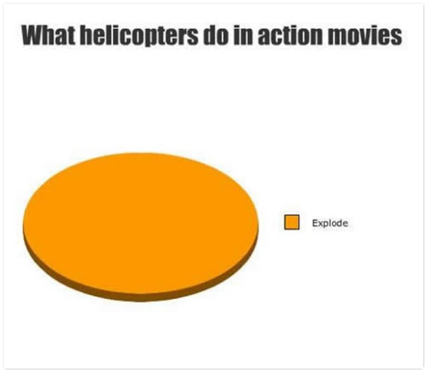
Of course, there is also the 'just for fun' infographic. For example, here is one showing what helicopters do in action movies.


Leave a Reply