I remember getting excited when my son finally seemed smart enough that I believed he was more intelligent than our dog. For the record, it took longer than I thought it would. Human and chimpanzee infants also start out remarkably similar in their early development. But here’s where it gets interesting – their developmental paths take dramatically different turns once human babies begin acquiring language. This cognitive fork in the road fundamentally shapes their future capabilities.
Language is a big domino. It allows “chunking” and makes learning new things more efficient, effective, and certain.
Language is powerful in and of itself. Using language consciously is a multiplier.
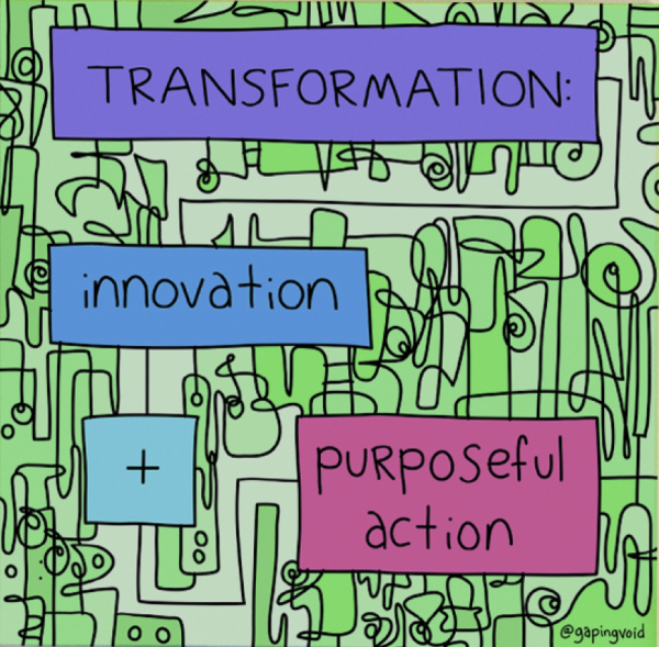
Today, I want to focus on one such use of language – the power of naming things.
The Power Of Naming Things
“I read in a book once that a rose by any other name would smell as sweet, but I’ve never been able to believe it. I don’t believe a rose WOULD be as nice if it was called a thistle or a skunk cabbage.” – L.M. Montgomery, Anne of Green Gables
Before I go into detail, I shot a video on the subject, with a few examples from our business.
Having a shared language allows you to communicate, coordinate, and collaborate more efficiently. But it’s hard to have a shared language when you’re discussing something intangible.
That’s where naming comes in. When you name something, you make the “invisible” visible (for you, your team, and anyone else who might care).
I’ve often said the first step is to bring order to chaos. Then, wisdom comes from finer distinctions. Naming is a great way to create a natural taxonomy that helps people understand where they are – and where they are going.
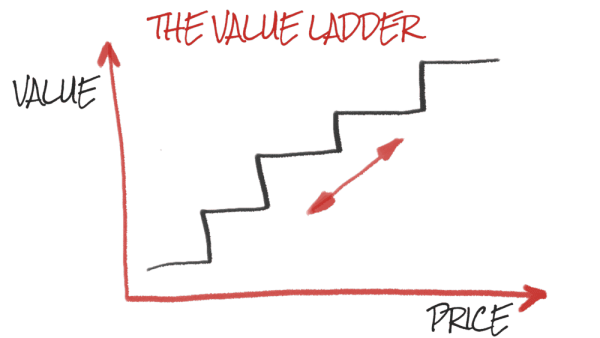
I like thinking of it in comparison to value ladders in marketing.
Each stage of the value ladder is meant to bring you to the next level. By the time someone gets to the top of the value ladder, they’re your ideal customer. In other words, you create a natural pathway for a stranger (meaning someone who doesn’t know you well) to follow, to gain value, trust, and momentum onwards … ultimately, ascending to become someone who believes in, and supports, what you offer and who you are.
Ultimately, successful collaboration relies on a common language. That is part of the reason naming is so important. The act of naming something makes it real, defines its boundaries and potentialities, and is often the first step toward understanding, adoption, and support.
Creating “Amplified Intelligence”
There are always answers. We just have to be smart enough. – John Green
Here is an example from our business. When we first started building trading systems, all we had was an idea. Then, we figured out an equation (and more of them). Next, we figured out some methods or techniques … which became recipes for success. As we progressed, we figured out a growing collection of useful and reliable ways to test, validate, automate, and execute the things we wanted to do (or to filter … or prevent the things we wanted to avoid or ignore).
It probably seemed chaotic to someone who didn’t understand the organizing principles. Fear, uncertainty, and doubt, which inhibit potential customers and stakeholders (such as a business’s employees), compound the problem.
Coming up with the right organizing principle (and name) makes it easier to understand, accept, and adopt. For example, many traders and trading firms want to amplify intelligence – meaning they want to make better decisions, take smarter actions, and ultimately perform better (which might mean making and keeping more money). To help firms amplify intelligence, we created the Capitalogix Insight Engine (a platform of equations, algorithms, methods, testing tools, automations, and execution capabilities). Within that platform, we have functional components (or modules) that focus on ideas like portfolio construction, sensible diversification, alpha generation, risk management, and allocation strategies. Some of those words may not mean much to you if you’re not a trader, but if you are, it creates an order that makes sense and a path from the beginning to the end of the process.
It makes sense. It explains where we are – while informing them about what might come later.
The point is that naming things creates order, structure, and a contextual map of understanding.
It is a compass heading used to navigate and guide in uncertain territory.
On the other hand, beware of the consequences of becoming overly connected to labels … once a name sticks, people stop questioning whether it’s still true or not.
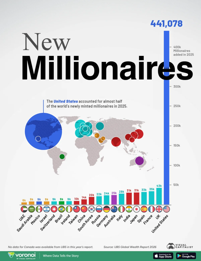
In 2025, nearly one million people became new millionaires, averaging over 2,680 daily. A closer look shows that the United States contributed nearly half of these new millionaires, with over 441,000, while the UK ranked second with just over 43,000.
I know many people are feeling stressed about the state of the world, the market, etc. However, this is another reminder that the U.S. is one of the strongest markets and an incredible place to do business.
Wealth creation is continuing at pace despite the headline anxiety, which itself signals where capital is flowing …
The last time I drove in New York City, the traffic was so bad that I complained, “I didn’t understand why people came here.” It reminded me of a Yogi Berraquote about a restaurant he used to work at: “Nobody goes there anymore, it’s too crowded.”
The same is true in business. Opportunity draws a crowd … but the best opportunities are often in areas of less competition.
For entrepreneurs, oversaturation can turn products into commodities, reducing profit potential. Conversely, many shy away when a challenge seems insurmountable, creating unexpected opportunities for those willing to take the risk.
While Artificial Intelligence is becoming commoditized, that doesn’t mean every application is.
As an entrepreneur, I’m drawn to projects others might dismiss as science fiction. These are the challenges that often lead to the most groundbreaking and rewarding outcomes.
As a practical matter, exponential technologies are changing the game in many ways. First, based on what they make possible. Second, by how fast that can happen now. And third, by making it necessary to make the invisible visible (what I mean by that is you must focus on thinking about things that were previously inconceivable to you), and that results in mining a bucket of opportunities that used to get no thought given to them.
Moonshot Projects
Moonshot projects offer a unique advantage. While they may seem daunting, their audacious nature often means less competition and greater potential for transformative impact and extraordinary profits.
A moonshot project is a highly ambitious, transformative endeavor that seeks to solve a significant problem or create a revolutionary innovation. These projects are characterized by:
Audacious Goals: They aim for breakthroughs that seem nearly impossible.
Disruptive Impact: They strive to create solutions that are vastly superior to existing offerings, often by introducing entirely new paradigms.
High-Risk, High-Reward: These projects embrace the potential for failure in pursuit of groundbreaking results.
Long-Term Focus: They prioritize long-term impact over short-term gains.
Technological Advancements: They leverage cutting-edge or even nascent technologies.
Paradigm Shifts: They challenge conventional wisdom and industry norms.
Moonshot projects are inherently challenging. They demand significant resources, interdisciplinary collaboration, and a willingness to venture into the unknown. This perceived difficulty often deters potential competitors, creating a unique opportunity for those willing to take the risk.
When successful, they push the boundaries of what is possible and redefine the landscape of their respective fields.
For us here, autonomous trading happens in live markets amid power failures, pandemics, wars, and the President’s ability to post whatever he wants on social media at any time. What started out as the quest for a better algorithm led to a real-time decision-making process that dynamically adapts to what happens, audits itself, and continually learns and evolves. Literally science fiction from 20 years ago.
In part, that is why a 10X mindset is particularly well suited to Moonshot projects. By aiming for a tenfold improvement over existing solutions, you’re essentially operating in a space with little to no competition or opposition. This allows you to redefine the rules of the game and establish a sustainable competitive advantage.
Playing a New Game
Our strategy of moonshot thinking creates a unique, sustainable competitive advantage that aligns perfectly with the Moonshot approach. By choosing to play a different game (with an asymmetric edge), we’re not just competing; we’re fundamentally changing the playing field.
I’m not interested in going head-to-head with tech giants on their turf. Instead, the goal is to carve out our own niche, focused on our unique abilities to push the boundaries that extend our edge.
Quote from Howard Getson
Being slightly ahead of the competition can be a powerful attractor. It often leads potential competitors to seek collaboration rather than confrontation. They might approach you with ideas, money, or opportunities, aspiring to share in your advanced position and capabilities. This dynamic can create unexpected partnerships and accelerate progress in ways that benefit everyone involved.
When interviewing potential team members, I often share a crucial insight: if you’re seeking a job where you work 9-to-5 solving problems so you can go home feeling satisfied, this might not be the right fit.
We tackle challenges of a different magnitude. Our projects rarely have quick solutions. Instead, we focus on making steady progress towards ambitious goals. Because of that, I sometimes joke that our motto should be: “We suck less.” Nevertheless, the underlying truth is more profound. It’s about understanding your ultimate objective and recognizing that each step that moves you in the right direction, no matter how small, is still progress.
This approach aligns with our belief in playing a different game. We don’t just compete; we redefine the rules of engagement, creating our own metrics for success and pushing boundaries in ways that traditional thinking often overlooks. Kind of like this quote:
“I have not failed. I’ve just found 10,000 ways that won’t work.” – Thomas Edison
Play to Win!
Business does not happen in a vacuum. You have to be aware of the playing field, the players, and asymmetric advantages. In other words, don’t compete with giants at their own game.
Choose to play a game you both want and expect to win.
Playing a different game is a theme at Capitalogix. We believe that you control the game you’re playing, the rules, how you keep score, and even how you evaluate success. These things inform where to spend time, where to invest money, and even what you see as an opportunity.
Wouldn’t you rather compete in areas where you can create a unique, sustainable competitive advantage? Personally, I want to invest in the things that extend the edges that let us win.
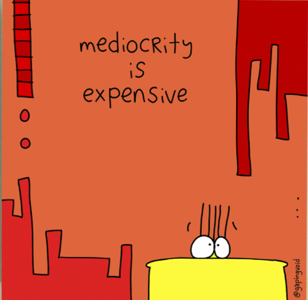
Why? Because the alternative — competing on someone else’s terms — is expensive in ways that don’t show up until it’s too late.
Mediocrity Is Expensive!
What you lack in size or computer power, you can make up for in creativity, agility, and innovation.
We built our edge in the investment industry through unique approaches to age-old problems, not raw computing power.
We have an incredibly narrow and consistent focus. Within that area, we are willing to take on problems others avoid and pursue goals that others say are impossible.
Our niche limits risk and lets us fail faster … and learn faster. This allows us to take confident action while others are tentative.
Most big companies – and most of our competitors – are afraid to be wrong. They have to protect their infrastructure, cash cows, and short-term performance metrics. It makes sense (from their perspective) that playing it safe means they’re secure. – but that’s not how it works.
You can’t challenge the status quo when you are the status quo.
10X vs. 10%
Pursuing moonshots (rather than incremental change) leads to a counterintuitive shift in belief … Improving something ten times is often easier than improving it ten percent. Astro Teller — who runs Alphabet’s moonshot factory, X — put it well in this TED talk:
Incremental change is hard – it’s finding new ways to do the same thing, and you often end up competing in very red oceans – saturated markets where you’re competing on price.
Moonshots sound harder, but you create your own niche, and the constraints of a new idea force creativity and energy. If you’re going after a goal that no one has accomplished before, it’s impossible to be in a red ocean, and it’s easier to mobilize a team around something exciting and new than decreasing some arbitrary metric by 2%.
There are a couple of important lessons to keep in mind when pursuing the unknown. Usually I like to say that it’s better to have a map before you get lost in the woods, but in pursuing the unknown, you often don’t have a map. If that’s the case, the first thing I think of is to focus on process rather than outcomes. In the unknown, following a trusted framework is a good place to start. In addition, here are a few ideas to get you started.
Forget what you know – self-reported “experts” are limited by their worldview. If you’re trying to get a different result, you won’t do it by playing by the same rules your predecessors followed. Heuristics are great for making life easier – but they’re very limiting when trying to create something new.
Attack the hardest problems first – your biggest problems are your biggest opportunities. If you don’t deal with the big problems now, you’ll never get around to them, and you’ll waste time and energy, only to realize you have to pivot much too late.
Be comfortable being uncomfortable – most people find failure taboo and are deathly afraid of it. Tony Robbins talks about our tendency to avoid pain more actively than we pursue pleasure, and it’s true in business. But failure is a part of business. The people I consider most successful got there through incredible pain tolerance and increasingly intense problems that they continued to conquer.
Have a short memory for pain– Focus on the gain, not the pain. People often focus on not having enough money, not enough time, or simply not having enough. That scarcity mindset is dangerous and can lead to getting lost in pain and fear. Acknowledging the pain/fear and moving forward from a place of abundance and opportunity helps create opportunities.
A clear identity is also important. You have to understand what you’re pursuing and how you want to attack the problem. At Capitalogix, we’ve gotten very in tune with our goals.
We invent techniques that identify and adapt to what happens. We apply the lessons learned from past experiences, data science breakthroughs, and hard work to eliminate the fear, greed, and discretionary mistakes that are the downfall of most decision-makers.
Small businesses don’t have a monopoly on these mindsets and opportunities, but companies like Y Combinator, HeroX, or X (and no, I don’t mean the company formerly known as Twitter) are few and far between. Speaking of the other X, Elon Musk is famous for moonshots such as Tesla, SpaceX, Starlink, Neuralink, and XAI. Google and Microsoft pursue moonshots as well.
Good news … the future is big enough for them and you.
Choose something that lights you up and leverages what you already know and who you already are.
If you’re the one writing checks instead of the one in the arena, the question isn’t whether a team has an edge today — it’s whether they’re building one nobody else wants to build.
Sometimes the best opportunity is the one others don’t want to pursue, not because it’s crowded, but because it seems hard.
Yogi Berra was joking about a restaurant. He wasn’t wrong about markets. The crowded road is the one everyone already found.
When my youngest son was born in 1993, cassette tapes and the Sony Walkman were popular. I had a brick-sized phone hardwired into my car, and we had a Macintosh-II in the study. We take a lot of today’s technology for granted — it’s evolved so fast it’s hard to remember any of that wasn’t so long ago.
Here is a throwback picture showcasing the cool tech we had back then.
Everything in that photo now exists in the cheapest of smartphones. And the features and functions available now far exceed my wildest expectations back then.
For a blast from the past and a look back at what used to be top-of-the-line … here’s a video of people buying a computer in 1994.
Video transfer and playback. 160-megabyte hard drive. 32 megahertz. All for the low price of $2,000.
I can remember back further than 1993, because I’m old enough that I didn’t have my first computer until after I graduated college. My first Macintosh had floppy disks measured in K, not megs or gigs. For context, my first job out of school was at a law firm where the only people who used computers were in the typing pool. And when I said I wanted a computer, the lawyers said “No!” because it would look bad.
It’s pretty cool to see how far we’ve come!
This week’s other piece is a reflection on moonshots. Just as a reminder, even the things that seem like moonshots today will someday look “primitive” and “quaint”.
For the past two years, “prompt engineering” has been treated as the defining AI skill. There were endless guides on magic phrases, secret prompt structures, and elaborate templates that promised dramatically better results.
In the early days, they often made a meaningful difference. They were the differentiator. They’re still an important part of my framework around AI.
But the landscape and the models have changed.
Today’s frontier models are remarkably good at understanding intent. Give them a reasonable request, and they’ll often infer the structure, ask clarifying questions, or even build the framework themselves. A prompt that once required a page of careful instructions can now be written in a sentence or two with surprisingly similar results.
Prompt engineering still matters. Good communication will always matter. But it’s no longer where the biggest advantage lies.
The new advantage is context.
From Better Prompts to Better Systems
The organizations getting the most value from AI aren’t necessarily writing better prompts. They’re building better systems or ecosystems.
They’ve documented their business. They’ve organized institutional knowledge. They’ve defined their voice, customers, products, and decision-making frameworks. They’ve connected their AI to the information that actually matters … and only what matters.
In other words, they’ve spent months building an ecosystem instead of minutes writing a prompt.
A company that’s actually done this has a living record of who owns which decision, a memory of why past calls were made and what happened afterward, and a standing way to tell its AI “here’s what’s changed since you last looked.”
A Recipe For Slop
The absence of that information and context is why so much AI-generated content still feels generic, and you see those artifacts of AI-construction.
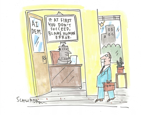
It’s not because the models aren’t capable. It’s because they’re operating without context — their defaults come from the sum of the internet’s knowledge, not your organization’s actual preferences.
When an AI knows nothing about your company, your customers, your history, your goals, or your standards, it fills in the gaps with averages. It sounds like everyone else because, statistically speaking, everyone else is all it knows.
That’s where the telltale AI signs come from: generic introductions, predictable transitions, vague conclusions, and writing that feels polished but somehow empty. The model isn’t being lazy. It’s doing exactly what it should with incomplete information.
Think about hiring a new employee.
You could hire the smartest person in the world. Still, if you sat them at a desk with no onboarding, no documentation, no understanding of your customers, no explanation of your culture, and no access to the institutional knowledge your team has built over the years, you wouldn’t expect exceptional work on day one. You’d expect educated guesses.
AI is the same.
A clever prompt might take five minutes to create.
Someone else can copy it in five seconds.
They can reverse engineer it, ask another AI to improve it, or find dozens of versions online. Prompts have become increasingly commoditized.
Context isn’t.
Context is months of documentation. It’s years of accumulated knowledge. It’s your operating procedures, meeting notes, customer conversations, product documentation, brand standards, strategy papers, and the thousands of small decisions that make your organization unique.
No two companies will build exactly the same context.
That’s why context has become a competitive moat.
Perhaps the word “moat” overclaims slightly. A moat is static — dig it once, it defends forever. What the piece actually describes is closer to a flywheel that decays if you stop turning it. Institutional knowledge rots the same way any documentation rots if nobody keeps it current.
Context has to be maintained, not just accumulated.
The Next Competitive Divide
The gap today isn’t simply between companies that use AI and those that don’t.
It’s between organizations that have methodically onboarded AI into their businesses — creating systems where intelligent agents understand the company almost like a new employee—and organizations that are still opening a chatbot and typing random questions into a blank text box.
Those companies are technically using the same technology.
They’re just not getting the same results.
Twenty years ago, the differentiator might have been whether your business had a website. Ten years ago, until recently, it was social media presence … then social authority and podcasts. Recently, it was whether you had AI at all. Increasingly, that won’t be enough. The companies that pull ahead will be the ones that invest in building an AI ecosystem: one where knowledge is captured, context is preserved, and intelligent agents are equipped with the same information your best employees rely on every day.
The next phase of AI won’t be won by whoever writes the cleverest prompt. It will be won by whoever builds the best-informed systems.
Start with the one thing your best person knows that’s never been written down.
As AI becomes more entrenched, data is becoming more important – not less.
Data is the fastest-growing commodity, and is today’s “wild west” and the battlefield of today’s tech titans. We talk about AI as the new gold rush, but data is the commodity everyone is mining—and the real advantage comes from how you refine it, not just how much you collect.
A staggering 402 million terabytes of data are created daily, which means around 130 zettabytes of data will be generated this year. But those numbers are vastly understated because AI and agents are poised to create and consume data on a scale we’ve never seen before.
Video is still growing rapidly, and so is IoT, with about 14% annual growth. There are now over 21.1 billion connected devices. Of course, AI is driving growth even higher.
Alphabet, Amazon, Apple, Facebook, and Microsoft all have unprecedented amounts of data (and power). And the new generation of giants like OpenAI and Anthropic (along with current trends in generative AI content creation, LLM usage, data center growth, etc.) tip the scales further towards almost unimaginable quantities of data, knowledge, and insights.
Rapid growth means little time to create adequate rules (or tools). Everyone’s jumping to own more data than the next person and to protect it from prying eyes.
Collecting basic data and using basic analytics were enough … but not anymore. The game is changing.
For example, traders used to focus on price data … but there has been an influx of firms using alternative data sets and making extraordinary investments in hardware and software to find an edge. If you’re using the same data sources as your competitors and competing on the same set of beliefs, it’s hard to find a sustainable edge.
Understanding the game others are playing (and its rules) is important. However, that’s only table stakes.
Figuring out where you can find extra insight — or where you can make the invisible visible — is what actually separates you from the field. But like the flywheel this week’s other piece [link] describes, it’s a separation you have to keep re-earning, not something you bank once.
Here is a quick high-level video recorded back in 2019 on data as fuel for your business — it holds up remarkably well. Check it out.
It is interesting to think about what’s driving the new world (of trading, technology, AI, etc.), which often involves identifying what drove the old world.
History has a way of repeating itself. Even when it doesn’t repeat itself, it often rhymes.
With that said, the key to unlocking the pathway to the new world often comes from a new or alternative data set that lets you approach the problem, challenge, or opportunity from a different perspective.
Before e-mails, fax machines were amazing. Before cars, people were happy with horses and buggies. Now, let’s talk about how technological improvements like dashboards and reporting seem old-world compared to firms that use data to re-architect their business models, create whole new opportunities … or even new industries.
These comparisons help explain the importance of data in today’s new-world economics.
You’ve heard “data is the new oil” before — it’s been the opening line of tech keynotes for over a decade. Clichés survive because something true is under them. Worth pushing on where this one holds and where it breaks.
Petroleum has played a pivotal role in human advancement since the Industrial Revolution. It fueled (and still fuels) our creativity, technology advancements, and a variety of derivative byproducts. There are direct competitors to fossil fuels gaining steam, but I think it’s more interesting to compare petroleum to data because of their parallels in their effects on innovation.
Pumping crude oil out of the ground and transforming it into a finished product is not a simple process. Yet, it is relatively easy for someone to understand the process at a high level. You have to locate a reservoir, drill, capture the resource, and then refine it to the desired product – heating oil, gasoline, asphalt, plastics, etc.
We discussed this in the video, thinking through what actually makes data usable:
You’ve got to figure out what data you might have, how it might be useful, you have to figure out how to refine it, clean it, fix it, curate it, transform it into something useful, and then how to deliver it to the people that need it in their business. And even if you’ve done this, you then have to make people aware that it’s there, that it’s changing, or how they might use it. For people who do it well, it’s an incredible edge. – Howard Getson
In a sense, data fuels the information economy much like oil fuels the industrial economy. The amount of power someone has can be correlated to their control of and access to these resources. Likewise, things that diminish or constrain access or use of these resources can lead to extreme consequences.
Why Data Is Better Than Oil
The analogy works, but it’s just that, an analogy, and the more you analyze it, the more it falls apart. Unlike the finite resource that is oil, data is all around us and increasing at an exponential rate, so the game is a little different:
Data is a renewable resource. It’s durable, it’s reusable, and it’s being produced faster than we can process it.
Because it’s not a scarce resource, there’s no need to hoard it – you can use it, transform it, and share it, knowing it won’t diminish.
Data becomes more valuable the more you use it.
As the world’s oil reserves dwindle, and renewable resources grow in popularity and effectiveness, the relative value of oil drops. It’s unlikely that will happen to data.
Also, while data transport is important, it’s not expensive the way it was with oil. Here is an example difference that dramatically changes the implications… Data can be transported, replicated, and transformed at light speed.
The cheapest crude you’ll ever refine is the data you’re already generating and throwing away.
Another high-value data concept is that alternative data gives traders an advantage, but it doesn’t always require confidential or hard-to-find information.
For example, Traders now have access to vast amounts of structured and unstructured data. A significant source that many overlook is the data produced through their own process or the metadata from their own trades or transactions.
The video highlights a prediction about where this goes next:
In the very near future, I expect these systems to be able to go out and search for different sources of information. It’s almost like the algorithm becomes an omnivore. Instead of simply looking at market data or transactional data, or even metadata, it starts to look for connections or feedback loops that are profitable in sources of data that the human would never have thought of. – Howard Getson
A word of caution: there are two common mistakes people make when making data-driven decisions.
First, people often become slaves to the data, losing sight of the bigger picture. It’s a mistake that’s become even more common in the age of AI. Both data and AI are extraordinary tools, but neither should replace critical thinking, experience, or judgment. AI can summarize, analyze, and recommend at incredible speed, but it still requires humans to ask the right questions, validate the answers, and decide what truly matters.
Second, even the most sophisticated models can’t predict black swan events. AI excels at identifying patterns in what has happened before, but history doesn’t always repeat itself. The unexpected still happens. Resilience, adaptability, and preparation remain just as important as prediction.
The future of data has never been brighter, but the challenges have grown just as quickly. Privacy concerns, data ownership, misinformation, and synthetic content are no longer theoretical debates—they’re everyday realities. Likewise, AI has dramatically lowered the cost of creating convincing text, images, audio, and video, making it easier than ever to blur the line between fact and fiction. At the same time, organizations are collecting and generating more information than ever before, making the ability to distinguish signal from noise one of the defining skills of the modern era. And all that doesn’t begin to unpack the risks from data quality, model risk, and how to know when you’re approaching the point of diminishing returns.
I believe one of the greatest challenges facing our youth—and, increasingly, all of us—isn’t a lack of information. It’s an overabundance of it.
No previous generation has had access to this much knowledge, or been bombarded by this much content. Ironically, more information doesn’t always produce greater understanding. Algorithms reward engagement over nuance. Headlines replace deep reading. AI can generate answers in seconds, but it can also create the illusion of expertise without the substance to back it up. The bottleneck is no longer access to information; it’s discernment.
The winners won’t simply be the people or organizations with the most data or the most powerful AI. They’ll be the ones who know what information to trust, what to ignore, and how to systematically combine technology with sound judgment.
In an age when intelligence is increasingly abundant, wisdom becomes increasingly scarce.
The question is no longer how to collect more data.
It’s how to use it without becoming a victim of it.
Two hundred and fifty years old… and honestly, we still look pretty good for our age.
Like anyone who’s made it this far, we’ve got our scars. We’ve had seasons we’re proud of, and seasons we’d rather forget. We’ve stumbled, argued, rebuilt, and kept moving forward.
There is still so much work to do. There always will be.
But perspective matters. In the story of nations, 250 years is remarkably young. We’re still growing. Still learning. Still writing the next chapter.
Maybe it’s a little amazing grace—or maybe just amazing luck—but I never want to take for granted how fortunate I am to call this country home. There’s something extraordinary about a place where millions of people from different backgrounds continue striving toward the same promise: that tomorrow can be better than today. An especially important lesson for entrepreneurs.
Here’s to celebrating where we’ve been, appreciating what we have, and believing in what we can still become.
Here’s a clip from Robin Williams showing us it’s always a good time to feel a bit of patriotism.
Happy Independence Day.
Hopefully, this day is a reminder to all that, despite our differences, we have a lot to be proud of.