When Punxsutawney Phil Speaks, People Listen
Forget about EF Hutton, or for that matter Warren Buffett. If you really want to know where stock prices are going and can’t wait until the Super Bowl, look no further than the Oracle of Punxsutawney, Phil the groundhog! Given his ‘perfect’ record at predicting the weather, we wanted to check up on the groundhog’s ability to predict the direction of the stock market.
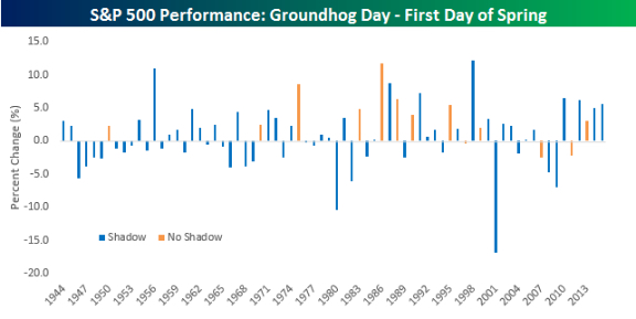
Going back to 1944, when Groundhog Day resumed following a brief pause during World War II, Punxsutawney Phil has seen his shadow on the morning of February 2nd 59 times and seen no shadow just 13 times. The table and chart below summarize the performance of the S&P 500 from Groundhog Day through the first day of Spring in each year based on whether or not Phil sees his shadow or not. (Disclaimer: If you are reading and still think this post is meant in any way to be taken seriously, it is not.)
On years when Phil sees his shadow, it not only means we are in for a longer winter but also sub-par stock returns. In the 59 years where Phil has seen his shadow, indicating a long winter is in store, the S&P 500’s median return from that day up until the first day of spring has been a gain of 0.54% with gains 54% of the time. Those returns don’t sound so bad, but they are actually below average. That’s because in the thirteen years where Phil did not see his shadow the S&P 500 saw a median gain of 3.01% with positive returns more than three-quarters of the time.
As shown in the lower chart, there are only three years (1997, 2007, and 2011) since 1944 than Punxsutawney Phil did not see his shadow and the S&P 500 declined from Groundhog Day through the first day of spring. Of those three years, the worst decline was 2.17%. With the S&P 500 already down 1.6% today, the S&P 500 has some digging out to do if it is going to continue its trend of winning ways following those days when the groundhog doesn’t see his shadow. It’s so easy a groundhog can do it!
Right … so, you know that was poo poo de moo moo. Punxsutawney Phill doesn't predict markets.
This year started with an 11 % drop. While that is the steepest drop to start a year, I'm pretty sure that doesn't mean much either. With similar numbers, the market ultimately went down 32 % in 2008 — and up 33 % in 2009.
Markets go up – and markets go down. It's not what happens, it's what you do that matters.


Leave a Reply