The world has over 7 billion people.
How can we get a sense of what it means … and who we are?
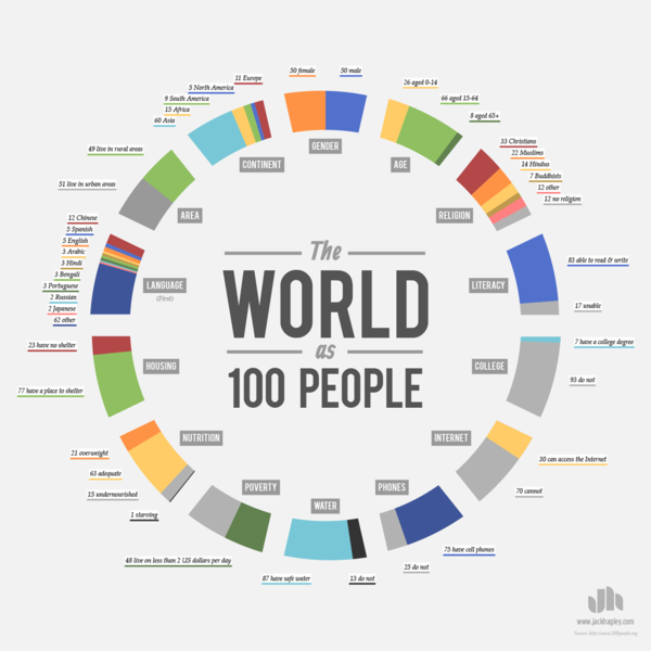
One way is by statistically representing the world population as 100 people. That way, complex issues become more comprehensible and help us get a clearer look at the big picture.
So, what would the world look like if it were represented by just 100 people?
The infographic below covers a broad range of statistics, including: gender, age, race and religion.

via Washington Post.
To see a video about this, click here.
A different look at the data is here.
You can find the original source of the data here.

Leave a Reply