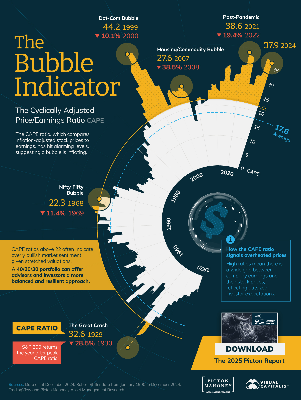
Change is the only constant in life, yet it rarely unfolds in ways we expect. While we sense its approach, its shape — whether sudden and disruptive or slow and subtle — often defies our predictions. As the pace and scale of change accelerate, understanding its patterns becomes more crucial than ever.
The World Government Summit put together a helpful interactive website where you can test your knowledge on the trajectory of key statistical indicators for the development of society over the past decade. Here is the text from their opening screen.
Can we estimate how much the world has changed in a decade? Or do our own experiences impact the perception of progress? This work challenges the assumptions we make about how key statistical indicators regarding Health, the Environment, or Education evolve through the years.
- The Shape of Change via the World Government Summit
The first part of the process was designed to be like a guessing game where you try to predict the direction and the rate of change of key issues shaping the world (like oil dependency, pollution, literacy, economic freedom, etc.) by answering some questions at "The Shape of Change." It is simple, easy-to-use, and has a nice interface ... but answering the questions was more challenging than expected. Try it here.
The Shape of Change via the World Government
The second part of the experiment lets you explore the year-over-year changes in key statistics regarding health, education, economy, and other topics.
The Shape of Change via the World Government
If you want to explore this further, I asked Perplexity to give me a broad overview of the project and its key insights. Here is the link.
The data is interesting. But, perhaps, your reaction to the data is more important.
Were there any numbers that surprised you?


How Are You Feeling About The Tariffs?
Trump announced his reciprocal tariffs this week, and the world went into an uproar and the market into a tailspin. As an immediate result, JP Morgan switched its economic prediction from "Solid Growth" to "Recession Risk"
My take: Actions Have Consequences. More importantly, we don't know all the actions ... and we certainly haven't recognized all the consequences. This is the beginning of something bigger than it seems, and many of the outcomes are beyond our current expectations or comprehension.
Sure, we saw some fundamental shifts last week ... but know that we are in for more.
The moves were big and fast enough that most people I know haven't had the time or brain cells to ponder things long and deep enough to form a well-reasoned opinion.
The only thing I "know" is that I expect more volatility and big moves.
With that in mind, here are some charts to help keep you informed as the consequences unfold.
Chart #1 - Global Stock Market Returns in Q1 of 2025
via visualcapitalist
Chart #2 - Trump's Reciprocal Tariffs on Major Nations
via visualcapitalist
Chart #3 - Tariff Shock Wipes $5.3 Trillion Off S&P 500: Index Falls 10.5% in Two Days
via visualcapitalist
Looking at the first chart, it's clear that prior to this announcement, there was a U.S. sell-off, perhaps caused by concerns about inflation and slower GDP growth. As a result, more investment was moving toward Chinese and European stocks.
After Trump's announcement, many things happened, including a joint response from China, Japan, and Korea - something I never thought I'd see. Also, many internet netizens started to plug questions into AI LLMs and receive similar results as Trump's tariffs. Contrary to a more complex equation, it appeared as if the tariff rates were calculated by dividing the deficit and imports of a country. Ultimately, this math was confirmed by the White House Deputy Press Secretary, Kush Desai.
It will be interesting to see what is walked back and what is doubled down on over the next few weeks.
Do you have faith? Do you have an opinion? I'd love to hear it!
Posted at 09:22 PM in Business, Current Affairs, Ideas, Market Commentary, Trading, Trading Tools | Permalink | Comments (0)
Reblog (0)