Wow, how time flies!
via someecards.com
The 1st Quarter of the year is almost in the books. How are things going?
Spring is an excellent reminder that I was supposed to get in shape before spring.

Thoughts about the markets, automated trading algorithms, artificial intelligence, and lots of other stuff
Wow, how time flies!
via someecards.com
The 1st Quarter of the year is almost in the books. How are things going?
Spring is an excellent reminder that I was supposed to get in shape before spring.
Energy Policy and Green Energy have been in the news recently. Here is a cartoon poking fun at the situation. It's called "Feeding the Federal Furnace."
Here are some of the posts that caught my eye. Hope you find something interesting.
Energy Policy and Green Energy have been in the news recently. Here is a cartoon poking fun at the situation. It's called "Feeding the Federal Furnace."
Here are some of the posts that caught my eye. Hope you find something interesting.
The S&P 500 Index had its biggest weekly drop of the year last week, with a less-than-whopping fall of 0.50%.
Yep, half a percent. Moreover, it was only the second week of the year out of twelve in which the index posted a decline. Results like that make traders fat, dumb and happy.
With a year to date gain of more than 11%, the S&P 500 is on pace for its second consecutive quarter of 10%+ gains. According to Bespoke, if this holds, it will be just the 12th time in the index's history that it has posted double digit percentage gains in back to back quarters.
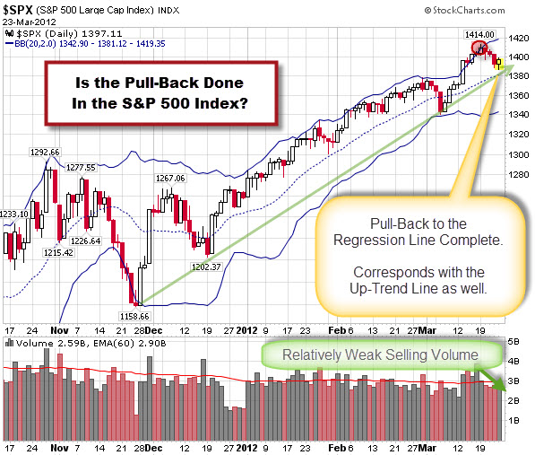
Here is a chart showing the daily performance of the Index.

Note the area circled in red. That marks where price came back inside the upper Bollinger Band. Technical analysts might expect that the first likely target would be the mid-line (marked by the dotted blue line). In this case, it also corresponds with likely support at the short-term up-trend line (marked by the green arrow). Add the weak volume of the recent decline … and you might have the recipe for a new rally?
The S&P 500 Index had its biggest weekly drop of the year last week, with a less-than-whopping fall of 0.50%.
Yep, half a percent. Moreover, it was only the second week of the year out of twelve in which the index posted a decline. Results like that make traders fat, dumb and happy.
With a year to date gain of more than 11%, the S&P 500 is on pace for its second consecutive quarter of 10%+ gains. According to Bespoke, if this holds, it will be just the 12th time in the index's history that it has posted double digit percentage gains in back to back quarters.
Here is a chart showing the daily performance of the Index.

Note the area circled in red. That marks where price came back inside the upper Bollinger Band. Technical analysts might expect that the first likely target would be the mid-line (marked by the dotted blue line). In this case, it also corresponds with likely support at the short-term up-trend line (marked by the green arrow). Add the weak volume of the recent decline … and you might have the recipe for a new rally?
Here are some of the posts that caught my eye. Hope you find something interesting.
Here are some of the posts that caught my eye. Hope you find something interesting.
The S&P 500 Index is entering a seasonally bullish period. The chart below shows the predicted turning points based on the past five years of historical data.
Something potentially different this year is that the S&P 500 Index has performed pretty well year-to-date. In fact, it is up 12.17% so far … and things look pretty strong until May.
However,the chart below should serve as a reminder that there a lot other markets worth trading too. For starters, the DAX is up 21.18% so far this year.
The chart shows the top-ten performing markets for the past few years. Click the chart to see an expanded version of this data.
Note how much diversification there has been in the top-ten throughout the years.
That is the funny thing about markets … something is always working. The trick is finding it while it's working.
“People often say that motivation doesn’t last. Well, neither does bathing – that’s why we recommend it daily.” ~Zig Ziglar