If you're still trying to figure out why Chicago lost the Olympic bid, this RIO 2016 commercial might explain it.
Nicely done; short and compelling. It certainly makes me want to visit.
Thoughts about the markets, automated trading algorithms, artificial intelligence, and lots of other stuff
If you're still trying to figure out why Chicago lost the Olympic bid, this RIO 2016 commercial might explain it.
Nicely done; short and compelling. It certainly makes me want to visit.
The Trend Is Up; So Discipline Says Buy the Dip.
Most of the U.S. Equity Indices (Dow, S&P 500, Russell 2000 and the MidCap Index) have pulled-back to their 50-Day moving averages and short-term support. So have many sectors, including: Financials, Metals, Energy, Drugs, Materials, and Consumer Discretionary. This would be a likely place for bulls, looking for a continued rally, to put some extra cash to work in the markets by buying the dip.
Tech is still leading the rally. So I'm watching that area closely for continued strength. A lack of buying here is a warning sign.
The Market Is Getting Jiggy.
One thing tempering my confidence in the "buy the dip" strategy is that I noticed a lot more "mischief-bars" recently. These head-fake moves show-up on charts as jaggy spikes, and often shake-out weak holders … only to reverse sharply. Here is a chart of the S&P 500 from Tim Knight's Slope of Hope site. The yellow sections highlight areas where it is easy to see the spikes in volatility.
This type of behavior often happens near major trend changes, and reflects the disagreement between bulls and bears.
Does the Recent Weekly Buying Climax Signal Exhaustion?
For those looking for further evidence of a turning point, Investors Intelligence recently released a chart showing major buy and sell climaxes in the S&P 500. As you can see, they often come at major turning points for the markets. The Blue Bars show Weekly Buying Climaxes, which occur when a stock makes a 52-week high and
then closes lower for the week. This represents distribution from strong
hands to weak ones and most often occur around market highs. And the Red Bars mark Weekly Selling Climaxes, which occur when a stock makes a 52-week low and
then closes higher for the week. This represents distribution from weak
hands to strong ones and most often occur around market lows.
This chart shows that there were 380 total Weekly Buying Climaxes as of the end of last week (see the blue bar at the bottom right of the chart). This was the highest buying total since June 2007 (which is the blue bar circled in red, towards the bottom left of the chart) and eclipses the extreme reached at the October 2007 top. Investors Intelligence notes, that after four months, climax signals for those who sell into buying climaxes and buy into selling climaxes are correct about 80 percent of the time. So another indicator has flashed a “warning” that suggests we be especially attentive to a trend change.
Employment Numbers.
Of course the other thing weighing down the hopes of economic recovery is unemployment. The numbers haven't been improving. Moreover, I expect to start hearing about the next wave of big cuts (that cut muscle, and not just corporate fat). Recent quarterly results showing corporate profits were often based on cost-cutting, which may not be sustainable. Revenue is a more telling indicator.
This is something that bears watching. The next topic bears watching too.
All You Need to Know About High Frequency Trading.
Here is a short video from the Jon Stewart Show. It portrays High-Frequency Trading in a less than flattering light. It was funny; yet made some non-trivial points.
The Daily Show With Jon Stewart | Mon – Thurs 11p / 10c | |||
Cash Cow – High-Frequency Trading | ||||
|
Ultimately I believe that innovation and intelligence can lead to competitive advantage. And, generally, that is a good thing. However, even a good thing can be taken too far. This is an area that needs some common-sense legislation and oversight. High Frequency Trading makes it too easy to manipulate price and markets.
Business Posts Moving the Markets that I Found Interesting This Week:
Lighter Ideas and Fun Links that I Found Interesting This Week
The Big Red Calculator.
I've known Matt Miles for years; and he does what's necessary to make a point. He is also a smart and successful entrepreneur. The result, a new company called Big Red, that makes a calculator with enough digits to display the national debt.
In his own words: "The Big Red Calculator, a 16-digit calculator, makes your old calculator extinct! First we owed millions. Then it was billions! And now-thanks to those wonderful people who brought you deficit spending, we've shattered the trillion-dollar ceiling. It truly is a proud moment. But how can the average American keep track of such an incomprehensible number? The answer is Big Red Calculator. It is "the official calculator of the national debt". Endorsed by professional spenders! Ensuring that "no digit is left behind", this calculator displays the largest collection of zeros ever assembled." Yes, you can buy one at Amazon.
This simple communication tool had a huge impact on our project management.
I took for granted that our team was working towards the same vision, that we were aligned, and that we had a clear understanding of what constituted success.I was only partly right. Here are some of the things we did to fix it.
Perception Changes With Focus.
The timeframe someone focuses on tells a lot about that person's level in a company. For example, people producing work tend to focus on what they're doing that day or week. Managers have a slightly longer timeframe, and may be looking at monthly production. Some executives are looking at the next year or two; while the CEO is often looking much further out than that.
On a generic level, it is easy to think about the future. On the other hand, for someone working on the day-to-day operational details, it's much harder to figure-out how to go from where we are to even the very next step.
Alignment Is a Key to Momentum and Progress.
Aligning vision, strategy, and tactics is important to make sure that
what we're doing now supports our ultimate goal and moves us in the
right direction. Consequently, one of the goals of the planning exercise is to create a clear path so each person understands what they're doing, and how what they're doing up takes us closer to our ultimate goal.
A Quick Look Backwards.
One of the ways we have done this is to talk about some of the past iterations of technologies that we've gone through. Doing this helps reinforce how much progress we've already made, as well as to recognize which things really marked the ending of one phase – or the beginning of another.
Looking back, we identified seven major phases of technology. We agreed to call what we're currently doing version 7.0. We also agreed on which features and functions would constitute version 8.0. In other words, here is where we are … And here is where we want to be.
A Clear Path Forwards.
Then, we identified five stages to get from here to there. The first stage will take about one month, and we're calling it version 7.1. The key is that the team understands that 7.1 Is an important milestone on the path towards a bigger goal. However, it's specific, measurable, and actionable. Each person understands what they have to do, and what the project plan looks like to get from here to there.
Accepting the Journey.
We talked about why version 7.1 was an important step for us. We discussed what it will entail, and how we will know that it's complete. Then we had each person sign the sheet indicating that they agreed with and accepted these specifications.
It sounds silly, but getting people to sign the sheet that documented a complete understanding of "who, what, when, where, and why" was important and freeing. It unlocked each person's unique abilities and gave them a clear path forward.
Think about an area in your business or personal life that could use a little more transparency, clarity and unconditional agreement. Perhaps this simple tool can make it better?
Hope that helps.
Bernanke said that the recession is "most likely over"; but added that the recovery would be jobless.
Moreover, recent surveys show that many companies expect to shed jobs
in the next 12 months and do not expect to reach former staffing levels
before 2012. The question is: How will that affect the economy and the markets?
Are They Buying or Selling the News?
I'm paying attention to indications that the markets have begun selling-off after news. This is typical behavior near tops and during bearish swings. In contrast, during the recent rally, the Markets often went up despite bad news.
There Still Is Not Much Selling Pressure.
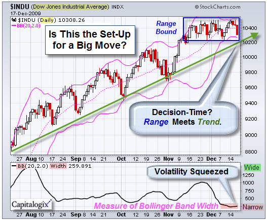
From a technical and market psychology perspective, we are seeing short spikes of intra-day selling that have not had much follow-through. However, it seems to me that fewer people are buying the dips and a bunch of negative divergences are in place. All that means is that it is time to watch major trend lines; they will tell you when something changes.
Is Something Fishy Churning Just Beneath the Surface of Our Markets?
Several articles claim that up to 40% of the volume in the New York Stock Exchange, recently, occurred in just four financial stocks: Bank of America, Citigroup, Fannie Mae, and Freddie Mac.
It could be normal, or at least something simple and innocent. Nonetheless, I am suspicious and a little skeptical that such a small group of low-priced stocks could account for such an unusual percent of the trading volume on the NYSE. Realistically, I doubt that it was retail investors jumping-in to drive the rally higher.
So was it churning, high-frequency flash trading, or a tacit government
sanctioned way to allow certain funds and brokers to profit while
making the markets appear healthier than they are? I don't know; but it has started people talking. And it is something that will stay on my radar.
The Changing Face of the Giants of Finance.
On a related topic, the NYTimes had a great interactive graphic showing how the Giants of Finance have changed. Since the stock market’s peak in October 2007, Wall Street’s landscape has been permanently altered. Lehman Brothers, gone. Bear Stearns, gone. Merrill Lynch, gone. Main Street’s landscape has also changed. Wachovia, National City, Washington Mutual and Countrywide, all gone. These financial giants all crumbled under the weight of the financial crisis.
Those that were left shrank down to a fraction of their former market capitalizations by early 2009, but since then, they all have grown. While most are nowhere near their former size, two — JPMorgan Chase and Wells Fargo — are slightly larger than they were at the market’s peak. Click the image to play.
Let me know what you think. Hope you have a great week.
Business Posts Moving the Markets that I Found Interesting This Week:
Lighter Ideas and Fun Links that I Found Interesting This Week

Here is a brief video that reminds me that the difference between men and boys is often just the price of their toys.
It's fun to watch these kids and the temptation of one marshmallow in the hand vs two marshmallows in the bush. To eat, or not to eat? … That is the question.
Oh, The Temptation from Steve V on Vimeo.