Initial Public Offerings are an indicator of market health. Well, here is some good news. More venture-backed companies have hadIPOsthis
year than there were in the last two years combined.
The bad news is that the market has not been kind to these newly
public companies. Scott Austin at the WSJnotesthat only six of this year's
venture backed IPOs are above their first day of trading.
For example, a recent IPO with a lot of "buzz" was Tesla. The enthusiasm generated for Tesla's stock during its first day on the market has waned. After reaching almost $30, Tesla faded fast. It's back down to $17.40. Here is the chart.
Nonetheless, I'm starting to see more articles about M&A activity too. I take the increase in IPO and M&A activity as a positive economic sign. What about you?
We started using 37signals' web-based applications: Basecamp (for project management), Campfire (for work-group chat), and Backpack (for knowledge management). These are simple, focused tools designed to help you collaborate, get organized, and to get things done.
The software is terrific, and so is the philosophy behind it. 37signals got so much positive feedback from their blog … they parlayed it into a best-selling book.
Why Is the Book Relevant?
Rework is about the business, design, programming, and marketing philosophies of a developer that makes web-based software used by millions of people.
What's In It For Me?
It is easy to find value, fresh perspectives, and inspiration in this practical book. At less than 300 pages, it's a quick read too. Each chapter is only a page or two, so it's a great airplane or nightstand book.
Also, they proudly present ideas in bold strokes; clearly favoring provocative over wishy-washy. For example, 37signals proclaims it builds software products with the least number of features necessary. In other words, their products intentionally do less than their competition.
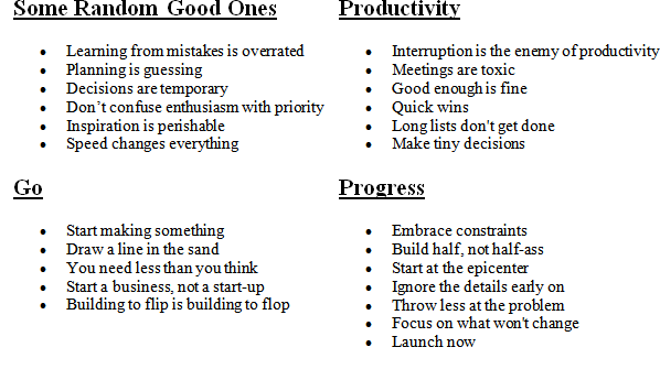
Here is a Partial List of the Essays in the Book.
This list will give you a sense of the book and its tone. Click the image for a more complete list.
I don't agree with some of what they preach. Yet, it is easy to get lots of value quickly from the book. Another way I know it is good, is that it is making its way around the office; and I often hear people referencing it and referring to it. All-in-all, it is worth reading.
We started using 37signals' web-based applications: Basecamp (for project management), Campfire (for work-group chat), and Backpack (for knowledge management). These are simple, focused tools designed to help you collaborate, get organized, and to get things done.
The software is terrific, and so is the philosophy behind it. 37signals got so much positive feedback from their blog … they parlayed it into a best-selling book.
Why Is the Book Relevant?
Rework is about the business, design, programming, and marketing philosophies of a developer that makes web-based software used by millions of people.
What's In It For Me?
It is easy to find value, fresh perspectives, and inspiration in this practical book. At less than 300 pages, it's a quick read too. Each chapter is only a page or two, so it's a great airplane or nightstand book.
Also, they proudly present ideas in bold strokes; clearly favoring provocative over wishy-washy. For example, 37signals proclaims it builds software products with the least number of features necessary. In other words, their products intentionally do less than their competition.
Here is a Partial List of the Essays in the Book.
This list will give you a sense of the book and its tone. Click the image for a more complete list.
I don't agree with some of what they preach. Yet, it is easy to get lots of value quickly from the book. Another way I know it is good, is that it is making its way around the office; and I often hear people referencing it and referring to it. All-in-all, it is worth reading.
It seems like there is a mighty long fuse on the real economic recovery. We might be in for a longer wait than the recent rally led some to believe.
A record drop in pending home sales and a slowdown in the construction
market contributed to a sluggish outlook for the economy last week, and highlighting the significance of government stimulus measures and job
growth.
Market Commentary
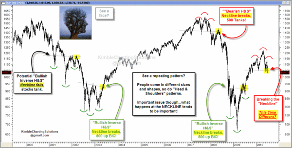
The Nasdaq Composite Index is showing a well-formed Head and Shoulders topping pattern. Price has broken beneath the neckline, which means it has triggered. Unless it can move back above that level, the pattern's target is the distance from the top of the head (2500) to the neckline (2100), which is 400 points lower.
Supporting the bearish case, new 52-week lows are expanding on the Nasdaq while new 52-week highs are drying up. Net New Highs (new 52-week highs less new 52-week lows) is an easy way to assess the battle for new 52-week extremes. An uptrend is unlikely as long as Net New Highs remain
negative.
Technical Analysis is often easy to see after the fact. Here is a look at several Head and Shoulder top and bottom patterns. Click the image to see a bigger version.
Here's Something That Will Show-Up On Lots of Radar Screens.
On some level, Technical Analysis is a self-fulfilling prophecy because "everyone" is looking at the same thing. While lots of people are worried about the Head and Shoulders pattern, I suspect that far more are watching the "Death Cross" or "Dark Cross" that is being formed on our indices as the 50-day moving average falls below the 200-day moving average.
While I see the bearish implications, some trader's will be looking for the head-and-shoulders and death-cross patterns to fail because of a short squeeze. Failed patterns often result in bigger moves than the patterns that didn't work. Here is an explanation about why that happens.
The OOPs Trade:
When a well-known pattern fails, the response is often dynamic. This often happens with obvious, high profile situations like a "Head-and-Shoulders"
pattern, a move through big Round
Numbers (like Dow 10,000), crossing
the 200-Day Moving Average, or violating a clear Price Channel. Just for the record, several of those are in-play at this price level.
An often violent reversal happens when the crowd realizes that it was wrong, and people rush to cover their painful losing positions. As the price of the stock increases, more short sellers feel driven to
cover their positions. This is very similar to a short squeeze;
and the move is often violent and prolonged.
The markets are
oversold here; lots of people know that we just made new lows, and we
have been bombarded with bad news recently. So, I'm not predicting that
the market will reverse here. I am just suggesting that it is
possible and something to watch.
It seems like there is a mighty long fuse on the real economic recovery. We might be in for a longer wait than the recent rally led some to believe.
A record drop in pending home sales and a slowdown in the construction
market contributed to a sluggish outlook for the economy last week, and highlighting the significance of government stimulus measures and job
growth.
Market Commentary
The Nasdaq Composite Index is showing a well-formed Head and Shoulders topping pattern. Price has broken beneath the neckline, which means it has triggered. Unless it can move back above that level, the pattern's target is the distance from the top of the head (2500) to the neckline (2100), which is 400 points lower.
Supporting the bearish case, new 52-week lows are expanding on the Nasdaq while new 52-week highs are drying up. Net New Highs (new 52-week highs less new 52-week lows) is an easy way to assess the battle for new 52-week extremes. An uptrend is unlikely as long as Net New Highs remain
negative.
Technical Analysis is often easy to see after the fact. Here is a look at several Head and Shoulder top and bottom patterns. Click the image to see a bigger version.
Here's Something That Will Show-Up On Lots of Radar Screens.
On some level, Technical Analysis is a self-fulfilling prophecy because "everyone" is looking at the same thing. While lots of people are worried about the Head and Shoulders pattern, I suspect that far more are watching the "Death Cross" or "Dark Cross" that is being formed on our indices as the 50-day moving average falls below the 200-day moving average.
While I see the bearish implications, some trader's will be looking for the head-and-shoulders and death-cross patterns to fail because of a short squeeze. Failed patterns often result in bigger moves than the patterns that didn't work. Here is an explanation about why that happens.
The OOPs Trade:
When a well-known pattern fails, the response is often dynamic. This often happens with obvious, high profile situations like a "Head-and-Shoulders"
pattern, a move through big Round
Numbers (like Dow 10,000), crossing
the 200-Day Moving Average, or violating a clear Price Channel. Just for the record, several of those are in-play at this price level.
An often violent reversal happens when the crowd realizes that it was wrong, and people rush to cover their painful losing positions. As the price of the stock increases, more short sellers feel driven to
cover their positions. This is very similar to a short squeeze;
and the move is often violent and prolonged.
The markets are
oversold here; lots of people know that we just made new lows, and we
have been bombarded with bad news recently. So, I'm not predicting that
the market will reverse here. I am just suggesting that it is
possible and something to watch.
Today is July 4th. However, few flags were waving as I drove around our
neighborhood.
A few years
ago, at least two-thirds of the houses had flags. Today I would estimate that number being 15% to 20% .
Around here, there is a relatively cheap service that provides flags for
patriotic holidays (like Independence Day, Memorial Day, etc.). They provide the flags, set-them-up, take them down, etc. It requires no effort – other than to write a check.
So,
did the economy make the outlay feel too extravagant? Or did the
collective level of patriotism drop significantly, recently?
My guess … a
little of both; but it probably has more to do with the economy. What
do you think?
I've been reading a pretty good new book that is an interesting mix of stories, life-lessons, and business content. It combines a behind the scenes peek into the situations, emails, checklists, sample interview questions, and "Happiness Framework" that led to some surprising results.
For example, here are Zappos' Core Values from which they develop their culture, brand, and business strategies:
In 1999, Tony Hsieh (pronounced Shay) sold LinkExchange, the company he co-founded, to Microsoft for $265 million. He then joined Zappos as an adviser and investor, and eventually became CEO.
In 2009, Zappos was listed as one of Fortune magazine's top 25 companies to work for, and was acquired by Amazon later that year in a deal valued at over $1.2 billion on the day of closing.
So, you might guess that he learned a few things about what worked, and what didn't.
In his first book, Tony shares the different business lessons he learned in life, from a lemonade stand and pizza business through LinkExchange, Zappos, and more. Ultimately, he shows how using happiness as a framework can produce profits, passion, and purpose both in business and in life.


