BP said Saturday that its latest attempt to stop the gushing oil well in the Gulf of Mexico was unsuccessful, and the effort, known as a “top kill,” was being scrapped in favor of yet another maneuver to stem the flow spreading into the waters.
BP said Saturday that its latest attempt to stop the gushing oil well in the Gulf of Mexico was unsuccessful, and the effort, known as a “top kill,” was being scrapped in favor of yet another maneuver to stem the flow spreading into the waters.
All-in-all, May was quite a month! We saw a "flash crash", followed by a 400-point
relief rally, followed by a slow motion free-fall, followed by a nearly
300-point rally. The cherry-on-the-top was last Friday's triple-digit
drop going into the long weekend.
Putting the Dow's Drops and Rebounds in Perspective.
The market's recent "flash-crash" ranks as the largest point-wise drop in history. But how does it stand up percentage-wise; and how many drops greater than 5% have we seen? Minyanville posted a visualization of the data (going back to 1928) that answers those questions. Click to the graphic for an interactive version.
One other point worth noting, historically, big gaps and daily rallies occurred most often in the context of bear markets. They are not usually a sign of impending calm waters or smooth sailing.
Nonetheless, we've seen a decent pull-back and there are signs that the short-term might offer some upside bias.
Recently, Bearish Spikes Have Provoked Bullish Responses.
Bespoke reports that this week's sentiment surveys from Investors Intelligenceand
the American Association of Individual Investorsshowed
sharp increases in bearish sentiment among both advisors and individual
investors. The chart below compares the S&P 500 with bearish sentiment since the
start of 2009. The current level of combined bearish sentiment is the
highest since the start of November. As shown in the chart, since the
market bottomed back in 2009, spikes in bearish sentiment have actually
turned out to be pretty good buying opportunities.
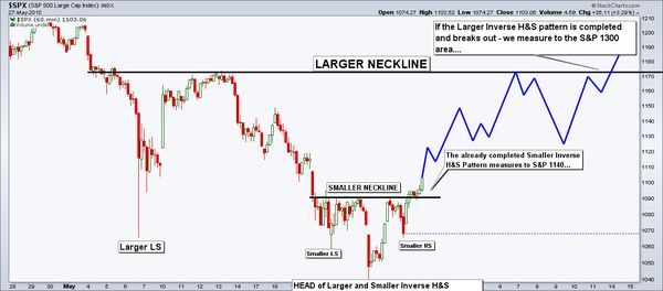
So, let's look at the market. Short-term, here is David Singer's
bullish case for the S&P. It is drawn on a 60-minute chart, and shows a series of head and shoulder bottom patterns. The implication is for a rally that measures the same distance as from the neckline to the head.
All-in-all, May was quite a month! We saw a "flash crash", followed by a 400-point
relief rally, followed by a slow motion free-fall, followed by a nearly
300-point rally. The cherry-on-the-top was last Friday's triple-digit
drop going into the long weekend.
Putting the Dow's Drops and Rebounds in Perspective.
The market's recent "flash-crash" ranks as the largest point-wise drop in history. But how does it stand up percentage-wise; and how many drops greater than 5% have we seen? Minyanville posted a visualization of the data (going back to 1928) that answers those questions. Click to the graphic for an interactive version.
One other point worth noting, historically, big gaps and daily rallies occurred most often in the context of bear markets. They are not usually a sign of impending calm waters or smooth sailing.
Nonetheless, we've seen a decent pull-back and there are signs that the short-term might offer some upside bias.
Recently, Bearish Spikes Have Provoked Bullish Responses.
Bespoke reports that this week's sentiment surveys from Investors Intelligenceand
the American Association of Individual Investorsshowed
sharp increases in bearish sentiment among both advisors and individual
investors. The chart below compares the S&P 500 with bearish sentiment since the
start of 2009. The current level of combined bearish sentiment is the
highest since the start of November. As shown in the chart, since the
market bottomed back in 2009, spikes in bearish sentiment have actually
turned out to be pretty good buying opportunities.
So, let's look at the market. Short-term, here is David Singer's
bullish case for the S&P. It is drawn on a 60-minute chart, and shows a series of head and shoulder bottom patterns. The implication is for a rally that measures the same distance as from the neckline to the head.
Wolfram Alpha is not a traditional search engine — rather, it is a "computational knowledge engine". That means it generates output from its own internal knowledge base, instead of searching the web and returning links. Nonetheless, it produces some amazing answers to things you want to calculate or know about.
Watch this video to get a sense of some of the things it can do, and how it can help you.
The breadth of topics it covers is pretty amazing.
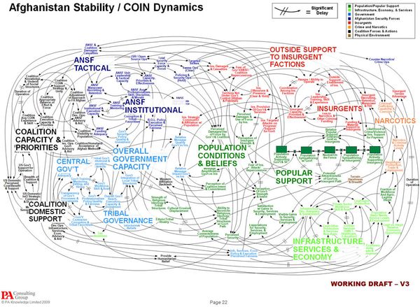
Can a graphic that looks like a bowl of spaghetti help people understand a complex problem?
By now, you may have seen the “Afghanistan Stability” chart. It is raising questions about the amount of time and effort spent on slides like these … and their point of diminishing returns.
Isn't Lack of Thinking a Bigger Problem?
So, is using PowerPoint (or some other tool) really dangerous? Some claim it is because it can create the illusion of understanding and
the illusion of control. Here are some interesting commentaries about that from the NYTimes and the comments from FlowingData.
Do You Focus on the Process or the Result?
Working on a PowerPoint presentation, mind map, data visualization, or even a business plan … all have something in common. In many respects, the process is more important than the product.
When a chart (like the one below) is shown out-of-context, I wonder about its construction process. For example:
Was it the work of one person, a group, or collection of sub-groups each working on a different part and then coming together to see how what they did fits with the rest?
Was it based solely on one perspective, or did they come up with a reciprocal map that represents the other point of view … in order to come up with our plans?
Was this map designed to stand alone, or was it background data for a different discussion (I noticed that the slide was numbered 22, and we don't know what came before (or after) it, or how many slides there were in that deck)?
OK, let's have some fun with the map.
The Afghanistan Stability Chart.
According to NBC News' Chief Foreign Correspondent, the goal in Afghanistan is to "convince militants to stop
fighting and to persuade Afghans sitting on the fence—those unsure
whether to back the Taliban or President Hamid Karzai’s government—to
throw their support behind the U.S.-backed government and its security
forces."
Fair enough … But if you want to know how we plan to
accomplish that feat, take a look at the large version of the military's
amazingly complicated schematic (from the Office of the Joint Chiefs of
Staff) which outlines the entire strategy. The chart, at least, is a
bit of a quagmire.
“When we understand that slide, we’ll have won the war,” a General joked.
Likewise, John Stewart has a few funny things to say on the subject.


![Reblog this post [with Zemanta]](http://img.zemanta.com/reblog_c.png?x-id=ec27b3c3-941a-4be0-a097-93d3870005d2)


![Reblog this post [with Zemanta]](http://img.zemanta.com/reblog_c.png?x-id=cc58c2bc-ee7f-427f-9a1d-5579a0ae3dad)


![Reblog this post [with Zemanta]](http://img.zemanta.com/reblog_c.png?x-id=b4995a17-3d40-4a37-8ae1-2214aa24754e)

![Reblog this post [with Zemanta]](http://img.zemanta.com/reblog_c.png?x-id=50641d90-0255-488c-bc00-af4899f850cb)
![Reblog this post [with Zemanta]](http://img.zemanta.com/reblog_c.png?x-id=463e7f2d-e7bc-4ae7-a488-baf2a8d1f329)