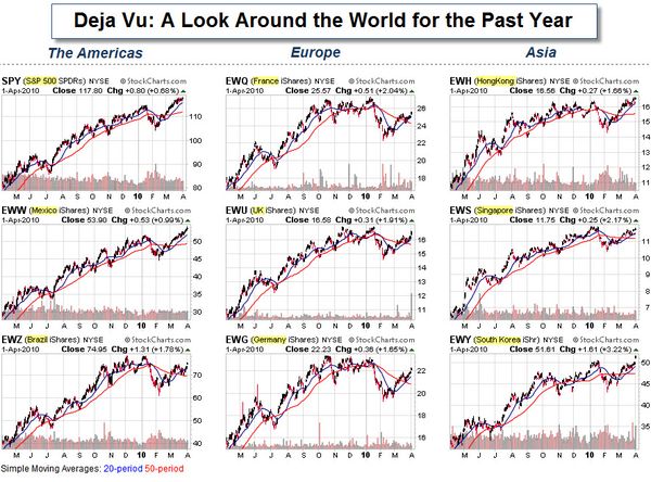
Trading

  • Capitalogix Commentary for the Week of 03/08/10

    Spider-Man Gets Fired You know Unemployment is becoming part of the cultural zeitgeist when Spider-Man gets fired

    Last week's employment report showed a fair number of other people got fired too.

    Apparently, though, not many people cared, because the markets rallied anyway.

    If you are interested, Barry Ritholtz put together a big picture look at employment charts

    Signs of Strength.

    The markets put on a show of strength this week, blasting through overhead resistance. The chart below shows the S&P 500 Index is approaching its recent highs, and now has two nice levels of support beneath it (marked by the light and dark green lines).

    As long as price is above these levels, it seems prudent to use
    bull-market techniques. That means to expect buying on dips.

    100308 Key Levels on the SP500

    On the other hand, trading often induces paranoia. So, there is some part of me looking for the next areas that would trigger the most stop-losses. Coincidentally, this weekend I talked to a money manager who told me they were going to exit their short positions if the markets get above the recent highs (marked by the orange line). That seems like a pretty widely followed level.  So, a spike above that … followed by a sharp reversal, might find some of the selling volume we've been missing lately.

    Could We Possibly Still Be in a Bear Market?

    A fresh view is often helpful. The next chart is not designed to be predictive. Instead, it simply provides an alternative context to view the recent price action in relation to historic market cycles.

    Below is an inflation-adjusted overlay of three secular bear markets put together by Doug Short. It aligns the current S&P 500 from the top of the Tech Bubble in March 2000, the Dow in of 1929, and the Nikkei 225 from its 1989 bubble high.

    100308 Inflation Adjusted Bear Market Comparisons

    The nominal all-time high in the index occurred in October 2007, but when adjusted for inflation, the "real" all-time high for the S&P 500 occurred in March 2000.

    There is a Lot of Deal-Making Going On.

    Increased merger and acquisition activity and the freeing-up of corporate assets (usually measured by increased corporate spending) are both typically bullish signs.  Why?  Both indicate that decision-makers are optimistic (or at least projecting optimism). There's been quite a bit of evidence showing that this is happening on a global corporate scale and all the way down to the local level.

    One thing holding-back the optimism is the lack of lending.  Here is a look at that.

    Chart-of-the-day-commercial-and-industrial-loans-at-all-commercial-banks

    Nonetheless, companies with cash are starting to use it.

    Here's a story that is a bit humorous, though still shows those green shoots of growth.

    In Kansas, the city of Topeka changed its name to Google. Supposedly part of a local effort to convince Google to make Topeka a test site for an ultra-fast Internet connection and set Topeka apart from other cities vying for Google's attention.

     Google Kansas Sounds Like Home

    Hope you have a good week, even if you used to live in Topeka.

    Business Posts Moving the
    Markets
    that I Found Interesting This Week
    :

    Lighter Ideas and
    Fun Links

    that I Found Interesting This Week

    Reblog this post [with Zemanta]
  • Capitalogix Commentary for the Week of 03/01/10

    The markets held-up well again this week despite lots of bad news on many fronts.  While there were several bouts of selling, each time buyers were there to prop things back up.

    Here were some of the news items the market handled last week. 

    And then there is the economy and the deficit …

    100228 Political Cartoon US Deficit Ice Dancing

    So, let's use some technical analysis to see where the markets stand.

    Three Views of the Market – and All Say the Same Thing.

    Sometimes simple is better.  What follows is a top-down look at the Dow Jones Industrial Average.  It starts with a monthly chart for the bigger picture.  That is followed by a weekly chart, and then by a daily chart.  In all three the key level is just above where we are.

    080228 Dow Monthly at Resistance

    Here is the weekly chart.  It shows price re-testing the upwards sloping trend-line from below.

    080228 Dow Weekly Re-Testing Trend-Line

    Here is the daily chart.  A sustained move above the orange line would be bullish.

    080228 Dow Daily Decision Zone

    Here is something else to watch.

    Does the Euro Help Predict US Equity Market Moves?

    This video suggests that the Euro is worth watching as an early indicator of likely movement in the U.S. Equity Indices (like the S&P 500 Index).

    080228 Video Using the Euro to Predict the SP500

    That is something I will keep an eye on to see how it works.  In the mean-time, here is a recent chart of the S&P 500 and the Euro.  It is showing a negative divergence because the Euro is continuing to show weakness while the S&P 500 rallied in February.

    080228 Using the Euro to Predict the SP500

    Time will tell.  Hope you have a good week.

    Business Posts Moving the Markets that I Found Interesting This Week:

    • Bernanke Reaffirms "Extended Period" of Low Rates. (NYTimes)
    • Recovery Focus: Which Banks Are Worth Betting-On? (WSJ)
    • U.S. New-Home Sales Drop 11.2% – to 1963 Levels. (WSJ)
    • Intel, VCs Investing $3.5 Billion In U.S. Technologies. (InfoWeek)
    • Economic Annual Report of the President – An Interesting Read. (White House)
    • More Posts Moving the Markets.

    Lighter Ideas and Fun Links that I Found Interesting This Week

    Reblog this post [with Zemanta]
  • The Illusion of Focus and Meaning

    Recently, the concept of "Focus" keeps coming to mind when I try to
    make sense of what's happening in the markets.

    As I review
    stories, news, and data, I'm trying to be more aware of where the bias
    is (even if it is unintentional).

    Focus,
    Bias and Perspective.

    The photo series, below, is an
    example of how our perception can be easily shaped.  The far left
    version looks violent.  The far right version looks compassionate.  It
    could be both (or neither).

    Example of How Focus Changes Meaning

    Each
    of us perceives the world through our own filters.  It is as if we're
    producing a film (which could be edited into a comedy, drama, or
    thriller … based on what we focus on, highlight, or ignore). Except
    that we often don't know it's just a film, edited by an amateur …
    Instead, we
    perceive it as truth because it is what we perceive.

    The point is
    that perspective matters.

  • Capitalogix Commentary 02/21/10

    It seems like everywhere I look, there is bad news about the economy. Recently, however, venture capital and M&A activities have been picking-up.  Both of those are early indicators of economic optimism. In addition, here are two other signs that economic winter may soon give way to spring.

    100221 vinceFirst, a Bankruptcy Partner in a major Dallas law firm just told me that he sees fewer filings in the pipeline. In addition, he says that credit has started opening-up to corporations, which is giving them the lifeline they need to start making progress again.

     Second, speaker bookings for corporate meetings seem to be picking-up again. I suspect that this is an indicator that corporations are willing to spend money on motivation, teamwork, and culture. In Maslow's hierarchy of needs, that's certainly a tier above food and shelter. In other words, when money frees-up for these types of activities, it suggests that corporations are starting to feel more comfortable about the short-term … and more optimistic about the longer-term.

    From a technical analysis perspective, optimism shows itself in the charts.

    Where Are We?

    In last week's commentary, I indicated that a
    holiday-shortened options expiration week was a likely time to expect a
    bounce. Well, even though the Fed announced a surprise discount rate hike to banks,
    the markets did rally.  While impressive on some levels, it happened on
    low trading volume and takes us to a resistance level.

    It is
    decision-time for the S&P 500 Index. The weekly chart, below, shows
    the downward sloping trend-line from the 2007 highs, as well as the
    rally off the 2009 lows. More recently, we've seen a nice rally off the
    high volume reversal bar from several weeks ago (marked by the yellow
    highlight in the green circle).  Nonetheless, the bigger issue is whether price will be
    able to rally and hold above the down-trend line
    (marked by the
    red arrow)?

    100221 SP500 Decision Time

    If the markets do sell-off soon, then many eyes will shift to the 200-day moving average (similar to the 40-week average marked in blue) as a likely support level.

    It Is a Matter of Perspective … But the Real Story is the Lack of Selling.

    I read an article that claims to outline the three basic causes of the market rally since March of 2009.

    1. The first is that the Fed has recently chosen to pump liquidity into the financial systems during options expiration week.
    2. The second is that markets closed higher on approximately 75% of Monday's since the recent market low (with 80% of the gains, since those lows, happening on Mondays).
    3. The third is that virtually all of the Q4 2009 market gains occurred in the overnight futures session, when US markets are closed. 

    The chart, below shows the gains and losses that occurred during the normal trading session versus during after-hours sessions.

    100221 Gains Came During After-Hours Session

    My first reaction was that this probably was the result of government
    action or manipulation by some unseen hand. Pushing the market higher
    during light futures trading periods (like weekends or after-hours)
    resulted in bigger gap-up openings.

    After a little thought, however,
    these actions make sense. Even if these after-hour pushes were the
    result of the government, it was easier, took less capital (and thus
    cost less to do it) after-hours than it would have during periods of
    thicker trading. So, it was smart to do it that way.

    More importantly,
    this is a free market; so if the market "disagrees" with the push
    higher, then sellers can freely take their profits or positions. The
    bigger issue is that even though the markets have been pushed higher, we
    still haven't gotten to the point that triggers selling volume.

    Business Posts Moving the Markets that I Found Interesting This Week:

    Lighter Ideas and Fun Links that I Found Interesting This Week

  • Capitalogix Commentary 02/14/10

    The markets did rally, a little, last week.  However, they are still beneath the overhead resistance and the longer-term downwards sloping trend-line

    The Dow Jones Industrial Average has been able to hold above the 10,000 level. Is that important?

    Does
    Dow 10,000 Really Mean Something?

    The WSJ published an
    article called "Milestone Figures Grab Attention, but Their Impact Is
    Hazy
    ".  A similar message comes from Barry Ritholtz; that Dow 10,000 has become “a
    meaningless number, without any impact technically or quantitatively.
    It's no surprise that the Dow did not hold over 10k for very long. It's
    been over 26 times, starting in 1999. And hear it is, 10 years later —
    zero progress. Why anyone — other than TV producers and silly hat
    manufacturers — cares about Dow 10k is quite simply beyond my
    comprehension.”  If you are curious, here is the chart that shows what that looks like.

    100213 WSJ Chart of Dow 10K Crosses

    If big round numbers don't mean anything, is there something to potentially point the way?

    Is Lumber Sending a Bullish Signal About the Broader Market?

    If you are looking for a potentially bullish early indicator, then Lumber may be sending you a signal.  It has continued higher, even during the recent equity market decline (marked by the orange rectangle).  Why do traders consider lumber an early indicator for the broader market?  Since lumber is a primary raw material in the early stages of new construction, the logic is that lumber purchases signal new construction.

    100214 Lumber Showing Strength

    What Can Copper Tell Us?

    Like Lumber, traders also look to Copper as another early indicator of new construction because it commonly used in things like wires and pipes.  Recently, several commentators have mentioned that the Copper/Gold Ratio is an interesting composite measure of economic activity.  The chart below shows weakness and a negative divergence of the Copper/Gold Ratio (in comparison to the S&P 500 Index) since last summer.  Most recently, price has been falling steeply.  We will see if that is an early indicator of broader market weakness?

    100214 Does the Copper - Gold Ratio Predict Market

    A similar flattening of trading range occurred in the Financial Sector as well.

    What Does the Financial Sector Tell Us?

    Financials often lead rallies higher.  The logic is that banks make more money when they are lending, doing deals, and helping companies go public.  The past six months have shown the hesitation investors have to buy into further gains in this sector.  However, price is now at the bottom of its six month trading range.  In bull markets, this is where the buying comes in.  So, let's see how this sector responds.  A move down from here would hurt the bullish case.

    100214 Financials at Bottom of Trading Range

    This is a holiday-shortened options expiration week.  Recently, those have been rally triggers.  Best wishes for a great week.

    Business Posts Moving the Markets that I Found Interesting This Week:

    Lighter Ideas and Fun Links that I Found Interesting This Week

    • Easy = True: How ‘Cognitive Fluency’ Shapes Our Beliefs &
      Investments. (Boston)
    • New and Easier CPR Technique from Mayo Clinic. (YouTube)
    • Google's Experiment: Leapfrogging ISPs to Deliver Ultra-High-Speed
      Web
      Access. (ZDNet)
    • Angry at Obama Regulation Proposals, Wall Street is Donating Less to

      Democrats. (Newser)

    • Clever Questions You Should Ask Every Job Candidate. (BizMore)
    • More Posts with Lighter Ideas and Fun Links.