Trading Tools

  • What To Do If the S&P 500 Index Starts to Out-Perform Asian Markets

    There is a slight, but potentially growing, disconnect between the S&P 500 Index and the Asian stock markets (specifically the Hang Seng).

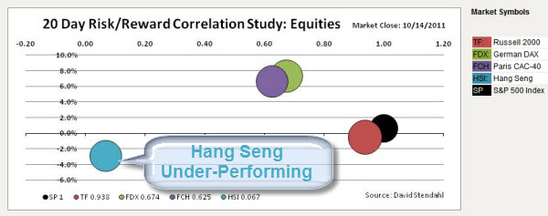
    On Friday the Hang Seng lost 1%. Moreover, looking at the recent price performance action … on a 20 day basis, the Hang Seng acting very different than other world markets.


    111016 Hang Seng UnderPerforming

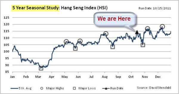
    Signal Financial Group just updated their seasonal chart series for the Hang Seng Index.  It indicates that we could be at a turning point, with little upside expected based on historical patterns.


    111016 Hang Seng Seasonal Chart 

    A Little Risk/Reward Exercise in Portfolio Diversification.

    If the S&P continues to the upside … the Hang Seng may not follow.  Thus, over the next few weeks, some traders may look at a potential Long S&P and Short Hang Seng play.

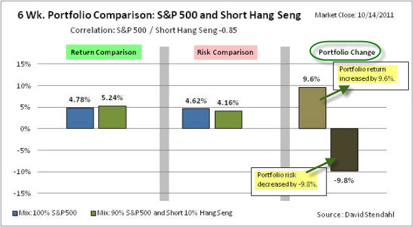
    Just as an example, here is a quick look at a portfolio study covering 6 weeks, comparing the performance of a portfolio based solely on the S&P 500 Index versus a portfolio that is long the S&P (using 90% of capital) and short the Hang Seng (with 10% of capital).  


    Portfolio Allocation:

    Equity Portfolio:   100% Long S&P 500 Index
    Mixed Portfolio:   90% Long S&P 500 Index and 10% Short Hang Seng


    The chart below provides a basic analysis, identifying the differences between the two portfolios. The chart is divided into three sections: return comparison, risk comparison and portfolio change. The first section shows the percent return figures for the portfolios over a recent six week period. The second section focuses on risk, which is defined as standard deviation of return, over the same six week time period. The final section shows the net percentage change to the portfolio's performance based on the small 10% allocation to Hang Seng.


    111016 Hang Seng Short SP500 Long Portfolio

    The diversification helps the risk/reward ratio in the study.  That looks like something to watch for in the coming weeks.  Hope it helps.


    Enhanced by Zemanta
  • TED Talk: How Algorithms Shape Our World

    Booting up SkyNet.

    Kevin Slavin argues that we're living in a world designed for — and increasingly controlled by — algorithms.

    In this thought-provoking talk from TEDGlobal, he shows how these complex computer programs determine: stock prices, espionage tactics, movie scripts, and architecture. And he warns that we are writing code we can't understand, with implications we can't control.

    Here is a TedTalk by Kevin Slavin.


    Enhanced by Zemanta
  • Risk-Off or Risk-On – What’s a Trader To Do?

    Fear is not logical.

    Nonetheless, you can often use logic to predict human response to certain emotions and stimuli.

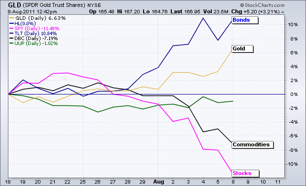
    For example, let's look at the clear shift in investor sentiment over the last few weeks.


    110814 The Risk-Off Trade
    Click here for a live version of this chart.

    In short, the money flows show a re-pricing of risk. Stocks and commodities, which are viewed as riskier assets, declined over the last two weeks. Bonds and gold, which are viewed as safe-havens, advanced as alternatives. The Dollar, which is somewhere in the middle is virtually unchanged.

    There Are Other Ways to Measure Fear.

    The sell-off of the past few weeks triggered a number of extreme measures. Whether you look at volatility, price action, breadth, or volume, recent readings were off-the-charts. The table below is from Quantifiable Edges. It highlights some of those extremes.

     110814 Big Readings from Sell-Off 

    However, every action brings a reaction … what can we expect next?

    What Does the Volatility Bring?


    We just saw four straight days with moves of 400 points or more in the Dow Jones Industrial Average … a first in its history. Is that just a meaningless market statistic?

    Perhaps, instead, it is another indicator that we're at a significant extreme?  If so, periods of great volatility are often followed by periods of relative calm.  The logic is that bulls and bears fight until one side gives up (for a while); and the market pushes forward in the direction of the winner.

    Looking For a Positive Sign?  Here's a Promising Trading Signal.

    Mark Hulbert says market indicator with perfect record just signaled 'buy'

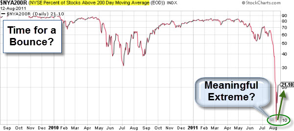
    Last week, we got to a point where less than ten percent of NYSE stocks traded above their 200-day average. When the number of stocks that manage to stay above this moving average — a common measure of momentum — make a nasty two standard deviation move to the downside from the norm, it usually means an oversold market and a good time to buy.


    110814 Time for a Bounce

    The last — and most extreme — oversold position was on March 2, 2009, about around the start of the bull market. Click here for more on this type of chart.

    You don't have to like the economy or the markets to trade them.


    Enhanced by Zemanta
  • Using Mind-Maps in Business – Part 2

    Mind mapping tools have been around for many years. However, I'm starting to see a much wider adoption of mind mapping throughout my company and with the wider business audience.

    Part 1 of this series, Using Mind Maps, examined mind mapping and why you might want to use its "radiant thinking" process.  Here, in Part 2, we will look at some specific business uses for mind maps.

    Below are four examples where mind mapping has proved useful to me recently.

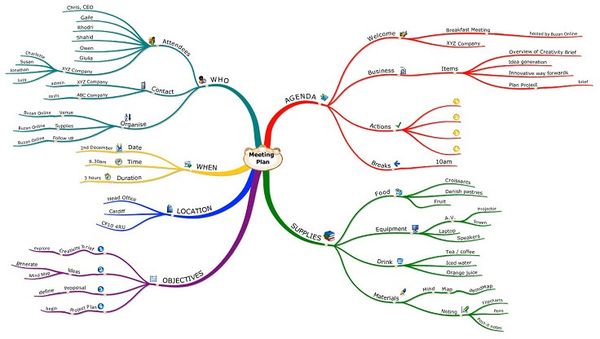
    Meeting Agendas: A mind map provides a great graphic overview of everything relating to the meeting, from attendee lists, meeting notes, web links, documents, to-do items, and parking lot issues.

    110606 Mind Maps - Meeting Agenda 
    Using the map during the meeting helps the team move above the details to keep the bigger picture in mind.

    Employee Reviews: A mind map is helpful during the complete review life cycle.

    • First, it's a great place to keep notes on how someone's doing and areas for improvement.
    • Second, it's a great template to prompt the reviewer to look at the whole picture in a  fair and balanced way.
    • Third, the map is easy to share and revise.

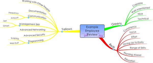
    In addition, while you may take the notes based on business categories like performance, potential, flexibility, and attitude  -  you might deliver the review based on a "Green", "Yellow", and "Red" metaphor that makes it easy for the employee to understand and act upon.  Here is an example of that type of map.

    110606 Mind Maps - Employee Review

    Business Planning and Project Management:  This was one of the first areas where mind maps proved useful. It's a great tool to see the forest and the trees. 

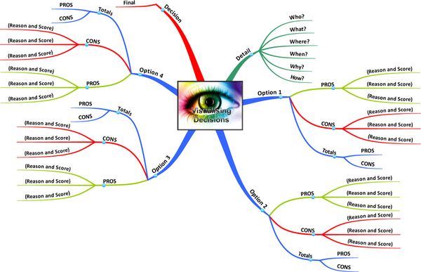
    Here is a simple decision-making template.

    110606 Mind Maps - Visualizing Decisions

    You will find that a mind map is a great tool to use interactively during meetings. It gives the team a common focus, yet allows the facilitator to adjust that focus efficiently and effectively.

    In addition, Project View makes it easy to see the plan as a GANTT timeline or task table.  This is a terrific added capability.

    Communication and Presentation Tool: Mind maps allow great flexibility an structure during presentations. This facilitates a logical and organized presentation, as well as ad hoc interactive discussions.

    More experienced mind mappers tend to use fewer words, opting to use images and the heuristic structure itself as a catalyst and reminder for deeper meaning.

    An added bonus of using mind mapping software to present your ideas is that the map can be updated and re-ordered while you are using it.  The map becomes the common-focus for an interactive discussion.

    Cool special effects, like 3-D Views, turn your map into a 3 dimensional object, allowing you to glide around it from different angles, zoom in on different areas and transform presenting mind maps into a whole new experience.  Here is an example.


    Obviously, there are many other things you can do with mind maps.

    Here is a link to Buzan's Gallery of Mind Maps and here is a link to BiggerPlate's Mind Map Gallery.  In addition, here is a link to product tutorial videos.

    The current generation of mind mapping tool is considerably more powerful, yet easier-to-use, than its predecessors. It's time to try it for yourself.

    Enhanced by Zemanta
  • Using Mind-Mapping Tools – Part 1

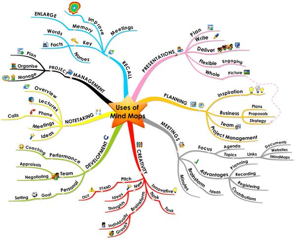
    Mind maps are going mainstream. They're showing up throughout the office, with a wide variety of users and uses.

    Initially, mind maps were simply a brainstorming, outlining, or note-taking tool. Now, they are showing up in thought processing, visual thinking, project management, process planning and presentations.

    110530 Uses of Mind Maps

    Tony Buzan is the father of modern mind mapping. Here is a video where he describes mind mapping and why you might want to use its "radiant thinking" process.


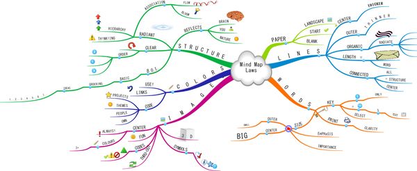
    Tony Buzan's company recently released iMindMap 5. It is software that helps you create mind maps.  Here is a map made with iMindMap that explains the basic best practices of mind-mapping.


    110530 Mind Map Laws

    iMindMap 5 is a great tool that keeps getting better. You can certainly use it for a lot more than taking notes.

    The product comes in various versions (starting with a no-cost basic version) and moving up to a full-featured Ultimate version, which includes rich project management and 3-D presentation tools.

    Here is a video showing the software.


    The current generation of mind mapping tool is considerably more powerful, yet easier-to-use, than its predecessors. You can download a copy of iMindMap to try for yourself.

     Next week, in part 2, I will show examples of maps made for specific business uses.

    Enhanced by Zemanta
  • Snake-Oil? The Scientific Evidence for Various Health Supplements

    Trying to lead a healthier lifestyle?  This data visualization can help you filter-out the marketing hype to help you find the vitamins, minerals and herbs that deliver tangible benefits … versus those that serve only as a "Guaranteed Genuine Placebo".

    This is an updated interactive model of the most current research data.

    It is interesting because of the health research itself … and also because models, like this, have far-reaching applications.  It comes from the site Information is Beautiful.

    Click on the picture to play with the interactive version.


    110512 Snake Oil

    Kind of cool. 

    Enhanced by Zemanta
  • Hans Rosling – The Health and Wealth of Nations

    The Joy of Stats is spreading.

    You can watch a history of the modern world, in less than five minutes.

    I'm surprised by how many people have sent links to this YouTube preview of The Joy of Stats


    Somehow, with nothing more than animated bubble charts, Hans Rosling has become quite famous.

    This four-minute clip shows Rosling presenting world development in the context of income versus lifespan. Rosling uses Gapminder, the software he and others had developed, to show multiply varying statistics as animations.

    The material is more or less the same as his TedTalks; but this time around, the motion chart isn't projected on a screen. The data is CGI'd into the air where Rosling can pluck and grasp at points as he highlights the significance of specific points in history.

    Until you’ve seen Hans Rosling in action you can have no idea just how moving a bunch of blue bubbles moving down a screen can be.

    The BBC writes that:

    Despite its light and witty touch, the film nonetheless has a serious message – without statistics we are cast adrift on an ocean of confusion, but armed with stats we can take control of our lives, hold our rulers to account and see the world as it really is. What’s more, Hans concludes, we can now collect and analyse such huge quantities of data and at such speeds that scientific method itself seems to be changing.

    "I kid you not, statistics is now the sexiest subject on the planet" says Hans Rosling, presenter of The Joy of Stats.


    Enhanced by Zemanta