Trading Tools

  • Trading After Groundhog Day

    On Groundhog Day, Bespoke put out these charts and comments (with minor edits).
     
    When Punxsutawney Phil Speaks, People Listen


    Forget about EF Hutton, or for that matter Warren Buffett.  If you really want to know where stock prices are going and can’t wait until the Super Bowl, look no further than the Oracle of Punxsutawney, Phil the groundhog!  Given his ‘perfect’ record at predicting the weather, we wanted to check up on the groundhog’s ability to predict the direction of the stock market.

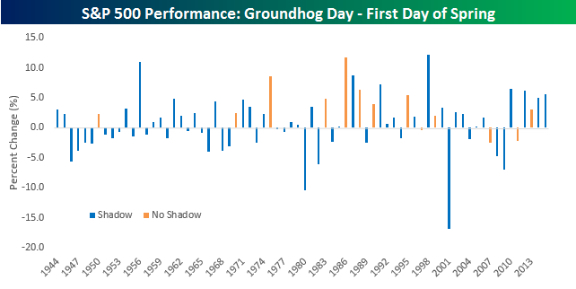
    Going back to 1944, when Groundhog Day resumed following a brief pause during World War II, Punxsutawney Phil has seen his shadow on the morning of February 2nd 59 times and seen no shadow just 13 times.  The table and chart below summarize the performance of the S&P 500 from Groundhog Day through the first day of Spring in each year based on whether or not Phil sees his shadow or not. (Disclaimer: If you are reading and still think this post is meant in any way to be taken seriously, it is not.)


    160213 Groundhog Day 1 

    160213 Groundhog Day 2


    On years when Phil sees his shadow, it not only means we are in for a longer winter but also sub-par stock returns.  In the 59 years where Phil has seen his shadow, indicating a long winter is in store, the S&P 500’s median return from that day up until the first day of spring has been a gain of 0.54% with gains 54% of the time.  Those returns don’t sound so bad, but they are actually below average.  That’s because in the thirteen years where Phil did not see his shadow the S&P 500 saw a median gain of 3.01% with positive returns more than three-quarters of the time.  

    As shown in the lower chart, there are only three years (1997, 2007, and 2011) since 1944 than Punxsutawney Phil did not see his shadow and the S&P 500 declined from Groundhog Day through the first day of spring.  Of those three years, the worst decline was 2.17%.  With the S&P 500 already down 1.6% today, the S&P 500 has some digging out to do if it is going to continue its trend of winning ways following those days when the groundhog doesn’t see his shadow.  It’s so easy a groundhog can do it!


    Right … so, you know that was poo poo de moo moo. Punxsutawney Phill doesn't predict markets.

    This year started with an 11 % drop.  While that is the steepest drop to start a year,  I'm pretty sure that doesn't mean much either.  With similar numbers, the market ultimately went down 32 % in 2008 — and up 33 % in 2009.

    Markets go up – and markets go down.  It's not what happens, it's what you do that matters.

  • What Knee Surgery Reminded Me About Technology

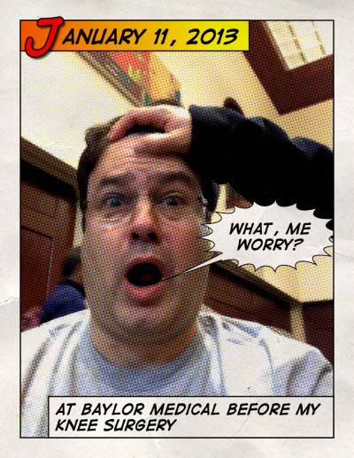
    This week, my son had knee surgery.  It made me remember my knee surgery from three years ago … And, it reminded me about what technology makes possible.

    Before my knee surgery, I wasn't enjoying the prospect of the needles, the knock-out drugs, the cutting, or the recovery process.  Frankly, I was scared.


    130113 What - Me Worry
     

    History is littered with tales of once-rare resources made plentiful by innovation. The reason is pretty straightforward … scarcity is often contextual.

    Imagine a giant orange tree packed with fruit. If you pluck all the oranges from the lower branches, you are effectively out of accessible fruit. From that limited perspective, oranges are now scarce. But once someone invents a piece of technology called a ladder, the problem is solved.

    Here is a picture from inside my knee (unlike years ago, they didn't have to rip me open to gain access for the picture or the repair). Less damage, less time, less drugs, less recovery.


    130113 Knee Surgery


    Bottom-Line: I walked over 2,500 steps the day after the surgery.  This time, my son and I had a burger on the way home from his surgery.

    Whether it is minimally invasive surgical instruments, or linking big data and elastic computing … Technology is a resource-liberating mechanism. It can make the 'once scarce' the 'now abundant' (or 'readily accessible') … and a lot less painful.

    Pretty Cool!

    Enhanced by Zemanta
  • Is a Leading Indicator of Economic Activity Drying-Up?

    People are afraid abandoned 'zombie ships' are an early sign of global economic collapse.


    160130 Abandoned Ships Image Credit: Sometimes Interesting


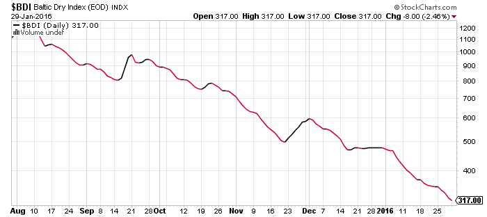
    If you are looking for insight into global supply and demand trends, the Baltic Dry Index is one of the purest leading indicators of economic activity. It offers a real-time glimpse at global raw material and infrastructure demand, as well as the supply of ships available to move this type of cargo.

    Unfortunately, it is sinking faster than a ship.


    160130 Baltic Dry Index Sinking

     via StockCharts.com

    The low is troubling because this Index is often interpreted as a reliable indicator of demand.

    The Index moved higher from 2003 to 2008. Since then, we have seen a series of lower highs and lower lows (in other words, it has been trending downwards since then).


  • Which U.S. Markets Did Best In 2015?

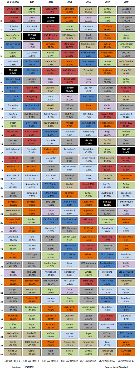
    There is always something working in the Markets.  It still surprises me how often it changes.

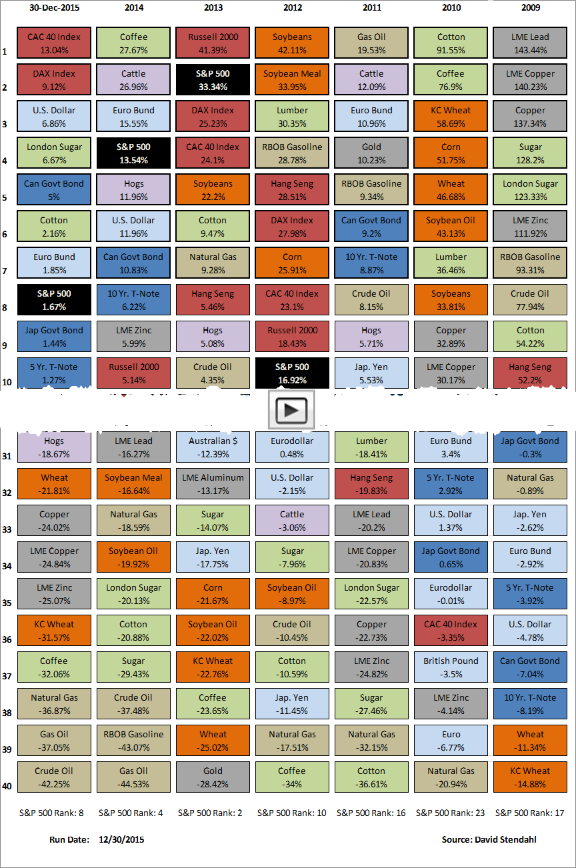
    A look at the recent winners and losers (based on year-end performance) shows the volatility and varied nature of this list.

    Who would have guessed the big winners this year would be the French and German markets, along with the U.S. Dollar. 

    The chart below shows the top-and-bottom performing markets for the year.  The data is color coded based on sector. The first column shows 2015 performance, followed by six columns of the most recent prior yearly market performances.

    Click the image to jump to the full chart.


    160109 2015 Best and Worst US Performers

    Table Key:


    Note: The S&P 500 Index is shown in black to highlight its performance vs other markets that offer an equity portfolio full diversification.


    Click this link to view weekly, monthly, quarterly, and yearly views of this data.


    So, how did the U.S market compare to other markets around the world? Here is an interactive chart showing how the S&P 500 out-performed this past year.

    160101 Relative Yearly Market Performance

  • Your Portfolio Guide to Rising Interest Rates. [Infographic]

    Here is an infographic on market environments during rising interest rates.


    151220 Infographic_Your_Portfolio_Guide_to_Rising_Interest_Rates_Final_Bigger

    via RCM's Alternative Blog  - “Your Portfolio Guide to Rising Interest Rates.