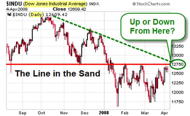
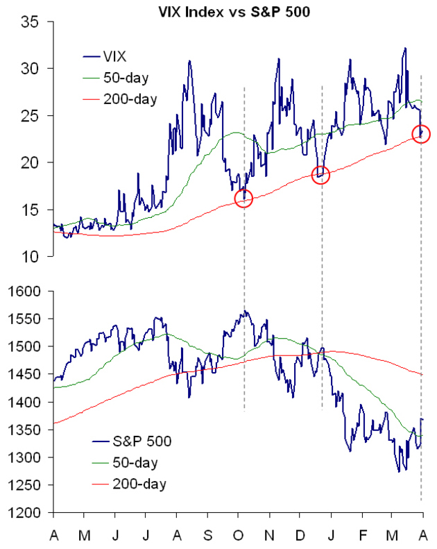
Worden Blocks is a fun and useful tool. It is very easy to build and customize charts, indicators, and scans. Here is an example of something built with Blocks. It is a composite index of the five major US equity indices (Dow, S&P, Naz, Russell 2K, and MidCap). On the version I use, I also have a tool that shows the percent change from any date to any other date. I marked two of them on the chart below.
Market Commentary
-
Custom Index Built with Worden Blocks
-
Market Commentary from February 29th
Who asked for the extra day in February anyway? Certainly not me. The week started great. Then investor confidence took another blow Friday as the S&P 500 declined by 2.7%; its worst day in a long time.
If you were watching, I don’t have to tell you how bad it was late last week. Bottom Line: oversold market conditions and a fair amount of manipulation from the sidelines has not been sufficient to move the market out of the consolidation range of the last several weeks.
The whipsaw volatility seen the last few weeks worsened Thursday and Friday. After attempts early in the week to take the market up and beyond the contracting Triangle patterns found on most of the US equity indices, the selling on Friday brought us down to levels where the lower-range boundaries of the Triangles are now clearly threatened.
On the other hand, DecisionPoint had an interesting chart that may indicate we’ll see a major low soon. It shows the percent of NYSE Stocks trading above their 200-day moving average.
-
Market Commentary as of February 22nd, 2008
Market Commentary Most major US equity indices are in a "triangle" consolidation pattern (like the one shown in the chart below). I view this as constructive, even if it results in lower prices short-term. The bear-swing down, from late December through January, had a lot of momentum. The consolidation worked-off a lot of that. Consequently, another move down would result in many positive divergences – and would likely be strong support for the next rally.
Choppiness increased as we moved further to the point of the "triangle" shown above. It makes sense, doesn’t it? The upper and lower boundaries for market swing is getting smaller (both in size and in time). The result is choppiness – or volatility that we’ve seen recently.
Think of this as a well-contested battle between the bulls and the bears. Neither side has given-up much ground, yet. Soon, though, one side will have had enough and the market will surge again.
Every once in awhile I feel the need to remind people that regardless of my personal opinion, we rely on the mechanical trading models to determine our market posture. And that my comments are intended for information and context.
-
080215 Market Commentary
The Markets may still have some room to downside. Basic chart reading says it is bearish when the 200 day moving average is higher than the 50, which in turn is higher than the 20. That is math-speak for "we are in a bearish down-swing." The S&P closed at its 20-day moving average.
Notice also that the NASDAQ/S&P 500 ratio (the indicator below the main chart, shown above) has been falling since early November. That line would have to start rising for the Nasdaq to begin to show some market leadership. Right now, it’s still leading to the downside.
However, the NASDAQ is approaching its rising three-year trendline, so we could see a bottom soon.
This chart is from www.theinformedtrader.com.