Can a funny video really explain Europe's economic woes?
It can if it asks how and why broke economies lend money to other broke economies that can't possibly pay them back?
This would be funnier if it wasn't so true.
Can a funny video really explain Europe's economic woes?
It can if it asks how and why broke economies lend money to other broke economies that can't possibly pay them back?
This would be funnier if it wasn't so true.
The good news is that the Markets have responded well to much uncertainty. Moreover, without committed sellers, it has been easier for prices to get pushed higher. The bad news is that the uncertainty comes from real issues.
I'm reminded of the phrase: "Just because you are paranoid, doesn't mean people aren't out to get you." Here are two things that to watch.
The Continued Risk of Default in Europe.
So far, none of the European austerity and bailout plans have not managed to stem the European debt crisis.
Some would claim that the severity of the crisis has only increased over time, given that Italy (the world's eighth largest and the euro zone's third largest economy) is now becoming the latest European nation threatening to require a bailout.
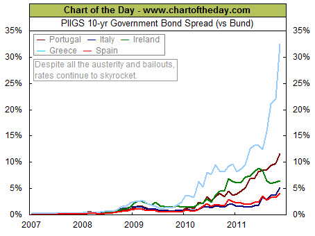
The following chart helps illustrate the risk of European debt by plotting out the 10-year government bond spread for all the PIIGS (i.e. Portugal, Italy, Ireland, Greece, and Spain) from 2007 to the present (versus the German Bund).

For example, (at the time this chart was constructed) the Greek 10-year government bond yield (light blue line) is currently a whopping 32.5 percentage points greater than that of the relatively stable German Bund. That is a far cry from where it was back in the summer of 2009 and shows the risk premium imposed based on the perceived likelihood of default.
Perhaps more important, however, is the status of Italy (dark-blue line). Italy has €1.9 trillion ($2.6 trillion) of debt outstanding. This level of debt is greater than that of all the other PIIGS combined. Due to the severity of the situation, the European Central Bank may ultimately be forced to do unpleasant things (like deciding to print a significant amount of euros – something they are very much ideologically opposed to doing).
The Relatively Poor Performance of Banks.
Banks often lead rallies higher. The logic is that banks make more money when they are lending, doing deals, and helping companies go public. In 2011, investors have been hesitant to buy into further gains in this sector.
Looking at the chart, below, notice that the S&P 500 Index (symbol: SPY) has been trending up since April 2010, while the Banking Index (symbol: $BKX) has been trending down since April 2010.
What Else Is Wrong With That Picture?
According to StockTiming.com, the Financials component on the S&P 500 is the second largest component representing 13.78% of the index.
Consequently, this chart implies that the "other components" (as a group) have been strong enough to overcome the huge weakness in the Banking sector.
Negative divergences like this cannot go on forever. For the S&P to continue trending up in the future, the non-financial sectors will have to stay strong, and stay strong enough for the Financials to start reversing its down trend.
So, while the markets have held up well through the recent negative sentiment and external risk factors, there are still some big challenges ahead. Perhaps all that means is that this is a more a trader's market than an investor's market. On the other hand, diversification seems like a good goal here.
The good news is that the Markets have responded well to much uncertainty. Moreover, without committed sellers, it has been easier for prices to get pushed higher. The bad news is that the uncertainty comes from real issues.
I'm reminded of the phrase: "Just because you are paranoid, doesn't mean people aren't out to get you." Here are two things that to watch.
The Continued Risk of Default in Europe.
So far, none of the European austerity and bailout plans have not managed to stem the European debt crisis.
Some would claim that the severity of the crisis has only increased over time, given that Italy (the world's eighth largest and the euro zone's third largest economy) is now becoming the latest European nation threatening to require a bailout.
The following chart helps illustrate the risk of European debt by plotting out the 10-year government bond spread for all the PIIGS (i.e. Portugal, Italy, Ireland, Greece, and Spain) from 2007 to the present (versus the German Bund).

For example, (at the time this chart was constructed) the Greek 10-year government bond yield (light blue line) is currently a whopping 32.5 percentage points greater than that of the relatively stable German Bund. That is a far cry from where it was back in the summer of 2009 and shows the risk premium imposed based on the perceived likelihood of default.
Perhaps more important, however, is the status of Italy (dark-blue line). Italy has €1.9 trillion ($2.6 trillion) of debt outstanding. This level of debt is greater than that of all the other PIIGS combined. Due to the severity of the situation, the European Central Bank may ultimately be forced to do unpleasant things (like deciding to print a significant amount of euros – something they are very much ideologically opposed to doing).
The Relatively Poor Performance of Banks.
Banks often lead rallies higher. The logic is that banks make more money when they are lending, doing deals, and helping companies go public. In 2011, investors have been hesitant to buy into further gains in this sector.
Looking at the chart, below, notice that the S&P 500 Index (symbol: SPY) has been trending up since April 2010, while the Banking Index (symbol: $BKX) has been trending down since April 2010.
What Else Is Wrong With That Picture?
According to StockTiming.com, the Financials component on the S&P 500 is the second largest component representing 13.78% of the index.
Consequently, this chart implies that the "other components" (as a group) have been strong enough to overcome the huge weakness in the Banking sector.
Negative divergences like this cannot go on forever. For the S&P to continue trending up in the future, the non-financial sectors will have to stay strong, and stay strong enough for the Financials to start reversing its down trend.
So, while the markets have held up well through the recent negative sentiment and external risk factors, there are still some big challenges ahead. Perhaps all that means is that this is a more a trader's market than an investor's market. On the other hand, diversification seems like a good goal here.
The Texas governor is trying to turn his recent stumble into an opportunity. He is asking supporters to pitch in a few dollars for every agency they would abolish.
Here are two excuses Perry could use to explain what happened.
For more, here is a link to Rick Perry's 'Letterman' Appearance: GOP Presidential Candidate Reads List Of 'Top 10 Rick Perry Excuses'.
Here are some of the posts that caught my eye. Hope you find something interesting.
After much speculation, Groupon (GRPN) went public last Friday. Its first day of trading ended with the stock closing 31% above its offering price.
Groupon's successful IPO raises a bunch of questions. What does it say about the market? Do you care that they floated less than 5% of the company?
Another question is how other hot IPOs have fared recently?
What comes after a blockbuster IPO tends to be less pretty. The chart, above, shows the post-IPO performance of 25 hottest offerings of 2010 and 2011. There’s a lot of red: after the initial “pop” (which is the jump from the offering price to the open), 20 of those 25 tanked. Many have fallen 50 percent from their first day opening price in the stock market* (one high profile example: Demand Media, down 68 percent since its January debut), a few more than 80%.
Here are some of the posts that caught my eye. Hope you find something interesting.
Here are some of the posts that caught my eye. Hope you find something interesting.
I've been spending time with more vegetarians lately. I'd be one too if meat grew on trees.
Meanwhile, it is getting to be Halloween …
On a more serious note, here are some of the posts that caught my eye. Hope you find something interesting.