President Obama played a game of H-O-R-S-E with former NBA star Clark Kellogg during the Final Four telecast yesterday. My expectations were low, and I expected it to be corny.
Unlike the North Korean Supreme Leader's penchant for hitting fictional hole-in-one shots on the golf course, Obama started slow and was willing to show some weakness. Nonetheless, throughout the video, he seemed confident and athletic. Moreover, the bantering and interplay seemed to provide some insights into the President's psyche.
All-in-all, I thought it was a good move by him … and that it did a nice job of polishing-up his image and reminding people why he is so popular.
The terms "Internet
of Things" and "System of Systems" are concepts that help to explain a great deal about what
is happening, now, where the digital world meets the physical and
intellectual.
In the video below, from IBM, you get a glimpse of it …
Imagine if your alarm clock talked to your calendar and knows you
need to catch the
ferry in 1-1/2 hours to get to work, so it wakes you up. But, a half hour before it wakes you, it turned on the heater in your bathroom; and other sensors started your morning coffee and de-iced
the windshield in your car.
Here are some excerpts from the film:
“Over the past century, but accelerating over the past
couple of decades, we have seen the emergence of a kind of global data
field. The planet itself – natural systems, human systems, and physical
objects – have always generated an enormous amount of data, but we
didn’t used to be able to hear it, to see it, or to capture it. Now we can
because all of this stuff is now instrumented. And it’s all
interconnected, so now we can actually have access to it. So, in
effect, the planet has grown a central nervous system.
Look at that complex set of relationships among all of these complex
systems. If we can actually begin to see the patterns in the data, then
we have a much better chance of getting our arms around this. That’s
where societies become more efficient, that’s where more innovation is
sparked.
When we talk about a smarter planet, you can say that it has two
dimensions. One is to be more efficient, less destructive, and to
connect different aspects of life which do affect each other in more
conscious, deliberate and intelligent ways. But the other is also
to generate fundamentally new insights, new activity, and new forms of
social relations. So you could look at the planet as an information,
creation and transmission system, and the universe was hearing its
information but we weren’t. But increasingly now we can, early days,
baby steps days, but we can actually begin to hear the planet talking to
us.”
This framework applies to many other things (for example, trading and markets). Expect to hear more about this type of insight and automation.
March Madness is in full force. What's a $ Trillion here, or a $ Trillion there?
A Look at the Markets.
Most people consider it "bullish" when markets go up 14 of 16 days. That should make people happy, right?
Recently, though, I've had conversations with several "old-pro" traders who expressed a sense of frustration. They view the recent push higher with skepticism. Trading discipline is allowing them to make money on the upside, but it's not as satisfying as being "right".
What do the Charts Show?
Let's look beyond the obvious up-trend. The following chart and video, from Brian Shannon's Alphatrends site, shows that price is now below the volume-weighted average price paid since Fed Decision to leave rates unchanged.
There is now a lot of support under our recent highs, so many expect the market to correct a little, then resume its move higher.
How Far Can the Rally Go?
On a basic level, the recent market rally shows that there's more buying
demand than selling pressure. However, when there is little selling
pressure, it doesn't take much demand to keep prices going higher.
At this point, the rally has gone on long enough that many of the participants who profited
from the extended move up are now becoming defensive.
Also, some trading
relationships that tend to move together have decoupled. The following
chart shows the recent weakness of the China Shanghai Index and the Euro
in comparison to the U.S. Markets.
Some see the U.S. Market's continued relative strength as a precursor to a new leg of the bull market, while
others see it as a temporary anomaly.
Adding to the bearish case is that several sentiment indicators show
very little fear. The VIX
is moving back to the extreme levels of complacency. Odd-lot shorts
recorded a 13 week low, indicating that the "little guy" has virtually
given up on shorting. Likewise, the lack of fear is downright scary when
you look at CBOE's
Equity Put-to-Call
Ratio. These readings are contrary indicators, meaning they often occur at
turning points in the market.
And with quad-witching
expiration behind us, and an unpopular health-care issue in
the news, the bears will have another chance to show their conviction … or lack of it.
We'll see what happens. I hope you have a good week.
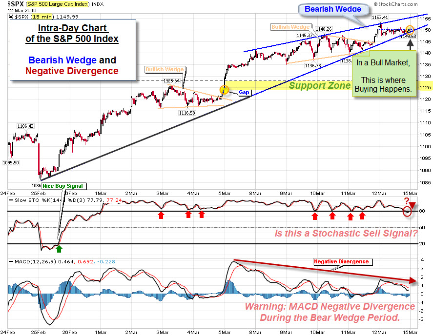
The Markets are showing signs of health and strength. These charts, from Stockcharts.com, show the internal strength and breadth powering the move higher and supporting the current rally.
Here is an intra-day chart of the S&P 500 Index for the past three weeks. It is a modified version of something I saw on Breakpoint Trades' site. It shows the decision-point; price has pulled-back to the trend-line.
In bull markets, this is where Buyers tend to appear. In contrast, Sellers probably see the bearish wedge and negative divergence as signs of waning momentum. Add the potential sell-signal from over-bought stochastics, and we have an interesting set-up for next week.
Even if the markets sell-off from here, there are now a number of support levels close by.
The markets have continued to do well, what about the economy? I think the Employment situation is a primary indicator.
We Stand Out – With Respect to the Severity of our Under-Employment Situation.
There is disagreement about whether the recent jobs number was a positive sign. Some are focusing on the slowing decline; others are focusing on the continued weakness … still others are focusing on the continued downwards adjustments. Nonetheless, this chart makes something clear. Compared to other recessions, the job losses (and lack of job gains), of this Recession are truly unprecedented.
Here is a different way to look at what that chart means.
The markets put on a show of strength this week, blasting through overhead resistance. The chart below shows the S&P 500 Index is approaching its recent highs, and now has two nice levels of support beneath it (marked by the light and dark green lines).
As long as price is above these levels, it seems prudent to use
bull-market techniques. That means to expect buying on dips.
On the other hand, trading often induces paranoia. So, there is some part of me looking for the next areas that would trigger the most stop-losses. Coincidentally, this weekend I talked to a money manager who told me they were going to exit their short positions if the markets get above the recent highs (marked by the orange line). That seems like a pretty widely followed level. So, a spike above that … followed by a sharp reversal, might find some of the selling volume we've been missing lately.
Could We Possibly Still Be in a Bear Market?
A fresh view is often helpful. The next chart is not designed to be predictive. Instead, it simply provides an alternative context to view the recent price action in relation to historic market cycles.
Below is an inflation-adjusted overlay of three secular bear markets put together by Doug Short. It aligns the current S&P 500 from the top of the Tech Bubble in March 2000, the Dow in of 1929, and the Nikkei 225 from its 1989 bubble high.
The nominal all-time high in the index occurred in October 2007, but when adjusted for inflation, the "real" all-time high for the S&P 500 occurred in March 2000.
There is a Lot of Deal-Making Going On.
Increased merger and acquisition activity and the freeing-up of corporate assets (usually measured by increased corporate spending) are both typically bullish signs. Why? Both indicate that decision-makers are optimistic (or at least projecting optimism). There's been quite a bit of evidence showing that this is happening on a global corporate scale and all the way down to the local level.
One thing holding-back the optimism is the lack of lending. Here is a look at that.
Nonetheless, companies with cash are starting to use it.
Here's a story that is a bit humorous, though still shows those green shoots of growth.
In Kansas, the city of Topeka changed its name to Google. Supposedly part of a local effort to convince Google to make Topeka a test site for an ultra-fast Internet connection and set Topeka apart from other cities vying for Google's attention.
Hope you have a good week, even if you used to live in Topeka.
The markets held-up well again this week despite lots of bad news on many fronts. While there were several bouts of selling, each time buyers were there to prop things back up.
Here were some of the news items the market handled last week.
So, let's use some technical analysis to see where the markets stand.
Three Views of the Market – and All Say the Same Thing.
Sometimes simple is better. What follows is a top-down look at the Dow Jones Industrial Average. It starts with a monthly chart for the bigger picture. That is followed by a weekly chart, and then by a daily chart. In all three the key level is just above where we are.
Here is the weekly chart. It shows price re-testing the upwards sloping trend-line from below.
Here is the daily chart. A sustained move above the orange line would be bullish.
Here is something else to watch.
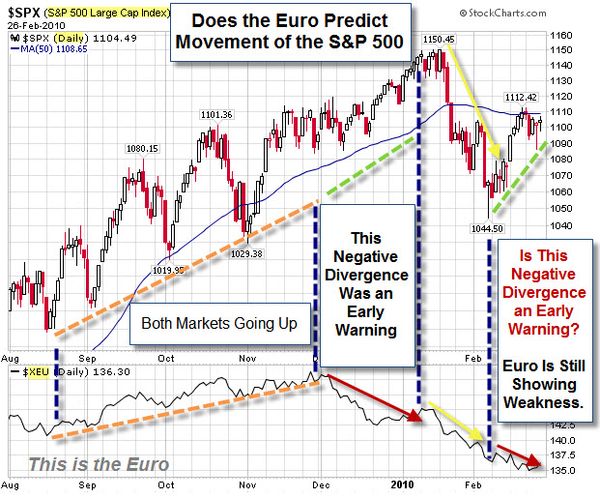
Does the Euro Help Predict US Equity Market Moves?
This video suggests that the Euro is worth watching as an early indicator of likely movement in the U.S. Equity Indices (like the S&P 500 Index).
That is something I will keep an eye on to see how it works. In the mean-time, here is a recent chart of the S&P 500 and the Euro. It is showing a negative divergence because the Euro is continuing to show weakness while the S&P 500 rallied in February.

![Reblog this post [with Zemanta]](http://img.zemanta.com/reblog_c.png?x-id=cfc1c322-267d-46cb-a34d-7572d6a1b4ee)
![Reblog this post [with Zemanta]](http://img.zemanta.com/reblog_c.png?x-id=da0c19c4-e1ea-4e39-b2a5-0f753aef5d0f)


![Reblog this post [with Zemanta]](http://img.zemanta.com/reblog_c.png?x-id=548afa6e-fc1f-471b-840e-9aaf4d28f9f3)


![Reblog this post [with Zemanta]](http://img.zemanta.com/reblog_c.png?x-id=2a510835-2afd-456c-8621-305859fb21a7)


![Reblog this post [with Zemanta]](http://img.zemanta.com/reblog_e.png?x-id=423cd613-8cb8-4eb0-a0d0-df9fd1b47c3d)


![Reblog this post [with Zemanta]](http://img.zemanta.com/reblog_e.png?x-id=7f8ada94-284e-4756-a250-21954814b1c7)