Holiday shopping season is in full-force. That means 2010 is right around the corner.
 As an early gift, I got to go to a hockey game with my son. This picture captures a Good News – Bad News moment for me. On the positive side, I'm happy to see that my son shaved off his strangely orange mop of hair. However, standing next to him, I look like a professional "before" model.
That helped me realize that it's time to start thinking about New Year's resolutions, and specifically some health related resolutions.
Here is a summary of that process. Hopefully, you can use some of these concepts.
- Focus on What You Want.
- Focus on Why You Want It.
- Focus on Ways You Might Get it.
- Focus on the Progress.
Below, I'll take you through an example of the four steps you need to use Positive-Focused Planning to get what you want.
Moving Towards a Solution, Rather Than Suffering with the Problem.
My first instinct was to think "I need to lose weight". Knowing that "you're fat" isn't helpful … my head, quickly translates that to something a tad more positive, yet generic, like: "I choose to be healthy and vital, and to live a healthy lifestyle".
Blah, blah … They are just words. What I needed was something specific, measurable and actionable. How about: "I will lose 15 pounds and stop eating after dinner." OK, but that isn't inspiring, and there isn't much for me to do. I can do better than that.
Figure-Out a Big Enough WHY, Rather Than Worrying about the HOW's.
This post isn't about health and fitness, it is about the mind-set and techniques you can use to set empowering goals and plans in any situation.
 So, while I could list a lot of ways to lose weight; and I might even remember to do some of them, when you create a driving force, the momentum takes care of itself. The first step in doing that is knowing WHY you want something.
I really do want to be healthy and vital (it sure beats the alternatives), and I want to have the energy and confidence to live and enjoy my life fully. The world is my playground, and I want to take advantage of more opportunities to play with family and friends. In order to do those things, I must find better ways for me to live a healthy lifestyle.
The WHYs are just as important for business goals too.
Focus on Potential Solutions, Rather than Problems or Challenges.
 Obstacles Exist. The bad news: I don't eat fish and I don't like vegetables (unless French Fries are vegetables). My joints aren't close to healthy from years of violent contact sports. And I rarely get 7 hours of sleep. The good news: is none of those things matter; and even if they did, it just would mean that I have a lot of room for progress.
It is natural to focus on obstacles. Use them as a reminder to focus on potential solutions instead. They are beacons, pointing the way.
How do you do it? To focus on solutions, you can make two action-based lists: one is of things To-Do … and another is of things Not To-Do.
Here are some of the sample To-Do Items:
- I will drink more water than coffee.
- I will stretch, or do basic calisthenics, on days that I do not go to the gym.
- I will make a healthy shake as a meal replacement rather than a meal supplement.
- I will focus on relaxation and meditation, as much as I focus on strength & physical exercises.
Here is the actionable list of Not To-Do Items.
- I will not buy new pants or wear stretchy pants.
- I will not eat snacks out their container, and will portion-out what I want first.
- I will not compare my current level of fitness to what I used to be able to do. Instead I will focus on my actions and improvement.
Create Healthier Habits.
It is easy to follow your routine. So, make your routine better. Here are some examples of things you could do to make being healthier happen with less effort.
- Pre-sort your vitamins into daily doses, and keep them by the coffee machine.
- Buy healthy snacks, like fruit, raw nuts or organic energy bars (instead of chips).
- Make exercise time, the time you enjoy listening to music.
- Park at the end of the parking lot, so you get to walk.
- Meet with friends at the gym, rather than a bar or restaurant.
You get the idea. Get in the habit of looking for ways to create better habits. What habits could you alter slightly, to make a big difference? Which things can you automate or outsource?
Focus on Your Progress.
In this case, it really is about the journey. Instead of keeping track of how far you have to go … notice how far you've come. It is about creating energy, momentum and a sense of possibility. You may have a big, hairy, audacious goal in mind. That's fine, as long as you realize that reaching each milestone along the way is still an accomplishment.
- Find shoes that don't hurt your feet.
- Pick a gym, or a personal trainer.
- Run more than two laps without stopping.
It doesn't matter what they are are … they all count, as long as you know that you are moving in the right direction.
Summary.
The point of this exercise as was not really to focus on fitness. These techniques and goal-setting tools work in any situation. The principles are:
- First, figure out what you want, and why it is important to you.
- Second, find something you can do, right now, which moves you in the right direction.
- Third, notice which things create (rather than take) energy. Spend your time on those, and automate or create routines to take care of the rest.
- Fourth, set milestones so that you can recognize and celebrate your progress.


 pzizz (pronounced puh-zizz) Relax is a power-nap app.


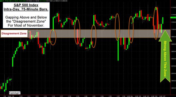


 Black Friday came in several ways this year. Yes, there was shopping. However, the markets had a dark few days, too, as the world markets quaked at the news of Dubai's sovereign debt default.


