

A record drop in pending home sales and a slowdown in the construction
market contributed to a sluggish outlook for the economy last week, and highlighting the significance of government stimulus measures and job
growth.
Market Commentary
The Nasdaq Composite Index is showing a well-formed Head and Shoulders topping pattern. Price has broken beneath the neckline, which means it has triggered. Unless it can move back above that level, the pattern's target is the distance from the top of the head (2500) to the neckline (2100), which is 400 points lower.
Supporting the bearish case, new 52-week lows are expanding on the Nasdaq while new 52-week highs are drying up. Net New Highs (new 52-week highs less new 52-week lows) is an easy way to assess the battle for new 52-week extremes. An uptrend is unlikely as long as Net New Highs remain
negative.

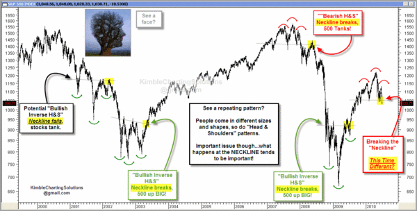
Technical Analysis is often easy to see after the fact. Here is a look at several Head and Shoulder top and bottom patterns. Click the image to see a bigger version.
Here's Something That Will Show-Up On Lots of Radar Screens.
On some level, Technical Analysis is a self-fulfilling prophecy because "everyone" is looking at the same thing. While lots of people are worried about the Head and Shoulders pattern, I suspect that far more are watching the "Death Cross" or "Dark Cross" that is being formed on our indices as the 50-day moving average falls below the 200-day moving average.
While I see the bearish implications, some trader's will be looking for the head-and-shoulders and death-cross patterns to fail because of a short squeeze. Failed patterns often result in bigger moves than the patterns that didn't work. Here is an explanation about why that happens.
The OOPs Trade:
When a well-known pattern fails, the response is often dynamic. This often happens with obvious, high profile situations like a "Head-and-Shoulders"
pattern, a move through big Round
Numbers (like Dow 10,000), crossing
the 200-Day Moving Average, or violating a clear Price Channel. Just for the record, several of those are in-play at this price level.
An often violent reversal happens when the crowd realizes that it was wrong, and people rush to cover their painful losing positions. As the price of the stock increases, more short sellers feel driven to
cover their positions. This is very similar to a short squeeze;
and the move is often violent and prolonged.
The markets are
oversold here; lots of people know that we just made new lows, and we
have been bombarded with bad news recently. So, I'm not predicting that
the market will reverse here. I am just suggesting that it is
possible and something to watch.
Business Posts Moving the
Markets that I Found Interesting This Week:
- Why the Year's First-Half Performance Says Little About the Second. (MarketWatch)
- John Hussman: A Recession Warning. (InvestmentNews)
- Summer Internships: Unpaid Positions Gaining Popularity At Small
Firms. (LATimes) - Apple iPad Sales Hit Three Million in 80 Days. (WSJ)
- Cost of Fannie Mae & Freddie Mac Rising; May Exceed Banking
Rescue. (NYTimes) - More Posts
Moving the Markets.
Lighter Ideas and
Fun Links
that I Found Interesting This Week
- Verizon Wireless Said to Start Offering iPhone in January. (Bloomberg)
- 10 Astonishing Facts About The Pixar Juggernaut. (BusinessInsider)
- Cyber-War: The Real Threat From the Internet. (Economist)
- Exceptional Longevity — Science Discovers It's In Your Genes. (LATimes)
- Not So Neighborly Associations Foreclosing On Homes. Pretty Scary. (NPR)
- More
Posts with Lighter Ideas and Fun Links.