China is now the world’s second-biggest economy; but some of its provinces by themselves would rank fairly high in the global league.
This map shows the nearest equivalent country. For example, Guangdong's GDP (at market exchange rates) is almost as big as Indonesia's; the output of both Jiangsu and Shandong exceeds Switzerland’s.
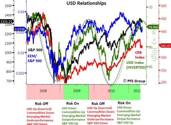
The "risk on/risk off" trade has come roaring back.
Across financial markets, trading patterns more commonly seen in 2010 are returning. Stocks and the dollar are consistently moving in opposite directions, as are stocks and Treasury securities.
It is a trading pattern that was common for much of 2010 as investors swung in and out of markets en masse–buying "risk on" investments like stocks when they felt brave, and "risk off" assets such as Treasurys and the dollar when they wanted safety.
Markets could be at risk of knee-jerk moves for the foreseeable future, a result of the increasingly volatile nature of global markets, and liquidity being pumped into markets by the Federal Reserve.
Volatility’s Whipsaw: VIX Falls 40% After Jumping 46%.
The Volatility Index (or VIX) is regarded as the "Fear Index" by many.
So, it is worth noting that the VIX has fallen 40% from its recent highs. It is also worth noting that That the big move down was preceded by a three-day rise in the VIX of more than 46.
The Volatility of Volatility.
According to Barron's, since 1990, the VIX has only experienced a three-day decline of 25% or more that was preceded by a three-day rise of 25% or more eight times.
“During those eight periods, the average and median performance of the S&P 500 has been negative in the days and weeks following these big moves higher and then lower in the VIX”.
We are Seeing a Lot of Big Ups and Big Downs.
One of the bullish signs, recently, has been the market's ability to snap back and continue its push higher despite recent events. Yes, there have been big swings; but instead of 'Fear', order returns … and the market is once again acting like it is relatively undaunted by concerns.
Remember, how much markets move up and down is a different form of volatility. You can measure it in many ways, for example, based on the Average True Range. However, historically, increasing volatility is not a positive sign for the markets (because it suggests indecision, and has often occurred near major market turning points).
We Are Still In a Bull Market.
If you are looking for another bullish sign, it isn't hard to find one in this market environment.
Here is one: Sectors are holding up, even when an individual stock tanks. A recent example is what took place after Research In Motion (RIMM) released a bad earnings report. The stock was absolutely annihilated. Yet, even thought the stock got slammed, the rest of the market did not. That's a sign we're in a bullish phase. In bear markets, the whole sector will be taken down if a stock reports badly.
These are the little subtle hints about where we are at the moment. It doesn't mean it'll be this way a week or two from now, but it is that way for the moment.
Imagine what was going on in the minds of the initial 50 Japanese workers who stayed behind (while everyone else was evacuated ) to try and fix things at the nuclear reactor after the earthquake …
Were they going to die, or become disabled from the exposure?
Imagine what was going on in the minds of the initial 50 Japanese workers who stayed behind (while everyone else was evacuated ) to try and fix things at the nuclear reactor after the earthquake …
Were they going to die, or become disabled from the exposure?
For the first time in a long time, the S&P 500 Index experienced a small corrective phase. The Index fell 7% from its high, set on February 28th.
Considering the state of global unrest, the pull-back was reasonably small and orderly. So, is the selling over? David Stendahl, one of the authors of Dynamic Trading Indicators, sent me this chart signaling a potential short term bullish pivot low.
Below is daily chart of the Index and a short term momentum indicator that focuses on mean reversion (David calls it a "Value Chart"). In general, Value Charts respond to extreme movement away from recent norms and signals when the market is likely to reverse course.
There is a short term bullish divergence between price action and the Value Chart indicator. I've marked the last three signals, and you can see that they preceded bullish moves.
The weekly chart, however, shows that the S&P 500 is sitting on support with a number of technical indicators poised to turn to the downside. So, if you are expecting another test lower, there is your cue for caution.
I'm curious whether the market will trigger buyers looking for a bargain, or whether another push lower will result in some real selling?
Is Lumber Sending a Bullish Signal About the Broader Market?
If you are looking for a potentially bullish early indicator, then Lumber may be sending you a signal. It is back near its recent highs. If it can break through to the upside, traders may take that as a good sign of market strength.
Why do traders consider lumber an early indicator for the broader market? Since lumber is a primary raw material in the early stages of new construction, the logic is that lumber purchases signal new construction.
What Can Copper Tell Us?
Like Lumber, traders also look to Copper as another early indicator of new construction because it commonly used in things like wires and pipes. In addition, the Copper/Gold Ratio is an interesting composite measure of economic activity. The chart below shows weakness and a negative divergence of the Copper/Gold Ratio (in comparison to the S&P 500 Index) since last October. Most recently, this ratio has been falling steeply again. We will see if that is an early indicator of broader market weakness?
A similar flattening of trading range occurred in the Financial Sector as well.
What Does the Financial Sector Tell Us?
Financials often lead rallies higher. The logic is that banks make more money when they are lending, doing deals, and helping companies go public. In 2011, investors have been hesitant to buy into further gains in this sector. However, price just put in a volume reversal.
In bull markets, this is where the buying comes in. So, let's see how this sector responds. A move down from here would hurt the bullish case.
Lots of Speculation about Japan.
When disaster stikes a first world country with a first world economy, there is little doubt about re-building. It will happen. The question investors are asking is how they can profit from it?
Someone called me last week and said "I feel terrible for the people and the tragedy, but I also expect to hear that Hank Paulson ends up making billions of dollars on it next year."
That is the mindset of someone looking to put money back to good use. There is still a lot of money sitting on the sidelines. Where will it go to work?
Do you see a rush to invest it in the U.S. equity markets (as we face the end of QE2)? Do you see a rush back into Gold and Silver?
It could be we are about to see an opportunistic shift. It is worth watching where money flows.