

 Image by Simon Miller via Flickr
The Economist's Big Mac index seeks to make exchange-rate theory more digestible. They say it is arguably the world's most accurate financial indicator to be based on a fast-food item.
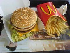
The Big Mac index is based on the theory of purchasing-power parity (PPP), according to which exchange rates should adjust to equalize the price of a basket of goods and services around the world. For them, the basket is a burger … a McDonald’s Big Mac.
According to this measure, the most undervalued currency is India's Rupee at 67% below its PPP rate. In India, a McDonald’s Big Mac costs just 90 Rupees on average, the equivalent of $1.50 at market exchange rates.
In America, the same burger averages $4.56.
The interactive graphic, below, shows by how much, in Big Mac PPP terms, selected currencies were over- or undervalued.

The index is supposed to give a guide to the direction in which
currencies should, in theory, head in the long run. It is only a rough
guide, because its price reflects non-tradable elements such as rent
and labor. For that reason, it is probably least rough when comparing
countries at roughly the same stage of development.


