
Lowering the value of the Dollar is not a goal … it is a strategic by-product.
From Reuters:
Cleveland Federal Reserve Bank President Sandra Pianalto said on Thursday that lowering the value of the U.S. dollar is not a goal of the central bank’s ultra-easy monetary policy. “We don’t target or try to manipulate the value of our currency; we focus on our two objectives of price stability and maximum employment,”
Translation: We don’t care about the Dollar right now.

The Rising Cost Of Keeping The U.S. Recovery On Track.
According to CityWire, in 2010, many emerging economies began to withdraw (tighten) some of the money they had used to stimulate growth.
But in the U.S. yet more money will be spent in 2011 – with 'QE2' and on welfare – to try and revive the faltering recovery (loosening).

I don't normally reproduce articles verbatim. However, this piece from Barry RItholtz at the Big Picture deserves to be seen.
A Dozen Random Things I Am Thinking About . . .
Every now and again, I like to jot down some random thoughts — about the markets, economy, crowd psychology. It is how I process ideas, intuition, various data inputs.
Make of this what you will, but these are the random thoughts that seem to be occupying my mind lately:
1. Markets are frequently disconnected from their expected inputs: Economy, Profits, Tax Policy, Interest Rates. This is more than a mere lag, it is a complex interplay that often looks like randomness — but isn’t.
2. To many market participants, this seemingly random walk is an exercise in frustrated expectations. Let’s call it “Fooled by Taleb” to separate the true low correlation, random outcomes from the hard-to-understand but non-random events.
3. The economy’s impact on markets is neither linear nor consistent. (Despite this, some people insist on basing investments on current economic data).
4. Wisdom consists (in part) of learning what to keep and what to discard. What you purposefully sequester and do not read is just as important as what you do consume. In practice, you I find it helpful to “Quarantine” the sources that are consistently wrong or money losers.
5. Evolution has shaped Human Beings over many millenia. I suspect Human learning came from adapting to recent experiences. Perhaps this is why people are so backwards looking, suffering extensively from the recency effect: Learning from recent events is a good survival skill, but it turns out to be a terrible investing trait.
6. I continue to wrestle with the concept of Valuation –it is more of a challenge than I previously believed. Fair value changes relative to numerous inputs, including taxes, interest rates and bond yields. I wonder if Valuation is far less of an objective measure than classically believed by the Graham & Dodd crowd.
7. Long arcs of time are an abstract philosophical concept, one that seems to elude many investors. While most people understand the idea of time elapsing intellectually, they do not seem to truly grasp cycles, years, and decades intuitively; I wonder if this is due to people being uncomfortable with it emotionally due to other factors (impatience, desire, even mortality).
8. Discerning crowd sentiment is more challenging than it appears at first blush. There are objective numerical readings, subjective surveys, and lastly, anecdotes. None are perfect tells, all require interpretation.
9. How someone constructs their rhetoric tells volumes about the underlying strength of their arguments. Abusing data, appealing to emotions, ignoring facts, shifting the debate to secondary or tertiary issues are signs of a weak, poorly reasoned thesis. Investors that learn to recognize the difference between powerful arguments and clever, weak ones are at an advantage.
10. Speaking of rhetoric: I sometimes wonder if the Expert Fallacy is a fallacy itself. The difficulty lay in some experts adding value, while the bulk do not. If you can identify the difference between the two — which apparently, most folks cannot — its money.
11. I have been mulling over this Jeremy Grantham quote a great deal lately: “We will learn an enormous amount in the very short term, quite a bit in the medium term and absolutely nothing in the long term. That would be the historical precedent.” That is quite a damning statement about you Humans.
12. If everyone is a contrarian, no one is a contrarian . . .
Business Posts Moving the Markets that I Found Interesting This Week:
- Is The Fed Saying One Thing But Doing Something Very Different. (Ritholtz)
- Economy Growing Faster Than Expected; But Where Are the Employees? (LATimes)
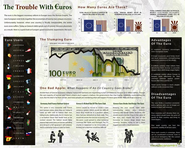
- Here’s How The Euro Could Collapse – And Why It’s Unlikely To. (Citywire)
- Bernanke Admits QE2 May Fail, Requests Fiscal Stimulus Now. (Forbes)
- The Letter Warren Buffett Should Have Written To The Government. (Ritholtz)
- More Posts Moving the Markets.
Lighter Ideas and Fun Links that I Found Interesting This Week
- Verne Harnish's One-Page Strategic Planning Worksheet & Other Stuff. (Gazelles)
- Om My! Meditation Changes Brain Structure Permanently. (Newser)
- Squashed Philosophers – Condensed Wisdom From Great Minds. (BTInternet)
- Toddlers Judge Good and Bad Intent, Study Says. (NYTimes)
- Freaks, Geeks, and Economists: The Study of Dating. (Slate)
- More Posts with Lighter Ideas and Fun Links.


![Reblog this post [with Zemanta]](http://img.zemanta.com/reblog_c.png?x-id=463e7f2d-e7bc-4ae7-a488-baf2a8d1f329)


![Reblog this post [with Zemanta]](http://img.zemanta.com/reblog_c.png?x-id=8a58009c-1db2-417b-acc5-f9bd0da33f73)