
 John Mauldin and George Friedman
were in Dallas this week. Several hundred people came out to hear
their thoughts on the world and the economy.
For what it's worth, Freidman's Stratfor service and Mauldin's Thoughts from the Frontline and are both terrific reads.
I take it as a bullish
sign that so many people made time, in the middle of the day, for an
event like this.
While the mood in the room was that the
easy money has already been made in the equity markets, people were
looking for places to put money to work.
Sentiment Soaring …
Up-and-Down … the ride continues. Still, sentiment is quite bullish. How bullish? AAII's weekly survey showed the fewest bears since April 30th. That was just about the time the Russell 2000 rolled-over to start an 8% correction.

Market Commentary.
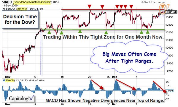
Here is a daily chart of the Dow Jones Industrial Average. It shows the market at a decision-point. The month-long consolidation has taken the market to a place just above major support and resistance level … And back to the upwards sloping trendline.

Traders expect a big move after periods of compressed range (like the one we are in now). Bollinger Bands are often used to represent volatility. You can construct by plotting bands two standard deviations on either side of the 20-period moving average (note the pink bands in the chart above). One of the indicators I keep an eye on, is the band-width of these Bollinger Bands (it is plotted in the bottom pane of the chart shown above). When it gets narrow for an extended period, that "squeeze" puts me on alert for expanding volatility.
What do you do? You watch price. This is the classic buy point in an up-trend. On the other hand, there's everything else.
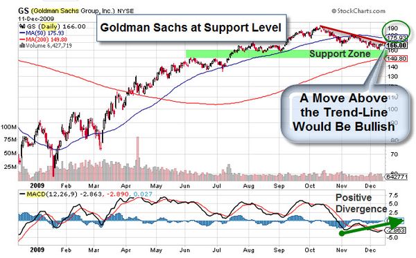
Insight: Price is the Primary Indicator.
What do you think is the most bullish indicator of our markets? It's not a trick question; the answer is "price".
The
markets have held-up nicely, throughout this rally, despite lots of bad
news about the economy. And that, in-and-of-itself, is bullish.
It
doesn't matter what technical analysis indicator you use (increasing
negative divergences and selling on down days … or less positive
momentum and market breadth), the markets have given us a clear message
recently. Price is the primary indicator, and it has stayed above
support.
While there will likely be a bearish divergence when
the trend finally ends, it is clear that a strong uptrend trumps most
bearish divergences.
The Implications of America's Rapidly Expanding Debt.
Here is a video from Consuelo Mack's WealthTrack, about the lessons of history. Best selling author and historian Niall Ferguson talks about the seismic global economic and market shifts of recent years mean for our future, particularly the longer term implications of America's exploding debt.
Here is the transcript.
Business Posts Moving the Markets that I Found Interesting This Week:
- Volcker: No Growth Besides What the Fed's Pouring Into the Economy. (BusinessInsider)
- M&A Activity: Google Buying Start-ups Again. (BusinessInsider)
- A Start-Up Jokingly Touted a $100 Billion Valuation. Now VCs are Calling. (Forbes)
- Wal-Mart's Web War Against Amazon Risks Little. (WSJ)
- What's Glittering Isn't Always Gold – Other Metals Doing Well.(WSJ)
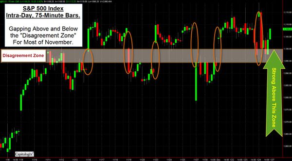
- Thoughts on the Market's Recent Gap Activity. (Quantifiable Edges)
- More Posts Moving the Markets.
Lighter Ideas and Fun Links that I Found Interesting This Week
- A Glimpse at the Future from Microsoft's Lead Tech Visionary. (CNet)
- Forbes Gave Ken Auletta’s ‘Googled’ a Great Book Review. (Forbes)
- Milken Institute's Journal of Economic Policy Worth a Look. (Milken)
- Craziest Google Street View Shots. (HuffingtonPost)
- Jewish Delis Are Dwindling, Traditions and All. (NYTimes)
- MIT's Next Bionic Breakthrough … Stepping Beyond Human. (Forbes)
- More Posts with Lighter Ideas and Fun Links.


 Black Friday came in several ways this year. Yes, there was shopping. However, the markets had a dark few days, too, as the world markets quaked at the news of Dubai's sovereign debt default.


