This week the Markets
tried to rally several times. Unfortunately for the Bulls, none of
these attempts worked. And Friday's move down was the worst for the
market in a year-and-a-half.
tried to rally several times. Unfortunately for the Bulls, none of
these attempts worked. And Friday's move down was the worst for the
market in a year-and-a-half.
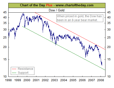
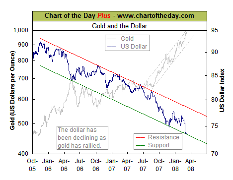
So the headlines are "another week
of a weak dollar, rising oil prices and falling markets." One of the
key take-aways, from my perspective, is that the Markets are not
responding as resiliently to bad economic data as they had a few weeks
ago.
You don't have to look much farther than this chart from FinViz.com.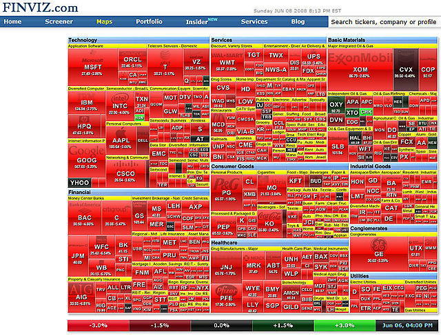
Also, something I'm hearing more of are questions about whether you can trust the government's economic numbers? Some people are
saying that key measures have been distorted lately.
Some things that caught my eye this week:
- The weekly newsletter from StockCharts.com had some interesting insights.
- The International Monetary Fund published research on Herding Behavior in Markets.
- Self-Motivation & Other Hyper-Intentional Mistakes from the Financial Philosopher.
- Why the sky-rocketing VIX may not be so bearish, from VIX and More.