Trading Tools

  • The Dow Has Given Back All Its 2014 Gains – Do You Care?

    All trades result from a disagreement.  Someone wants to buy, while someone else wants to sell.

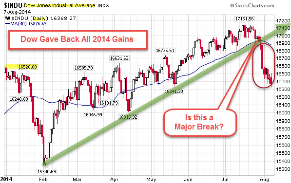
    The Dow Jones Industrial Average has given back all 2014 gains.


    140807 Dow Daily


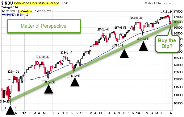
    So, is that a major trend-line break to sell?  Or, is it a buying opportunity?


    140807 Dow Weekly


    It is a matter of perspective.  What matters is what happens next.

  • Half the Word’s Population Lives in 6 Countries

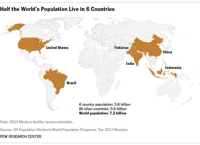
    As of this month, the world’s population is now 7.2 billion.

    According to U.N. data, half of the people around the globe (3.6 billion) live in just a half-dozen countries. China has the world’s largest population (1.4 billion), followed by India (1.3 billion). The next most-populous nations – the United States, Indonesia, Brazil and Pakistan – combined have less than 1 billion people.


    140807 Half the World's Population Lives in 6 Countries

    via Pew Research.


    The demographic future for the U.S. and the world looks very different than the recent past.

    For example, the U.N. projects that during this century, the number of people living to at least age 100 will increase more than 100-fold, from 181,000 in the year 2000 to over 20 million in the year 2100.

  • Which Markets Did Best In the First Half of the Year?

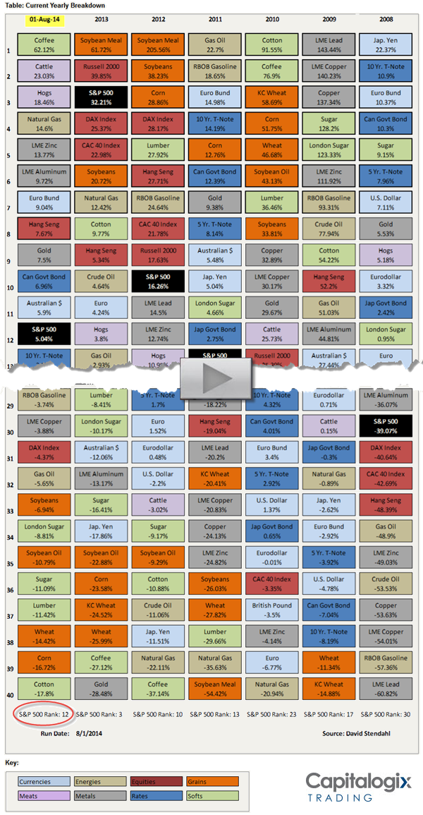
    There is always something working.  It still surprises me how often it changes.

    For example, take a look at Coffee's rise.

    The chart below shows the top-and-bottom performing markets so far this year.  The data is color coded based on sector. The first column shows year-to-date performance, followed by six columns of the most recent yearly market performances.

    Click the image to jump to the full chart.


    140802 First Half of 2014 and Yearly Market Performance


    Click this link to view weekly, monthly, quarterly, and yearly views of this data.

    So, how does that compare to other markets around the world? Here is an interactive chart to answer that question.

  • More S&P 500 Stocks Above Their 50-Day Averages than NASDAQ Stocks

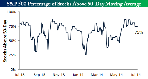
    As shown below, 75% of the stocks in the S&P 500 are currently trading above their 50-day moving averages. 


    140720 Percent of SP500 Stocks above 50 Day Average

    via Bespoke.

    This indicator has been trending slightly downward for about a month now, but it hasn't fallen below the 75% mark for quite some time.  Generally, whenever this breadth reading gets above the 80% level, the market is due for a breather.

    In contrast, less than 50% of NASDAQ stocks are above their 200-day moving averages.

    According to Martin Pring, that means that relatively few stocks are participating in the rally, and an even lower number are registering new highs. Moreover, there are currently slightly more stocks at new 52-week lows than highs, even though the NASDAQ is very close to its bull market high
  • What’s The Biggest Business In Your State?

    Obviously, business effects the economy of states. But, as the Washington Post notes,  businesses are not created equally – bigger businesses naturally have outsized influence, generating more revenue, paying more taxes and employing more people.

    The following chart shows the largest company, by revenue, in each state.  Some of these seem like easy guesses.  For example: GM in Michigan, ExxonMobil in Texas, Berkshire Hathaway in  Nebraska, Nike in Oregon, Walmart in Arkansas, and FedEx in Tennesse.
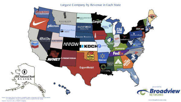
    140703 Largest-Company-By-Rev-In-Each-State-2014

    via Washington Post.

    But some of the others were surprising.  For  example, in Washington (home of Microsoft and Amazon), it is CostCo. Equally surprising, to me, was Verizon in New York, and Chevron in California.
  • Across the world, the number of people who say the economic situation in their country is “bad” is climbing

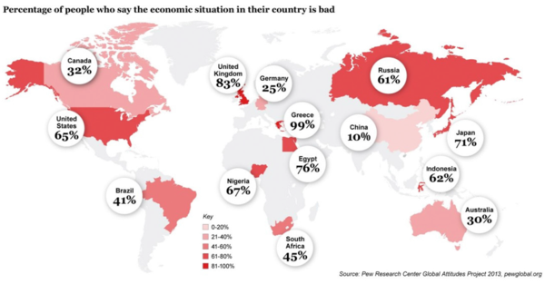
    Across the world, the number of people who say the economic situation in their country is “bad” is climbing — despite the much-vaunted recovery we all keep hearing about from politicians.

      
    140628 Is the Economic Situation In Your Country Bad

     
    via Grant Williams.

    The stock market is not the economy, and vice versa … but when you are interested in one, it doesn't hurt to pay attention to the other.

  • Smart Money Expects a Short-Term Top, Will the Rally Continue?

    Traders are often confronted by mixed signals. 

    Personally, when I have to choose between something straightforward or something complex – simple is better.

    For example, when large "Smart Money" traders show their directional bias, it often pays to follow in their tracks.

    Another technique would be to bet against the smaller retail "Dumb Money" traders (because, historically, they are often wrong at major turning points.

    However, if I have to decide between following "Smart Money" or doing the opposite of what "Dumb Money" does … then in the absence of other information, following Smart Money wins because it is more straightforward and simpler.

    Here is an example.

    Smart Money – Dumb Money Confidence Index.

    The chart, below, compares the bets made by small traders (a.k.a. the "Dumb Money"), to those of large commercial hedgers (a.k.a. the "Smart Money").

    In practice, Confidence Index readings rarely get below 30% or above 70% (they usually stay between 40% and 60%). When they move outside of those bands, it's time to pay attention.

    Even more noteworthy is when there is a wide confidence spread between the bets made by the Dumb Money and Smart Money traders. This type of sentiment spread only happens a few times a year. We often get substantial reversals when it happens.

    Consequently, you might want to note this chart from SentimentTrader. It shows that the confidence spread is at extreme levels.


    140620 Smart vs Dumb Money Confidence

    Conventional trading wisdom says that Crowds are usually wrong at turning-points.  That doesn't mean they are wrong all the time (yet, as discussed, it makes sense to notice when the Smart Money clearly disagrees). So, after such a strong rally, this is the kind of data that causes me to pay closer attention.

    Could this be  a trend-break?  Will Smart Money start actively making Bearish bets?

    Price is the primary indicator, and until it breaks down, expect that dips will be met with buying.