Science

  • The Boy Who Sees Without Eyes

    Innovation comes in many forms. I often challenge my research team to come at the edge-finding process differently. For example, how can you tell what’s happening in the stock market (or in your portfolio) without looking at the market?

    As an example, I might ask how we could determine the number of people in a room, without using sight?  To answer, you could: ask; use heat signatures; detect the number of heartbeats, etc.  The point is, there is usually a way if you want it badly enough. 

    The story and video below captured my attention … and admiration. 

    Hope you enjoy it.


    Diagnosed with retinal cancer at the age of two, Ben Underwood had his eyes removed at the age of three.

    Still, he was able to detect the location of objects by making frequent clicking noises with his tongue. He used it to accomplish such feats as running, playing basketball, riding a bicycle, rollerblading, playing football, and skateboarding.

    Check out the video.


    Via CBS News.

    He died just before his 17th birthday; but his life is still an inspiration.

    For more, watch this.
  • What Knee Surgery Reminded Me About Technology

    This week, my son had knee surgery.  It made me remember my knee surgery from three years ago … And, it reminded me about what technology makes possible.

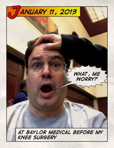
    Before my knee surgery, I wasn't enjoying the prospect of the needles, the knock-out drugs, the cutting, or the recovery process.  Frankly, I was scared.


    130113 What - Me Worry
     

    History is littered with tales of once-rare resources made plentiful by innovation. The reason is pretty straightforward … scarcity is often contextual.

    Imagine a giant orange tree packed with fruit. If you pluck all the oranges from the lower branches, you are effectively out of accessible fruit. From that limited perspective, oranges are now scarce. But once someone invents a piece of technology called a ladder, the problem is solved.

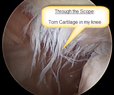
    Here is a picture from inside my knee (unlike years ago, they didn't have to rip me open to gain access for the picture or the repair). Less damage, less time, less drugs, less recovery.


    130113 Knee Surgery


    Bottom-Line: I walked over 2,500 steps the day after the surgery.  This time, my son and I had a burger on the way home from his surgery.

    Whether it is minimally invasive surgical instruments, or linking big data and elastic computing … Technology is a resource-liberating mechanism. It can make the 'once scarce' the 'now abundant' (or 'readily accessible') … and a lot less painful.

    Pretty Cool!

    Enhanced by Zemanta
  • How You’ll Probably Die, Visualized

    Bad news sells.  All the talk of bombings, health scares, and obituaries can make a person contemplate their impending death.
     
    Good news … There is an infographic for that.

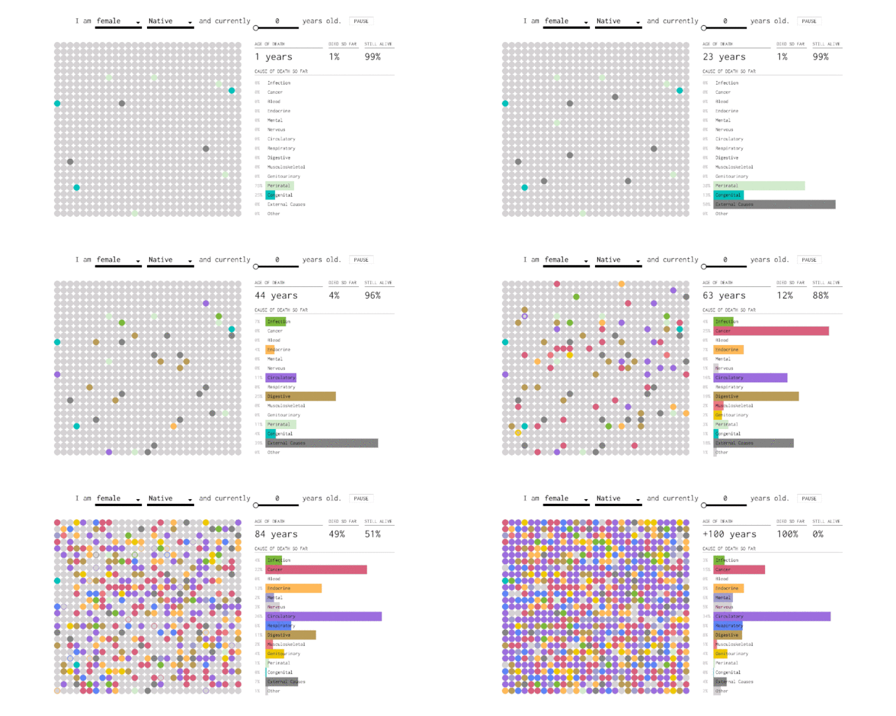
    Flowing Data has previously visualized when we'll die and how our loved ones will die.  Now, they have put together an interactive infographic that charts out how you will likely die, based on how many years you've lived.

    160123-how-you-will-die

     via Flowing Data.

    Here's how it works: go to the infographic on the Flowing Data page and enter your sex, race, and age into the blanks at the top of the infographic. On the left side, each dot represents the death of a simulated self, and the color of each dot corresponds to a cause of death (infection, cancer, circulatory problems, external causes, etc.). As each year passes, more of your simulated selves die. On the right side, a bar graph keeps tabs on your cumulative percentages. When the animation ends (at year 100), you're left with the percent likelihood that you will die of each cause.

    It's an interesting way to visualize the data because it shows not only your chances of dying from a certain disease but your likelihood of dying in general during certain phases of your life.

    The results have one pretty obvious takeaway—your chances of dying increase as you age—but it's fascinating to watch how the chances change in different age groups. Shift the age to 0, and you'll see that once you get past year one, the dots accumulate slowly over the next few decades (chances of death, from anything, are low). Past 30, the dots change color more quickly (you get the point).

    Ultimately, we all have to go one way or another.

    Let's just hope it is later.

  • 2015 Was an Amazing Year for Science [Video]

    Lots of people thought last year was tough.  

    There were lots of great things too.

    Here is a quick video highlighting some of the amazing breakthroughs achieved in science and technology.

    Fun to watch … Lot's of innovative ideas.


    via Yahoo News.