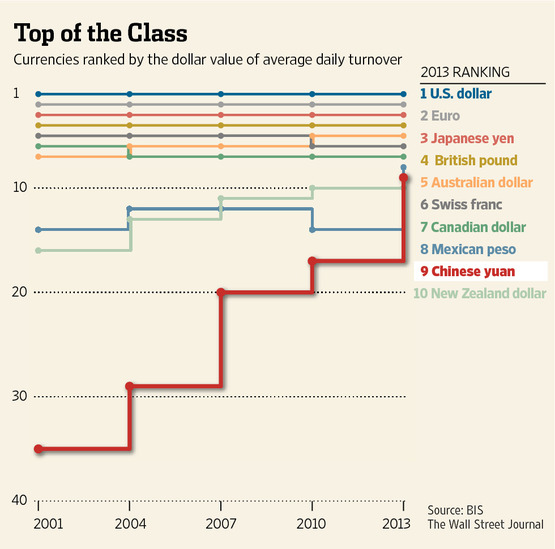
The Chinese yuan has vaulted into the Top-10 of most frequently traded currencies for the first time, the Bank for International Settlements said in its foreign exchange survey.
Clearly, this is a trend worth noting.
The Chinese yuan has vaulted into the Top-10 of most frequently traded currencies for the first time, the Bank for International Settlements said in its foreign exchange survey.
Clearly, this is a trend worth noting.
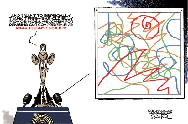
Sometimes confusion precedes a breakthrough – other times …
Here are some of the posts that caught my eye. Hope you find something interesting.
Talk about a flight to safety … August saw the biggest cash withdrawal from all U.S. exchange-traded funds in over three years. Likewise, scared investors triggered the largest outflows from US equity funds in the last five years.
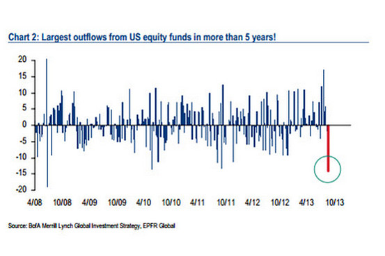
Think of it as a flight to cash as retail investors dump risk assets.
The question is whether this marks the beginning of a new trend, or just nimble trading in the face of perceived danger?
Joshua Brown, who blogs under the moniker "The Reformed Broker," tries to put things in perspective with this handy guide to market pull-backs.
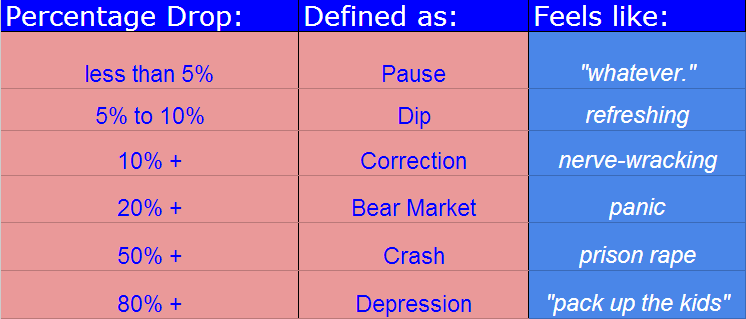
With less than a five percent pull-back, it is a little early to trot out words like "correction."
As to whether we could see a correction (or worse, a bear market or even a crash), the answer is that it is always possible. Nonetheless, most corrections do not become crashes, and over time, every single one of them turned out to have been great buying opportunities.
Apparently not everyone is worried.
According to Bespoke's Bank and Broker CDS (credit default swap) Index, however, credit traders do not seem too worried.
The chart below measures default risk for the major financial firms around the world. Default risk for the financials typically spikes when stocks fall and vice versa.
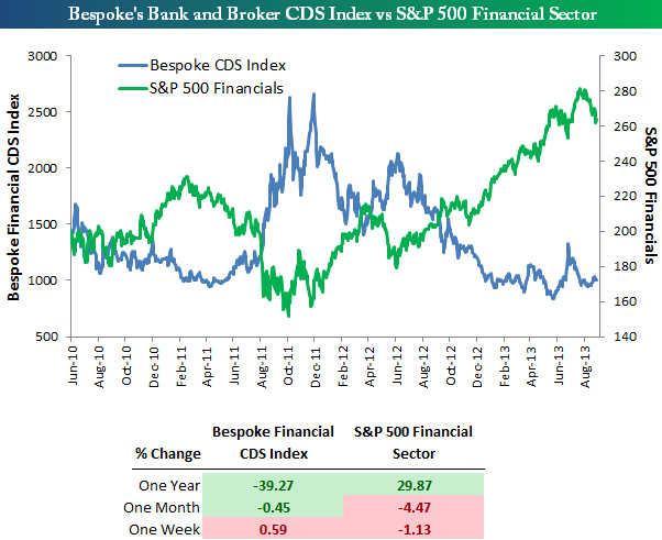
Throughout 2013, the credit markets have become as comfortable with financial stocks as they've been since before the financial crisis of 2008/09. During the stock market pullback we saw in June, default risk picked up a bit, but during the most recent pullback, we've seen default risk trade sideways. Over the last month, the S&P 500 Financial sector is down 4.47%, but Bespoke's CDS Index is actually down 0.45% as well. So, for whatever the reason, the credit markets don't think there's reason to be concerned just yet.
What about you?
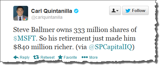
As we head into Labor Day, think about Steve Ballmer … By retiring (or the Market's response to the announcement of his retirement), he made himself nearly $1 billion richer. Nice job.
Here are some of the posts that caught my eye. Hope you find something interesting.
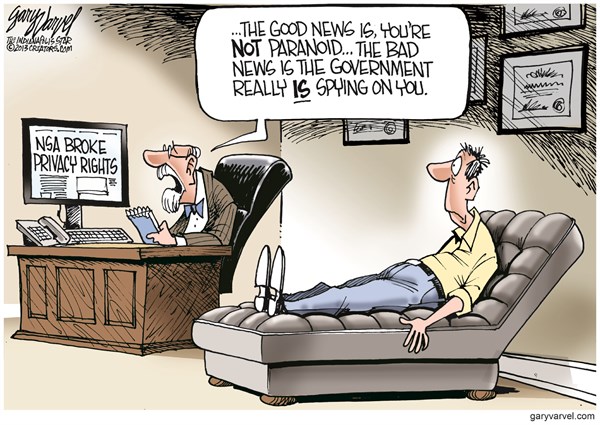
There is Good and Bad News … Which do you want first?
Here are some of the posts that caught my eye. Hope you find something interesting.
When you hear a reference to how the market is doing on the news, it is pretty common for the report to reference the performance of the Dow Jones Industrial Average. The Dow is a price-weighted measure of 30 U.S. blue-chip
companies. It covers all industries with the exception of
transportation and utilities. While this index is not as broad a representation of the US economy as the S&P 500, the Dow's performance typically tracks the S&P 500 pretty closely.
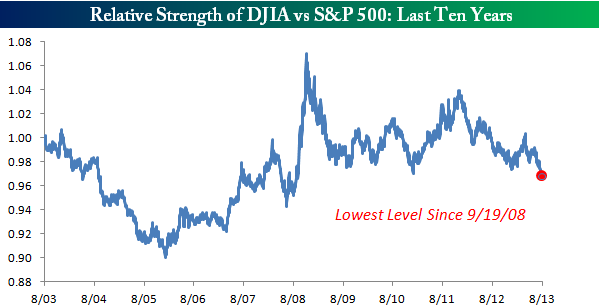
Recently, however, the blue-chip Dow has been a notable laggard compared to the broader S&P 500.
The chart below shows the relative strength of the DJIA vs. the S&P
500 over the last ten years. When the line in the chart is rising it
indicates the DJIA is outperforming, and when the line is falling the
DJIA is lagging.
As you can see, in the last several months the DJIA has been underperforming to such a large degree that the relative strength vs. the S&P 500 is at its lowest levels since the depths of the Financial Crisis.
Do you take that as a bullish sign for the broader market, or early indicator that we are in for a lull before the next move up?
The CFTC releases data on the positions of "Smart Money"
commercial hedgers in the Dow Jones Industrial Average and Nasdaq 100
futures contracts.
According to SentimenTrader, extremes in
hedgers' positions in the futures have been good clues to the future
prospect for stocks in the intermediate-term.
For example, the chart below shows that there were heavy short positions last September, immediately
preceding a correction. In addition, there was a near net long position last November,
immediately preceding a rally. Finally, look at the record net short in
May right before another rough few weeks for stocks.
Obviously, we are close to those levels again.
Neither of the recent record short positions by commercials marked a major market peak. At its worst point during the next 4-8 weeks, the S&P 500 lost 4% – 6% before recovering … painful but not damaging.
Still, it is prudent to notice these kind of early indicators. However, remember that the trend has been bullish recently. Price is the primary indicator, and until it breaks down, expect dips to be met with buying.
Some people are reacting like Bernanke said "On the count of three … run."
Here are some of the posts that caught my eye. Hope you find something interesting.
How long would it take for an average person to earn a million dollars?
To find out, the Economist looked at how much the main breadwinner in an average household makes each year (before tax).
On this measure, America creates the swiftest millionaires, and also the most (around 5m households, or 4% of the total). South of the border, Mexicans can expect to work for three centuries to earn the same amount.
This chart displays the price of the Dow going all the way back to 1885 — and adjusts it for inflation. Clearly, if you do that, it is lower now than it was 13-years ago.
via Global Financial Data via Kimble Charting.
But, does the series of lower highs (marked at the far right of the chart) imply a meaningful technical analysis resistance level? Moreover, can you safely infer that the Dow is 'struggling' with that level? I don't think so.
Technical analysis is supposed to help you understand, and respond intelligently, to what is happening in the market. This pattern seems more coincidental, rather than causal.
Support and resistance zones supposedly reflect meaningful price points where a genuine disagreement between the Bulls and Bears is contested. I doubt this pattern was caused by Traders making big bets based on inflation-adjusted charts.
Consequently, I view this as interesting, but not tradeable, information … What about you?