Market Commentary

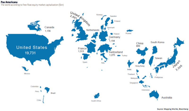
  • Here is a Map Showing Countries Scaled Based on the Size of Their Stock Markets

    There has been a lot of news lately about global markets … and how something that happens in one affects the others.

    This chart is interesting because it puts the world's markets in a different perspective.

    It shows the world according to free-float equity market capitalization in billions of dollars measured by the MSCI


    150906 Map Showing Countries Scaled to Equity Market Capitalization


    From BofAML’s Transforming World Atlas

    The US, with a market cap of $19.8 trillion, is the biggest and represents 52% of the world's market cap. Japan is in second place at $3 trillion, followed by the UK at $2.7 trillion, and then France at $1.3 trillion.

    Notably, Hong Kong's market cap is nearly the same size of China (both of which are significantly smaller than countries like the US and Japan). 

    Meanwhile, Russia, which has a bigger surface area than Pluto, is about the same size as Finland in terms of market cap.

    Interesting.

  • Putting This Market Decline in Perspective

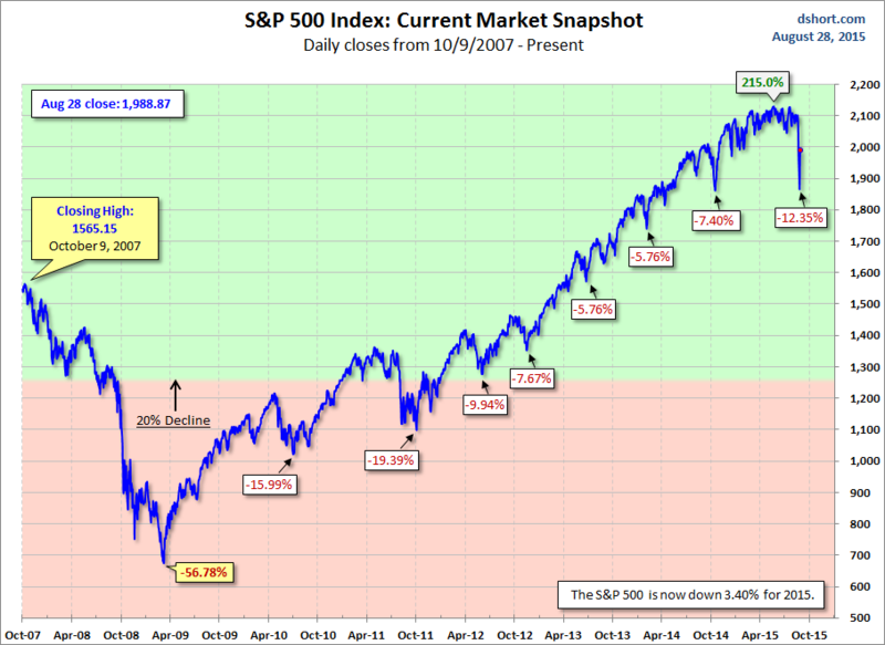
    How bad was the recent decline?  It was the biggest since 2011.

    To put it in better perspective, here is a chart (based on daily closes) showing significant S&P 500 Index declines since the all-time high prior to the 2008 Bear Market.

    The area with the pink background highlights the "Bear Market" area beyond the 20% decline mark.


    150828 SPX Snapshot Showing Draw-Downs

    via Doug Short, Advisor Perspectives.


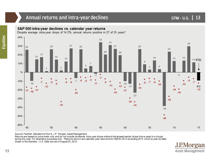
    Buy and Hold investors must stomach significant drawdowns to get their returns — even in 'good' years.

    The chart below shows S&P 500 intra-year declines compared with calendar year returns. The bars represent year-end returns since 1980, while the reddish dots mark each year's market low.


    150828 SP500 Annual Returns vs Intra-Year Declines

    via JPMorgan Guide to the Markets.


    According to Business Insider, here are the historical frequencies of certain market correction levels.

    Since 1900, we've seen:

    • 5% market corrections: 3x per year.
    • 10% market corrections: Once per year.
    • 20% market corrections: Once every 3.5 years.

    The point is that 10-15% pull-backs are normal (and perhaps even healthy) for the market.

    Interesting.

  • The Market’s Slow Roll-Over Just Accelerated

    On Friday, Aug. 21, the Dow Jones Industrial Index fell below 17,000.  That means the Dow has now shed well more than 1,700 points in just 90 days. The day before was the S&P's worst day in 18 months. 

    Things look like they are moving fast.  But, for the past several months, the US markets have s-l-o-w-l-y rolled over — with the Dow leading the way.

    Lots of people are talking about the "Death Cross" that occurred on the Dow's daily chart early last week (when the 50-day simple moving average moved below the 200-day average).  What led up to it?  Here is a chart from a week ago.


    150822 DJI Roll-Over

     via StockCharts.com

    When a market rolls over slowly like this, the first thing to go is the uptrend's momentum.  

    To see this market's declining momentum, note that MACD (shown in the upper indicator window) has been moving lower for months.  

    The next thing that happens is increased interaction with the 50-period moving average.  Followed by tests of the 200-period moving average.  Then comes a definitive break below the 200-period average and then finally the "Death Cross" occurs - which is where we are at with the Dow.

    A longer-term weekly chart shows the slow "text-book" roll-over from a different perspective.


    150822 DJX Weekly

      via StockCharts.com

    The 40-period weekly moving average corresponds to a 200-period daily moving average.  

    This drop takes us back to levels seen at the start of 2014.

    Even though the current trend is clearly down, we are approaching a likely decision zone.  If we don't get a bounce here, the election season will be a different game.  

    What do you think happens next? 

  • Apple Is Enormous. How Enormous Is Apple?

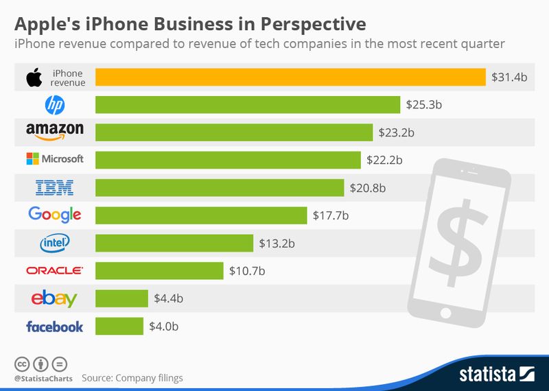
    In case you hadn't noticed, Apple is BIG!  

    It is the biggest company in the world, worth about $725 billion.

    How big is that, really? 


    150816 Apple is Getting Pretty Big

     Photo AP via Gawker.

    PriceWaterhouseCoopers recently released its annual overview of the world’s largest companies.

    Here are some factoids from that report to put Apple's enormity in its proper perspective:

    • Apple is worth almost twice as much as the world’s second largest company, Google (valued at $375 billion).
    • Apple is worth as much as the second and third-largest companies in the world (Google and ExxonMobil) combined.
    • Apple is worth more than Walmart, Facebook, and JPMorgan Chase combined.
    • In the past year, Apple increased in value by more than the total value of General Electric.
    • Apple is worth more than the gross domestic products of Pakistan, Peru, and the Philippines combined.
    • Apple is worth more than the gross domestic products of West Virginia, New Hampshire, Idaho, Delaware, North Dakota, Alaska, Maine, South Dakota, Wyoming, Rhode Island, Montana, and Vermont combined.
    • Apple is worth more than the net worth of the fourteen richest people on earth combined—a list that includes Carlos Slim, Bill Gates, Warren Buffett, Larry Ellison, Michael Bloomberg, the Koch Brothers, and the entire Walton family.
    • Apple is worth more than $100 billion more than the entire 2014 United States defense budget, which includes all spending on the armed forces and Defense department and related departments and all international wars.