Market Commentary

  • The Fate Of Banking: A Brief Look at Silicon Valley Bank

    This week, the rapid collapse of Silicon Valley Bank (“SVB”) stunned the venture capital and startup community.  SVB customers initiated withdrawals of $42bn in a single day (a quarter of the bank’s total deposits), and it could not meet the requests.  By Friday, the Federal Deposit Insurance Corporation (the “FDIC”), the US bank regulator that guarantees deposits of up to $250,000) declared SVB insolvent and took control.  The run was so swift SVB’s coffers were drained in full, and the bank carried a “negative cash balance” of nearly $1bn.

    Silicon Valley Bank’s death spiral started on Wednesday when it told investors that it needed to raise over $2 billion … in large part due to unforced errors.  To start, its balance sheet took a massive hit because of inflation and the subsequent rise in interest rates.  Deposits in the bank grew massively from 2019 to 2021, and interest rates were low, so the bank heavily invested in treasury bonds.  Those bonds were yielding an average of only 1.79% at the time.  When the Fed jacked up rates, the approximately $80 billion SVB had in bonds cratered in value.  Suddenly, SVB customers began a hysteric bank run, ultimately withdrawing $42 billion worth of deposits by the end of Thursday.  By Friday, the FDIC had seized the bank in the most significant failure since the Great Recession.  To make matters worse, 97% of deposits in the bank were above the FDIC insurance threshold and thus uninsured.

    When I started writing this article, it was unclear what would happen to the thousands of VCs, PE Funds, and startups heavily reliant on SVB.  Over 65,000 startups were worried about missing payroll, and it was all dependent on the whim of the FDIC.  Luckily for them, they took aggressive action and agreed to backstop all depositors – hoping to prevent runs on any other financial institutions. 

    Meanwhile, the Dow posted its worst week since June on the back of the big banks being hit with big losses. 
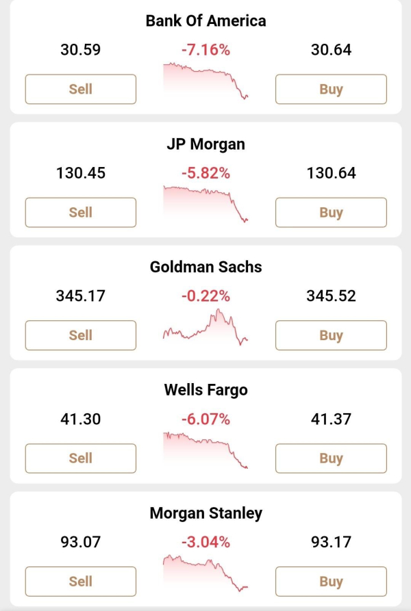
     

    IMG_1718


    The FDIC stepping in is part of a broader effort by regulators to reassure customers that their money is safe.  For example, the US central bank added it was “prepared to address any liquidity pressures that may arise.”

    The Fed’s new facility, the Bank Term Funding Program (BTFP), will offer loans of up to one year to lenders who pledge as collateral US Treasuries, agency debt, mortgage-backed securities, and other “qualifying assets.”

    Those assets will be valued at par, and the BTFP will eliminate an institution’s need to quickly sell those securities in times of stress.  The Fed said the facility would be big enough to cover all US uninsured deposits.  The discount window, where banks can access funding at a slight penalty, remains “open and available,” the central bank added.

    Officials on Sunday said that the taxpayer would bear no losses stemming from the resolution of deposits.  A levy on the rest of the banking system would fund any shortfall.  They added shareholders and certain unsecured debtholders would not be protected.

    A Look at How This Happened

    We’ve already touched on the bank run and what caused it … but let’s dive deeper. 

    One of the biggest risks to SVB’s business model was catering to a very tightly-knit group of investors who exhibit herd-like mentalities.  The problem with a business model like that is that when capital dries up, the deposits flee.  Unfortunately, that sounds like a bank run waiting to happen … and it did.

    The situation created a prisoner’s dilemma for depositors: I’m fine if they don’t draw their money, and they’re fine if I don’t draw mine.  But once some started withdrawing, others followed suit.

    Part of what started the run was SVBs decision to search for yield in an era of ultra-low interest rates.  SVB ramped-up investment in a portfolio of highly rated government-backed securities, A significant portion of those in fixed-rate mortgage bonds carrying an average interest rate of just 1.64 percent.  While slightly higher than the meager returns it could earn from short-term government debt, the investments locked the cash away for more than a decade and exposed it to losses if interest rates rose quickly.

    When rates rose sharply last year, the portfolio’s value fell by $15bn, almost equal to SVB’s total capital.  If SVB were forced to sell any of the bonds, it would risk becoming technically insolvent.

    Although SVB’s deposits had been dropping for four straight quarters as tech valuations crashed from their pandemic-era highs, they plunged faster than expected in February and March.  As a result, SVB decided to liquidate almost all of the bank’s “available for sale” securities portfolio and reinvest the proceeds in shorter-term assets to earn higher interest rates and improve the pressure on its profitability.

    The sale meant taking a $1.8bn hit, as the value of the securities had fallen since SVB had purchased them due to surging interest rates.

    To compensate for this, SVB arranged for a public offering of the bank’s shares, led by Goldman Sachs.  It included a large investment from General Atlantic, which committed to buying $500mn of the stock.  Although that deal was announced on Wednesday night, by Thursday morning, the deal was failing.  SVB’s decision to sell the securities had surprised some investors and signaled to them that it had exhausted other avenues to raise cash.  Some “smart” VC clients directed their portfolio clients to withdraw their deposits en masse to avoid losing it all.

    What happened was the “perfect storm.” Many say it was predictable, especially after a decrease in regulation (which the bank’s management successfully lobbied for in 2015). 

    For now, SVB seems like an outlier, with its unusual (and specific) clientele.  Still, there’s already nervousness for other small/regional banks … and there’s bubbling fear about the system as a whole. 

    Where Do We Go From Here?

    My first question is, should the FDIC raise the insurance limit above 250K?  While Giannis Antetokounmpo might have his money in 50 banks to keep it insured, it doesn’t seem a reasonable expectation of small companies that need liquidity for payroll and other monthly expenses.  While some might be happy to see a bank potentially penalized for perceived recklessness, you also have to consider the clientele of this bank – many of the innovators that are driving the future of technology (or at least, hoping to).

    My second question is, where were the regulators?  The issues that led to this disaster were pointed out publicly months before this happened.  Are more regulations required to ensure trust in the American financial system?  Or is this a free market where pain and pleasure point out the evolutionary path?

    What happens when another bank fails the same way?  Do we continue to find a way to bail them out?

    Trust in the Fed – and the government as a whole – is low.  It’s one of the reasons why people are so interested in cryptocurrency and the blockchain.  As a result, we’re at a bit of a crossroads.  Various governmental agencies want to assure you your money is safe, but there’s no belief that will always be the case. 

    SVB failed, in part, due to their own mistakes … but they also failed due to herd mentality and negative sentiment.  Had people felt confident in this 40+ year-old bank, business might have continued as usual. 

    And, what does this mean for banks and regulation as a whole?  Perception is often more important than reality in the case of markets, pricing, and a host of other supposedly logic-and data-based decisions.  Clearly, Markets are not rational … that’s why you shouldn’t try to predict them.  Even scarier is the potential lack of trust in banks’ ability to meet the needs of their stakeholders.  There are countless banks with more than 50% of their money in uninsured deposits … will companies want to bank with them if there aren’t safeguards protecting them?

    A big crisis was averted this time … but this won’t be the last crisis for banks. 

    As news continues to shake out, I’ll give more of my thoughts, but for now, I want to watch more and see what changes. 

    For a bonus laugh, here’s Jim Cramer calling Silicon Valley Bank a buy a month ago.


    via CNBC Television

  • Bank Failures Since 2000

    Most of you have probably already seen the news. The second-biggest bank collapse in U.S. History happened in just 48 hours. Two days before that, a crypto bank called Silvergate collapsed. 

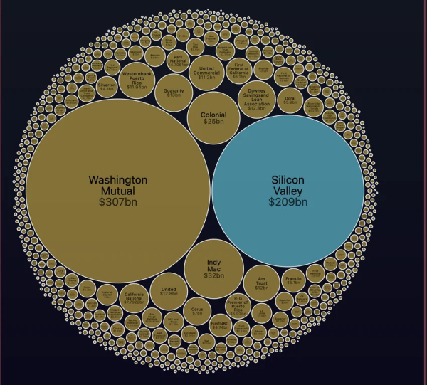
    Here's a chart that shows the size of bank failures since 2000 … It helps put Silicon Valley Bank's downfall into perspective.

    E9jtao3428na1pranshum via Reddit


    For more context, several massive companies have large portions of their money with SVB, including

    • Circle – $3.3 Billion
    • Roku – $487 Million
    • BlockFi – $227 Million
    • and Roblox – $150 million

    In 2008, Washington Mutual was taken over by the FDIC, filed for bankruptcy, and then was bought by JP Morgan.

    Some of the other significant failures of the Great Recession, like Lehman Brothers, aren't in the chart because they were financial services firms – not banks. 

  • What’s In The Box? The Consequences of Labeling

    “Words can be twisted into any shape. Promises can be made to lull the heart and seduce the soul. In the final analysis, words mean nothing.
    They are labels we give things in an effort to wrap our puny little brains around their underlying natures,
    when ninety-nine percent of the time the totality of the reality is an entirely different beast.
    The wisest man is the silent one. Examine his actions. Judge him by them.”

    ― Karen Marie Moning

    The current socio-political climate has me thinking about the consequences of labeling things, creating boxes, and simplifying ideas into news-ready headlines.

    Whats-in-the-box

    via Se7en

    With more news sources than ever and less attention span, you see ideas packaged into attention-grabbing parts.  The focus isn't on education or the issues, but on getting the click, making your stay on their page longer, and sending you to a new article utterly unrelated to why you clicked on the page.

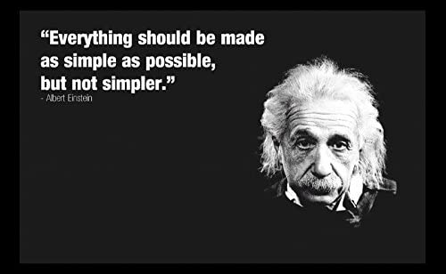
    Complex issues are simplified – not even into their most basic forms – but instead into their most divisive forms … because there's no money in the middle.


    200705 Einstein's Simplicity Quote

    via Quote Investigator

    The amplified voices are those on the fringe of the average constituents' beliefs – precisely because those are the ones who are often the most outspoken.

    Issues that should be bipartisan have been made "us" versus "them," "liberal" versus "conservative," or "right" versus "wrong." The algorithms of most of these sites create echo chambers that increase radicalization and decrease news comprehension.  Identity politics have gotten so strong that you see families breaking apart and friend groups disintegrating … because people can't imagine sharing a room with someone they don't share the same values as. 


    Neitzche

    via BrainyQuotes.

    In psychology, heuristics are mental models that help you make decisions easier.  They're a starting point to save mental bandwidth, allowing you to spend more brain cycles on the important stuff.

    That's a great use of "boxes" and "simplification"… but it shouldn't preclude deeper thought on important issues. 

    In an ideal world, we would all have the bandwidth to view each case of an issue as a whole issue within itself.  Most things are nuanced, and the "correct" answer changes as you change your vantage point.

    I recognize that's not realistic.

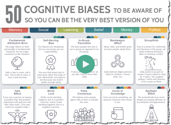
    Instead, I encourage you to remember to continue to think and learn … even about things you already knowConfirmation Bias is one of the more common forms of cognitive bias.  Here is an infographic that lists 50 common cognitive biases.  Click to explore further.

    200705 50 Cognitive Biases Small
    via VisualCapitalist

    Important issues deserve more research.  New insights happen between the boundaries of what we know and don't.  Knowledge comes from truly understanding the border between what you are certain and uncertain about. 

    I challenge you to look beyond the headlines, slogans, and talking points you like most.  Look for dissenting opinions and understand what's driving their dissent.  Are they really blind or dumb (or are their value systems just weighted differently)?

    Not everything needs to be boxed.  Not everything needs to be simple.  You should explore things and people outside of your comfort zone and look to see things from their point of view … not your own. 

    Applying This Lesson  

    “I am ashamed to think how easily we capitulate to badges and names, to large societies and dead institutions.”
    ― 
    Ralph Waldo Emerson, Self-Reliance

    I love learning a lesson in one space and applying it to other spaces.  It's one of the cool things about AI.  An algorithm can learn rules in the construction space that may help in the medicine or trading space.  Everything's a lesson if you let it be.

    In that vein, the lesson on labeling also applies to yourself and your business.  Don't get me wrong – naming things is powerful.  It can help make the intangible tangible.  However, don't let the label (or your perception of the label) stop you from achieving something greater. 

    Many things are true because we believe them to be, but when we let go of past beliefs, the impossible becomes possible, and the invisible becomes visible.  

    We are our choices … and you can make choices today that change who you are (and what you or your business is capable of) tomorrow. 

    Hope that helps – Onwards!

  • The “Chart Of The Century” in 2023: A Look At Consumer Price Inflation

    This post considers the “Chart of the Century” created and named by Mark Perry, an economics professor, and AEI scholar.  This chart has gotten a lot of attention because it’s loaded with information regarding the challenges faced by the Fed and other Washington policymakers.

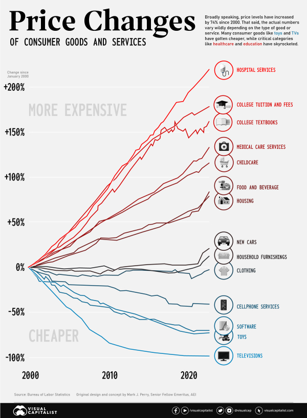
    VisualCapitalist put together the most recent version of this chart.  The most current version reports price increases from 1998 through the end of 2022 for 14 categories of goods and services, along with the average wage and overall Consumer Price Index.

    It shows that prices of goods subject to foreign competition — think toys and television sets — have tumbled over the past two decades as trade barriers have come down worldwide.  Costs of so-called non-tradeable items — hospital stays and college tuition, to name two — have surged.

    From January 1998 to June 2019, the CPI for All Items increased by approximately 74% (up from 59.6% in 2019 when I last shared this chart).  The graph displays the relative price increases for 14 selected consumer goods and services and average hourly earnings.

    Lines above the overall inflation line have become functionally more expensive over time, and lines below the overall inflation line have become functionally less expensive. 


    Price-changes-goods-servicesvia VisualCapitalist

    At the beginning of 2020 (when I shared the 2019 post), food & beverages and housing were in line with inflation.  They’ve now skyrocketed above inflation – which helps to explain the unease many households are feeling right now. 

    There are a lot of ways to take this chart.  You can point to items in red – whose prices have exceeded inflation as government-regulated or quasi-monopolies.  You can point to items in blue as daily commodities that have suffered from ubiquity, are subject to free-market forces, or as goods that are subject to foreign competition and trade wars.  Looking at the prices that decrease the most, they’re all technologies.  New technologies almost always become cheaper as we optimize manufacturing, components become cheaper, and competition increases.  From VisualCapitalist, at the turn of the century, a flat-screen TV would cost around 17% of the median income ($42,148).  In the early aughts, though, prices began to fall quickly.  Today, a new TV will cost less than 1% of the U.S. median income ($54,132).

    Compare “tradable” goods like cell phones or TVs (with lots of competing products) to less tradable “goods” like hospital stays or college tuition, and unsurprisingly they’ve gone in opposite directions.  In 2020, I asked what the Coronavirus would do to prices … and the answer was less than I would expect.  If you don’t look at the rise in inflation, but instead the change in trajectories, very few categories were affected heavily.  While hospital services have skyrocketed since 2019, they were already skyrocketing. 

    There are a lot of complex economic relationships displayed in this chart, and we’ve only covered the basics. 

    What did you take from the chart?

  • My Thoughts On ChatGPT and the AI Revolution

    Last week, I shared a post about the rise of ChatGPT. To summarize … new AI tools (like ChatGPT) are cool, but they can be a distraction if you're not focused on your actual business goals.  Likewise, those tools seem smart, but they are not smart enough to replace you. 

    Below is a video containing an edited version of my contributions about using AI in business at a recent Genius Network meeting.


    via GeniusNetwork.

    With something as powerful and game-changing as AI, smart people find a way to take advantage of it (rather than finding ways to avoid or ignore it).

    If you keep your head in the dirt, you'll get left behind like Blockbuster, Kodak, or RadioShack. 

    With that said, one of the key things I've noticed about new tech is that there's massive churn.  You've seen it with the blockchain and cryptocurrencies.  The companies, products, and modalities that pioneer the industry aren't always the ones who make it.  I think it's because they focus on technology instead of solving their customers' real problems.

    Pioneers often end up with arrows in their backs and blood on their shoes.  Too often, this causes them to give up before they achieve real and lasting success.

    You don't have to rush, even if it feels like you're falling behind.  To use a surfing metaphor, you shouldn't ignore the coming waves, but you can certainly take the time to wax your board, get in the ocean, and choose which wave you want to ride. 

    You can catch the little waves and take advantage of ChatGPT or Midjourney, but as a final reminder, if everyone is doing it, it's not a competitive advantage … it's the playing field. 

  • Tech Trends To Watch in 2023

    Technology is on the mind of most people I have talked to recently. Even with Big Tech letting go of droves of employees, the innovation happening in the world is impressive. 

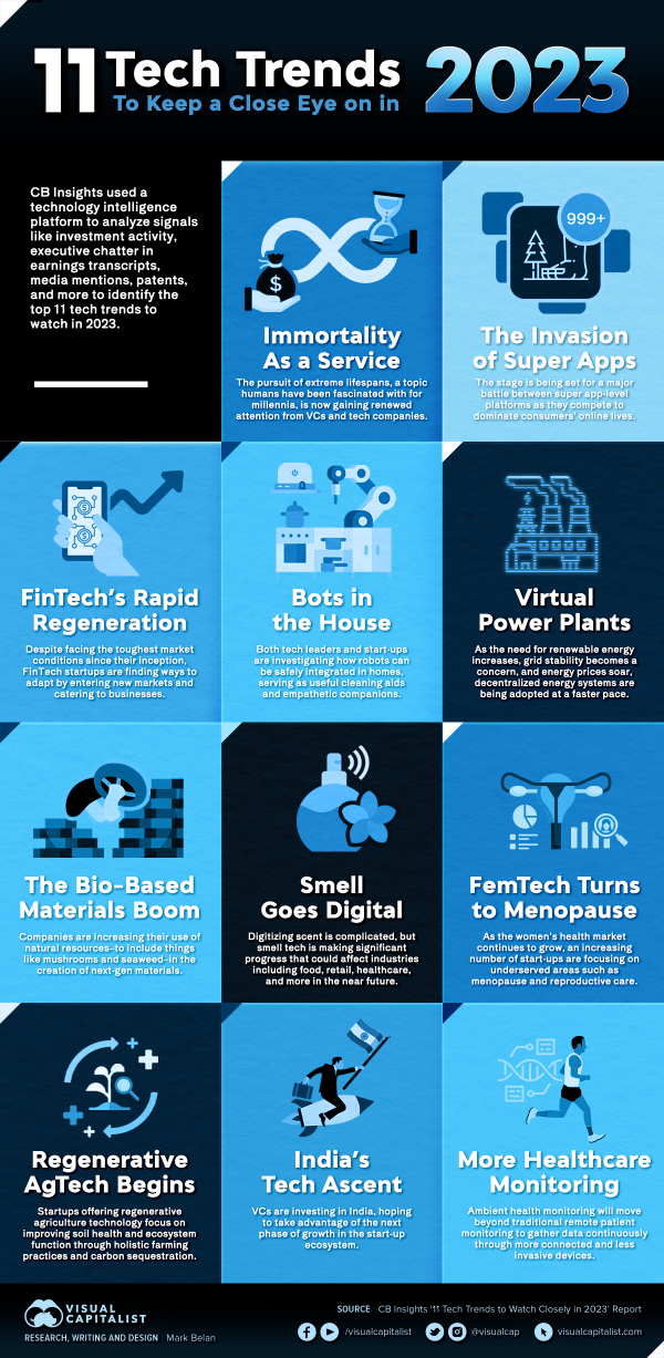
    VisualCapitalist put out a list of 11 trends to look out for this year. Check it out

    Tech-Trends-2023

    via visualcapitalist

    As always, no list gets it entirely correct. Lists like this are made to spark interest and influence the direction of tech development. However, I've been impressed with what visualcapitalist has gotten right in the past. 

    A lot of the trends on the list make sense. India has been a massive investment space in tech over the last few years, and it's about time for more results to show. Healthcare is a massive investment space, and we're seeing a lot of innovation go to the medical space before migrating to other industries … on top of health monitoring, other specifics like menopausal care could see more investment, especially with an increase in women-led and women-focused companies. 

    As well, Fintech has been hit hard since 2020. Many of the bulwarks of the industry have been sliced down as a result of covid-19, market turmoil, the Russia/Ukraine conflict, and more. These years haven't been without learnings. New market conditions require new approaches, but the past 2+ years have been a great opportunity for adaptation and advancement. After winter comes spring. 

    What trends do you think are missing, and what trends do you think won't come to fruition?

  • The Big Mac Index: Worth Paying Attention To?

    Last week, I wrote about various “indicators” for markets that just don’t make sense — like the Superbowl Indicator.  The lesson from those indicators is that we crave order and look for signs that make markets seem a little bit more predictable, even where there are none.  This is especially true in complex systems like the stock market, where so many variables and factors are at play that it can be difficult to predict or explain why things happen.

    Now, it doesn't mean there aren't patterns – and benefits to watching them. Warren Buffet has proven that. In order to improve your understanding of "markets" you can focus on the fundamentals of individual companies and industries rather than broader market trends. By conducting thorough research and analysis of financials, management, and competitive landscapes of companies, you can make informed decisions about which stocks to buy or sell. Another way to improve your understanding of the market is to focus on long-term trends and avoid getting caught up in short-term fluctuations.  It's about focusing on what doesn't change – instead of what does. But, ultimately, you should realize that if you don't know what your edge is … you don't have one. And, market movements are getting faster, more automated, and harder to predict over time, not less. 

    With that said, Wall Street is still inundated with theories that attempt to predict the performance of the stock market and the economy.  More people than you would hope, or guess, attempt to forecast the market based on gut instinct, ancient wisdom, and prayers.

    While hope and prayer are good things … they aren’t good trading strategies.

    It’s true that there are many indices and economic indicators that can provide valuable insights into the workings of economies and markets.  While some of these indices may seem “out there,” or even frivolous, they can often shed light on underlying economic trends and realities.

    One example of this is the Big Mac Index, which is published annually by The Economist.  This index is based on the idea of purchasing power parity, which suggests that exchange rates should adjust to ensure that the price of a basket of goods is the same in different countries.  The Big Mac Index uses the price of a McDonald’s Big Mac burger as a proxy for this basket of goods.  It compares the price of a Big Mac in different countries to determine whether currencies are overvalued or undervalued.

    While the Big Mac Index is not a perfect measure of purchasing power parity, it can provide valuable insights into the relative value of different currencies and the economic factors that influence exchange rates.  By looking beyond the headline numbers, and digging into the underlying data and trends, investors and economists can gain a deeper understanding of the forces shaping the global economy.

    Ultimately, the key to using economic indicators like the Big Mac Index is to approach them with a critical eye and a willingness to dig deeper.  By looking beyond the surface level and using data-driven analysis to understand the underlying trends and drivers of economic performance, we can gain a more accurate picture of the economic realities shaping the world around us.

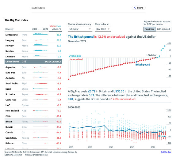
    In 2020, when I last talked about the Big Mac Index, the Swiss Franc was 20.9% overvalued based on the PPP rate.  That math was based on the idea that, in Switzerland, a Big Mac costs 6.50 francs.  In the U.S., it costs $5.71.  The implied exchange rate was 1.14, and the actual exchange rate was 0.94 – thus, 20.9 was overvalued.  At the time, the most undervalued was South Africa. 

    As of the end of 2022, The Swiss Franc is still the most overvalued but has now increased to a whopping 35.4%.  Meanwhile, the South African rand has “increased” to only 45.9% undervalued, making the Egyptian Pound the most undervalued currency at 65.6%.

    Click the image below to see the interactive graphic.

    Screen Shot 2023-02-17 at 3.45.08 PM

    via The Economist

    One of the main limitations of the index is that the price of a Big Mac reflects non-tradable elements such as rent and labor, which can vary widely across different countries and can distort the accuracy of the index.  This means that the index is most useful when comparing countries that are at roughly the same stage of development and have similar economic structures and cost of living. Consequently, while it can provide some useful insights into exchange rates and currency values, it is important to recognize that it is only a rough guide and has some limitations when comparing countries.

    Another limitation of the index is that it does not consider factors such as taxes, trade barriers, and transportation costs, which can also affect the relative value of currencies.  These factors can be especially important in countries highly dependent on imports or exports. They can lead to significant disparities in currency values that are not reflected in the Big Mac Index.

    Despite these limitations, the Big Mac Index can still be useful for gaining insights into global economic trends and currency values.  By using the index in conjunction with other economic indicators and data sources, investors and economists can achieve a more comprehensive understanding of the forces shaping the global economy and make more informed decisions about how to invest their money.

    Obviously, there are more factors at play if something can be significantly overvalued or undervalued for multiple years without significant consequences. 

    It is not meant to be the most precise gauge, but it works as a global standard because Big Macs are global and have consistent ingredients and production methods.  It’s lighthearted enough to be a good introduction for college students learning more about economics. 

    You can read more about the Big Mac index here or read the methodology behind the index here.

  • The Importance of the Super Bowl

    Thirty years ago, the Cowboys played the Bills in the Super Bowl.  As a Cowboys fan, I wanted to watch the game, but my second son was scheduled to be born that day. 

    Luckily, our doctor said, “if you want me to be the one to deliver your baby, you need to induce early.” 

    So, I got to watch the Cowboys win with my youngest in hand … while his mother shot me angry looks as I woke him up with my screaming. 

    That anchors the Super Bowl as a special day for me … but some believe it’s also a "special day" for markets. 

    The theory is a Super Bowl win for a team from the AFC foretells a decline in the stock market – while a win for the NFC means the stock market will rise in the coming year.  There is one big caveat … the history of that "indicator" counts the Pittsburgh Steelers as NFC because that’s where they got their start.  If you accept that caveat, it has been on the money 33 years out of 41 – an 80% success rate.  Sounds good, right?

    Come on … you know better!

    There is no substantial evidence to suggest that the outcome of the Super Bowl has any significant impact on stock market returns. 

    The stock market is driven by many factors, including economic data, company earnings, and overall market sentiment, rather than the outcome of a single sporting event.

    Ultimately, it’s important to recognize that the stock market is a complex system – and that no single event, such as the Super Bowl, can predict its performance.  While the Super Bowl may be a fun event and a source of excitement for many people, it’s not a reliable indicator of stock market returns.

    Here are some other “fun” stock market fallacies:

    Back to Reality

    Rationally, we understand that football and the stock market have nothing in common.  And we probably intuitively understand that correlation ≠ causation.  Yet, we crave order and look for signs that make markets seem more predictable.

    The problem with randomness is that it can appear meaningful. 

    Wall Street is, unfortunately, inundated with theories that attempt to predict the performance of the stock market and the economy.  The only difference between this and other theories is that we openly recognize the ridiculousness of this indicator.

    More people than you would hope, or guess, attempt to forecast the market based on gut, ancient wisdom, and prayers.

    While hope and prayer are good things … They aren’t good trading strategies.

    As goofy as it sounds, some of these “far-fetched” theories perform better than professional money managers with immense capital, research teams, and decades of experience.

    Here is something to ponder…

    What percentage of active managers beat the S&P 500 in any given year?

    … Now, what percentage beat the S&P 500 over 15 years?

    The percentage of active managers who beat the S&P 500 in any given year can vary, but it is typically low. According to research by S&P Dow Jones Indices, the majority of active managers underperform the S&P 500 over the long term.

    For example, in 2020, only 24.5% of large-cap fund managers outperformed the S&P 500. In 2019, the figure was slightly higher at 28.2%, but in 2018 it was just 17.2%. These figures are representative of a broader trend in which a relatively small percentage of active managers outperform the benchmark index in any given year.

    Over 15 years, the answer is about 5% of active managers are able to beat the performance of the S&P 500 Index (and that’s in a predominantly bull market). That’s significantly worse than chance.  It means that, in general, what they’re doing is hurting, not helping. 

    It's worth noting that these figures represent the average performance of active managers across all market segments and time periods. The percentage of managers who outperform the S&P 500 in any given year can be influenced by a number of factors, including the overall performance of the stock market, the specific market segment being analyzed, and the time period being considered.

    In conclusion, while there are some active managers who outperform the S&P 500 in any given year, the majority of them underperform the benchmark index over the long term.

    6a00e5502e47b28833022ad3bb6fb9200d

    via Gaping Void

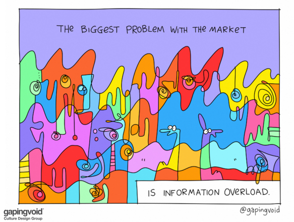
    There’s simply too much information out there for us to digest, process, rank, and use appropriately.

    In 2009, I wrote an article about how things aren’t always what they appear to be.  In it, I mentioned the human predisposition to find patterns in data.  At the time, I was still analyzing and marking up charts looking for patterns … but I was also using early AI and computers to find better patterns and remove my fear, greed, and discretionary mistakes. 

    I suspect that the desire to find patterns is the same element of human nature that leads people to become superstitious, read their horoscope, or go to a fortuneteller.  It is also the reason so many authors and speakers sell access to their chart patterns that supposedly work. The successes are much more startling than the failures.  So the successes stand out.
        -"Things Aren't Always What They Appear To Be"

    Today, my stance is even more extreme.  Every second you spend looking at a market is a second wasted.

    There are people beating the markets — not by using the Super Bowl Indicator … they’re doing it with more algorithms and better technology. 

    There will never be less data or slower markets.

    Onwards.

  • Time’s Ticking On The Doomsday Clock

    The Doomsday Clock was created by a group of atomic scientists in 1947 to warn the public about the dangers of nuclear weapons.  The clock is a metaphor, with midnight representing the catastrophic destruction of the world.  The closer the clock is to midnight, the closer humanity is to a global catastrophe.

    Nuclear war is still a significant risk, but not the only one.  A list of the biggest existential risks to humanity includes:

    1. Nuclear War: The threat of nuclear weapons and the possibility of a global nuclear war continue to pose a significant risk to humanity.

    2. Climate Change: Climate change is a growing threat to humanity and the planet, causing rising sea levels, extreme weather events, and loss of biodiversity.

    3. Pandemics: The rapid spread of infectious diseases, such as COVID-19, highlights the vulnerability of the human species to pandemics.

    4. Artificial Intelligence: The development of advanced AI systems has the potential to pose existential risks if not properly regulated and controlled.

    5. Biotechnology: The rapid advancement in biotechnology, including genetic engineering and synthetic biology, has the potential to bring about new risks to humanity.

    6. Natural Disasters: Natural disasters such as earthquakes, tsunamis, and volcanic eruptions can cause widespread destruction and loss of life.

    Some would argue that our exploration of space is another potential threat.  So, these are just a few examples, and the list is not exhaustive. Addressing these risks requires a global effort and cooperation between nations, organizations, and individuals.

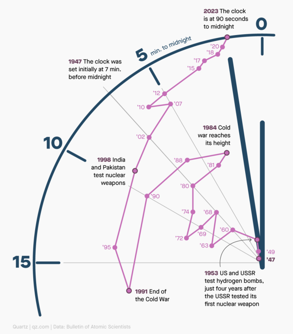
    The Doomsday Clock was initially set at 7 minutes to midnight in 1947.  In the 76 years since it launched, the hands have been adjusted 25 times.  The most recent change, in 2023, moved the clock from 100 seconds to midnight to 90 seconds.  This was a small but significant shift.

    Flowing Data put together a chart to show the clock's movement since inception. 

    Doomsday-shiftsvia flowingdata

    The Doomsday Clock provides a long-term perspective on the dangers facing humanity.  Despite the seemingly small number of seconds remaining to midnight, it serves as a reminder of the urgency to act.  We can move towards a brighter future by acknowledging the potential consequences of our actions (or inactions).  Advancements in fields such as medicine, technology, and human potential offer hope and the potential to overcome even the most pressing challenges.  With collaboration from the brightest minds across the world and private industry, we have the ability to solve even the world's most significant problems.

    If I have to choose, I always bet on humanity. 

    Onwards!