Market Commentary

  • Weekly Market Commentary from 5/09/08

    While the market did pull back, as expected, it was orderly and relatively mild.

    The chart below shows daily view of a composite of the 5 markets we currently trade. 

    080509_composite_index_above_suppor
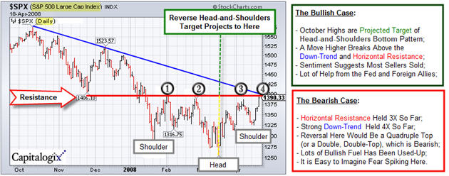
    The Markets are above the red support line and the yellow down-trend;
    both of those are bullish indicators.  Though not on the chart by itself, last week the S&P 500 index could not hold above the 1400 level that we’ve been following.  That is
    worth watching this week.

    Also note that this chart shows that
    the rally from March 10 through last week retraced just over 50% of the
    loss from the October highs. 

    The graphic below is a market heat map from FinViz that shows that last week was good for the Oil & Gas sector (because it shows up as mostly green) and bad for the Financials (shown mostly in bright red).

    080509_finviz_heatmapThis free site has a simple yet powerful stock screener, maps that allow you to see sector and stock rotation, and insider trading info.  It is worth checking-out.

  • Market Commentary as of May 2, 2008

    The Bad News:

    The Good News:

    Somehow the market is finding a way to rise.  It is often tough to remember, yet price is the primary indicator; and it is going up.  That is a good sign, especially during periods of apparent bad news.

    This was another solid week for the major Indices, with virtually every index taking out their respective downtrend-lines for the week. Barron’s called it the best finish of 2008.

    The S&P 500 finally closed above the 1400 level for the first time since early January. If it holds, that upside breakout moved the S&P 500 out of a three-month trading range into an intermediate recovery.  The next major test likely will take place at its 200-day moving average and a trendline drawn over its October/December highs.

    Here is a similar chart of the NASDAQ.

    080502_nasdaq_resistance

    Please answer the poll below.

  • Loonie Commentary on the Dollar

    Canada_cocky_loonie Funny thing happened to me in Canada this week as I got off the plane and exchanged some money. I gave them $140 US – and they gave me $126 Canadian. Huh? That’s Loonie.

    As the Fed hints it may stop easing and the dollar may be bottoming,  an article on Bloomberg notes that "futures traders are betting for the first time since December 2005 that the dollar will gain against the euro."

  • Market Commentary from April 25th

    Bull_and_bear_3dmarketabstract
    We’ve talked about the "line in the sand" (where the bulls and bears are battling at the 1400 level in the S&P 500 index). Well, at the end of this week, we’re still at the same place.

    The emotional momentum of last week has faded some, however the market held up nicely in the face of additional bad news this week. From my perspective, that’s a positive sign.

    I expect a bunch of smaller traders to short the 1400 level into Tuesday’s Fed meeting.  It seems like a safe trade.  So, while a "correction" downward wouldn’t surprise me here; I am not bearish.  In fact, I think a move above that level would trigger a rash of buying (both organic and short-covering) … and is thus more likely.

  • What is a Dollar Worth?

    Crying_dollar_sagging_economy_2
    The Fed meets this week to discuss the manic-depressive nature of our economy. If you are a glass-half-full type of person you could worry about both Recession and Inflation.

    From a trader’s perspective, though, the markets have been trading much better.

    On a related note, I heard lots of talk among traders this week about the Dollar potentially putting in a bottom. We’ll see.

    While I was researching this, I found a site that makes it easy to calculate the affect of inflation. Click the following link to see
    What Is A Dollar Worth?

    There is a fill-in-the-blank calculator that lets you figure-out things like: if you bought a house for $ 54,000 in 1973, then it would cost $262,000 in 2008 dollars. Check it out.

  • Market Commentary from April 18th

    Froghorse_252p_2
    This week I’m going to use an optical illusion to help make a point about the publics’ perception of what is happening in the markets.

    Instead of Bulls and Bears, perhaps the market is like a frog or a horse. 

    It simply depends on your perspective. 

    As you look at the picture on the right, you’ll see a frog sitting on the edge of a pond. 

    However, if you turn the picture (or your head), you’ll see a horse that is poking his head out of the stable.

    Things are not always as they seem on first glance.

    Markets At The Crossroads:  Decision Time:

    As it stands, the Markets have been acting
    quite well.  They continue to rally, even when there is bad news in the
    marketplace.  From a technical point of view, though, we are at a
    crossroads. 

    I prepared the following chart to show the arguments for both the bull and the bear cases.  It is a daily chart of the S&P 500.  The market’s downtrend line, since October, is marked in blue.  The red horizontal line shows that this is the fourth time we’ve hit this area since late January.

    080418_sp_crossroads_630p_2

    The question is whether we go up or down from here.

    Like a serial cliff-hanger, we’ll have to tune-in next week to see if
    anything gets resolved.