
Last week it started to feel like the markets were breaking-down. Most of the major US equity indices broke down through their 50-day moving averages and also below their up-trend lines. Likewise, the Dow is back under 10,000 again.
The chart, below, shows that we are that an important support and resistance level that goes back to November of last year. In addition, we're back to price levels from late July. That means that we've had three months of rally, good news, and talks of "green shoots", with no real price advancement and a decrease of momentum.
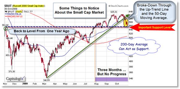
From a technical analysis standpoint, this would be a good place to
reverse and rally. However, longer-term charts and the sheer size of
the recent rally suggests that we might have a little more market
correction to go before the decline reverses.
A Rising VIX Often Means Falling Prices.
The CBOE Volatility Index (better known as the "VIX") is a measure of the implied volatility of
S&P 500 Index options, with very low numbers indicating extreme bullishness
and very high numbers severe bearishness. It is also referred to as the “fear
gauge” of US stock markets and is used as a contrary indicator as it moves
inversely to equity prices. So a rising VIX often means falling prices. As shown below, the VIX spiked to its highest level
since early July.

I'm watching the VIX for clues about the direction of the next big move. If fear subsides quickly, then the rally will likely continue. On the other hand, volatility will increase if the markets remain jumpy.
What's GDP Got to Do with It?
Going back to last week, Bears started jumping in on estimates that GPD would fall from 3.0% to 2.7%. Then GDP came in at 3.5%, and suddenly there were a bunch of headlines and news reports that the Recession was over. As a result, the market blasts 2% higher in one day. My guess, that was more a result of massive short-covering, rather than actual bullish buying behavior.
It's worth noting that the GDP number was annualized. Real GDP growth for the quarter was 0.87%.
So far, the Stimulus spending/ Bailouts have
cost the US more than WWI, WWII, and the New Deal combined… and we get
GDP growth of 0.87% for Q3? That's not a sign of a
strong economy.
Longer Term: How Does This Compare to Other Bear Market Rallies?
Here is an interesting inflation-adjusted comparison of three
Mega-Bear Markets. It
aligns the current S&P 500 from the top of the Tech Bubble in March 2000,
the Dow in of 1929, and the Nikkei 225 from its 1989 bubble high.

Something to keep in mind … while history doesn't always repeat itself … it often rhymes. If so, the next big move is down.
Business Posts Moving the Markets that I Found Interesting This Week:
- 2010 Economic Forecast: Don't Hold Your Breath for Fast Growth. (WP Carey)
- U.K. GDP Numbers Worse Than Most Thought – Down about 5% this Year. (WSJ)
- Bank Failures Hit 106 Year-to-Date - Most Since 1992. (MarketWatch)
- Will Retailers Top Last Year's Holiday Sales? (WSJ)
- The Good, Bad & Exaggerated in Michael Moore's New Film 'Capitalism'. (Wharton)
- Venture Firms Making Bets On Forex Start-Ups. (WSJ)
- Ten Odd Economic Indicators: From Hot Waitresses to Men’s Underwear. (Time)
- More Posts Moving the Markets.
Lighter Ideas and Fun Links that I Found Interesting This Week
- Ten Things Every Good Business Plan Must Have (Forbes)
- Google, Microsoft Intensify Search Rivalry with Music. (WSJ)
- E Pluribus Tunum: How Not to Price Online Music. (Economist)
- Online TV Leader Hulu Won't Remain Free, Official Says. (WSJ)
- Why We Lie to Our Spouses? (WSJ)
- White House's Fox News Boycott Prompts Network Revolt (HuffingtonPost)
- Secrets of the Centenarians – Life Begins at 100. (NewScientist)
- More Posts with Lighter Ideas and Fun Links.


