Now that the New Year is here, everyone has to get back to work.

What About the Markets?
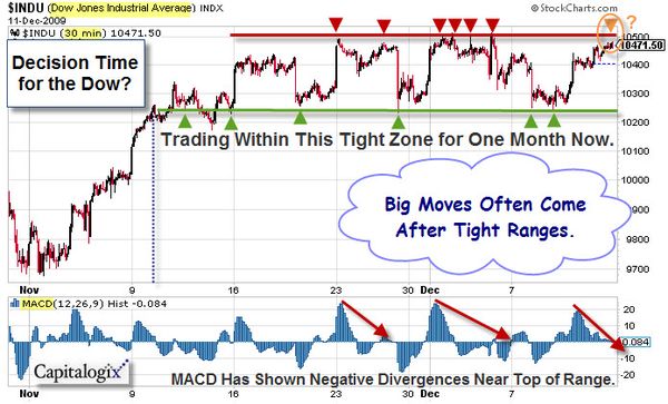
The rally continues. While volume hasn't been that impressive, price continues higher.
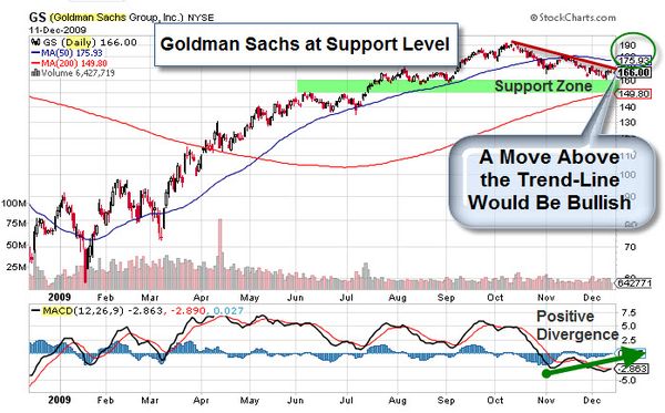
After taking a break, the Financial Sector has picked-up some relative strength and is leading the market higher.

Unemployment Still Factors Into the Equation.
The jobs number came in worse than expected, with continued cuts and unemployment still above 10%. Yet, the market reacted better than I expected to that news.

Joking aside, here is an interactive graphic to dive a little deeper into these numbers. Click on the picture to change the settings yourself.

Efficient Market Hypothesis: The Meltdown’s Biggest Casualty
Here is a video from BigThink about whether the market is as efficient as some economic theory paints it to be. Alan Greenspan said he was shocked "that market players turned out not to be able to take care of their own interests." Perhaps the takeaway of the recent crisis is that individual players (pursuing individual interests), collectively, will not always create an outcome which is good for the collective (or even for those individual players). Consequently, Chrystia Freeland, U.S. Managing Editor of the Financial Times, argues that the Markets needs someone or something to protect the collective interests and outcome.
Now for something a little lighter …
Here is a Preview of Next Year's Review.

Business Posts Moving the Markets that I Found Interesting This Week:
- Ten 'BreakOut!' Business Ideas Of 2009. (Forbes)
- Four Reasons to Remain Wary About an Economic Recovery. (WSJ)
- Will U.S. Home-Sales Data Temper Belief in the Government's Powers? (WSJ)
- John Mauldin's 2010 Forecast – The Year of Uncertainty. (InvestorsInsight)
- Decade Over – Here are 10 Huge Questions that Remain. (Forbes)
- Comprehensive List of 2010 Investment Predictions & Outlooks. (PragCap)
- More Posts Moving the Markets.
Lighter Ideas and Fun Links that I Found Interesting This Week
- Read This Later – How to Combat the Natural Tendency to Procrastinate. (Economist)
- Taming the Digital Distractions That Make Your PC a Time-Waster. (NYTimes)
- Amazon Sold More Kindle Books Than Physical Books On Xmas. (Business Insider)
- Innovation: Where Next for Social Networking? (NewScientist)
- Google Unveils News-by-Topic Service called "Living Stories". (NYTimes)
- More Posts with Lighter Ideas and Fun Links.