Market Commentary

  • Capitalogix Commentary for the Markets – 06/21/10

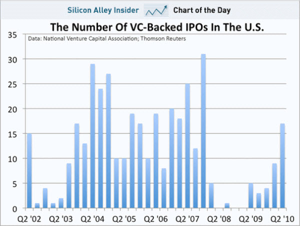
    100619 Weak IPOsInitial Public Offerings are an indicator of market health.  We got an interesting look through the IPO window last week, with six offerings.

    While some were weak, the long-awaited stock market debut of the Chicago Board Options
    Exchange
    had a strong opening reception.

    In general, though, it has been a tough market for IPOs. However, the WSJ argues that this has more to do with fundamentals of the deals than a weak market.

    So, how is the market doing?

    Fighting the 200-Day Moving Average.

    Even people who are not big fans of technical analysis tend to look at the market's 200-day moving average. This is the simply the average of the closes for the previous 200 days. The 200 DMA has a decent track record — when the market is above the 200 DMA, it tends to rally, below it, not so much.

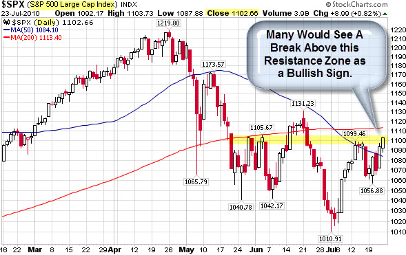
    In the daily chart of the S&P 500 Index, below, the 200 DMA is drawn as a red line.  The recent trades, back above the 200 DMA line, are circled in green with a yellow highlight.

    100619 SP500 Sitting Above Key Levels

    In the past few weks, the S&P 500 has tried to break out above its 200 DMA several times, but each attempt has sputtered out.  Let's see if it holds this time?

    There are a few other bullish reasons for it to hold.  The market has stayed above the light green 1040 support level, despite three tests (marked by the orange circles).  The last two tests count as a double-bottom, which indicates a bullish reversal (especially with price back above the orange-dashed down-trend line and 200 DMA).

    Sentiment towards the U.S. Markets is also getting better.

    The Pendulum Swings: Investors Starting to Pick U.S. Over BRICs.

    Bloomberg reports that the U.S. has supplanted China and Brazil as the most attractive market for investors as confidence in the global economic recovery wanes in the wake of the Greek debt crisis. 

    Almost four of 10 respondents picked the U.S. as the market presenting the best opportunities in the year ahead. That’s more than double the portion who said so last October.

    1006 US Ranked as Best Investment Prospect

    Business Posts Moving the
    Markets
    that I Found Interesting This Week
    :

    • Six Giant Banks Made $51 Billion Last Year; The Other 980 Lost
      Money. (Forbes)
    • Apple Reports 600,000 Orders for New iPhone On First Day. (NYTimes)
    • The Pain in Spain: On the Brink of Seeking Support From The
      Euro-Zone & IMF. (WSJ)
    • Trading Is Approved for Film Futures Contracts. (NYTimes)
    • State Crash Crunch: Arizona Sells Supreme Court Building for 3
      Month's Relief. (GEA)
    • More Posts
      Moving the Markets
      .

    Lighter Ideas and
    Fun Links

    that I Found Interesting This Week

    • I.B.M.'s Watson Supercomputer – Artificial Intelligence Smarter Than
      You Think. (NYTimes)
    • Interactive Map Shows Where Americans Are Moving.  Hint: Not to
      Detroit. (Forbes)
    • Obama's West Point Speech – Parsing the New Security Strategy. (Atlantic)
    • Things People Google When They Think Nobody Is Looking. Funny. (SEOLOL)
    • U.S. Identifies Vast Riches of Minerals in Afghanistan. (NYTimes)
    • More
      Posts with Lighter Ideas and Fun Links
      .
    Enhanced by Zemanta
  • Capitalogix Commentary for the Week of 06/14/10

    The fear, right now, is whether the recent down-turn will continue.  Meanwhile, there are signs of strength giving hope to the bulls.

    For example, disappointing U.S. retail sales data, last Friday, failed to dent the stock market as it closed higher on the day and the week.  That marks the first weekly gain in nearly a month. 

    Last week's market action sets-up some pretty clear decision-zones to watch.

    First, Let's Look at the Dow.

    Despite the recent market correction and fears surrounding Eurozone sovereign debt defaults, the bottom line is that the Dow Jones Industrial Average is only down 10% from its recent peak.  That is not bad, especially considering the length of the preceding rally.

    However, a quick look at the chart shows a series of lower highs and lower lows.  This is the classic definition of a down-trend.  Two other bearish things to notice are that price is still under its 200-Day Moving Average and that volume has been weaker on the recent up days.

    100613 Dow Jones Down-Trend
    On a bullish note, the Dow spent a good day-and-a-half below the 9,900 level, yet, sellers did not appear in force … and buyers once again prevailed. Analysts are likely to see a sustained break above the 10,300 level as a bullish sign.

    RSI Indicates That We Are Still in Bearish Territory for the S&P 500, as well.

    A chart of the S&P 500 ETF indicates that we may have some upside left in the recent bounce.  While the Relative Strength Index indicator remains bearish below its center-line for the SPY, it is close to turning positive.

    According to Arthur Hill at StockCharts.com, bounded momentum oscillators trade within a defined range. RSI trades between zero and one hundred, with fifty as the center-line. Think of this level as the 50 yard line in a football game. The bulls (offense) have the edge when RSI is above 50. The bears (defense) have the edge as long as RSI is below 50.

    In the chart, below, the yellow areas show periods with RSI below 50, which correspond with declines. RSI met resistance near 50 during each decline (red arrows). In fact, RSI met resistance near 50 twice during the current decline, and it is at that level again.

    100613 SPY Relative Strength

    So, while momentum remains bearish as long as RSI is below 50, this
    chart
    shows we are approaching a decision point.

    What Does the Extreme Fear Shown by Option Purchasers Mean for the Market?

    The public often uses the VIX as the standard measure of “fear” in the overall market.  Some prefer to look at option skew instead.  Skew tells the investor how much out-of-the money puts are being bid up versus out-of-the money calls. 

    If an investor is scared about the downside, then they buys puts.  If an investor thinks there is room for upside, then they are willing to buy calls.  SurlyTrader posits that when the difference between the implied volatility of OTM puts dwarves OTM calls, then investors are fleeing for the exits.  As the chart below shows, on May 20, 2010, the skew of 3-month options hit a five-year-high.

    100613 SPX_Skew

    Depending upon valuations and underlying market conditions, the skew can signal either prescient fear or undue panic.  Consequently, if the spike on May 20th is a positive signal, then we should soon find our own local bottom.

    SurlyTrader advises: "If you believe we are close to a bottom, selling OTM puts and buying OTM calls looks very attractive with a steep skew.  Always think about selling insurance when the building is on fire rather than buying insurance after the major damage has already taken place."

    Business Posts Moving the
    Markets
    that I Found Interesting This Week
    :

    • CEOs Made 11% Less in 2009; But Are Riches Ahead Because of Cheap
      Options? (LATimes)
    • Metal Mania Hits Mining Equipment – Many Models Sold Out Until Next
      Year. (Money)
    • Why is Europe Responding So Timidly to Its Economic Crisis? (Slate)
    • Germany's 'Desperate' Short Ban Triggers Capital Flight. (Telegraph)
    • Inflation in the U.S. Slides to its Lowest Level in 44 years. (WSJ)
    • More Posts
      Moving the Markets
      .

    Lighter Ideas and
    Fun Links

    that I Found Interesting This Week

    Enhanced by Zemanta
  • Capitalogix Commentary for the Week of 06/07/10

    This week marked the first time that the S&P
    500
    Index
    had two up-days in a row since April 23rd.  In contrast,
    remember that
    we used to be surprised about not having had two down-days in a row for an
    extended period during the recent rally.  Sometimes that is the nature
    of this market – it
    either has a relentless bid, or a relentless offer … and nothing in
    between.

    The Changing Character of the Market.

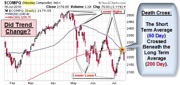
    The chart below shows that things have, in fact, changed.  The green-shaded area shows the smooth trend upwards on a daily chart of the S&P 500.  The pink-shaded area shows where things changed.  Moves became rougher and more volatile.   The series of lower highs and lower lows indicates a trend shift downwards.  Likewise, the failure to get back above the 50 or 200 day averages are bearish signs.

    100606 Changing Character of SP500

    How Do You
    Spell Volatility?

    The move down hasn't been smooth on other
    markets either.  Since the beginning of May, the Dow Jones Industrial Average has made a
    three-digit move in either direction on 17 out of 24 trading days. The
    steepest loss over that period came on May 6, the day of the four-digit
    “flash crash.” The biggest gain came just two trading days later, on May
    10.

    That trend continues; just this past Friday the Dow dropped 324 points, its second worst slide of the year. As a result, the index closed below 10,000 for the second time in two weeks.

    We are not alone.  Many world markets are suffering.  For example, concerns about Hungary suffering a Greek-like crisis pounded the Euro to a four-year low.

    Prechter Says: “Even $1 Trillion Can’t Save the Euro, But Gold is No Safe Haven”.

    The euro’s recent loss has been the dollar’s gain, which means that it’s not the best time to buy the U.S. dollar. Meanwhile, the most popular alternative to currencies, gold, isn’t such a good buy either. Here is an excerpt from Robert Prechter’s interview with Yahoo! Finance Tech Ticker host Aaron Task to hear what Prechter thinks is in store for the U.S. currency and gold.


    Labor Market on the Ropes.

    May employment report was a sucker punch. On the surface, the Labor Department reported that nonfarm payrolls increased by 431,000.  However, a deeper look shows that private-sector job growth was a mere 41,000 jobs … and 411,000 of the new positions were temporary census jobs.

    I remember when this cartoon was an absurd commentary on big government. Now it is funny that we thought that would be enough to fix things.

    Obama-jobs

    This chart provides some perspective on the US job market. Note how the number of jobs steadily increased from 1961 to 2001 (top chart). During the last economic recovery, however, job growth was unable to get back up to its long-term trend (first time since 1961). More recently, nonfarm payrolls have pulled away from its 40-year trend (1961-2001) by a record percentage (bottom chart). In fact, the number of US jobs is currently at a level first reached in early 2000.

    100604 Jobs Chart

    Business Posts Moving the
    Markets
    that I Found Interesting This Week
    :

    Lighter Ideas and
    Fun Links

    that I Found Interesting This Week

    Reblog this post [with Zemanta]
  • Capitalogix Commentary for the Week of 05/31/10

    Volatility is back in the markets and it seems like people can't decide whether to buy or sell.

    100531 Fear and Greed as Tweedle Dee and Tweedle Dumb

    The Dow Jones Industrial Average broke below 10,000 last week.  Then again, it also crossed right back above that level.  If it seems like 10,000 has been one of the most 'magnetic' 1,000 point thresholds, you are right. On the other hand, is it a meaningful trading level?

    All-in-all, May was quite a month!  We saw a "flash crash", followed by a 400-point
    relief rally, followed by a slow motion free-fall, followed by a nearly
    300-point rally. The cherry-on-the-top was last Friday's triple-digit
    drop going into the long weekend.

    Putting the Dow's Drops and Rebounds in Perspective.

    The market's recent "flash-crash" ranks as the largest point-wise drop in history. But how does it stand up percentage-wise; and how many drops greater than 5% have we seen? Minyanville posted a visualization of the data (going back to 1928) that answers those questions. Click to the graphic for an interactive version.

    100531 Dow Drops and Rebounds

    One other point worth noting, historically, big gaps and daily rallies occurred most often in the context of bear markets.  They are not usually a sign of impending calm waters or smooth sailing.

    Nonetheless, we've seen a decent pull-back and there are signs that the short-term might offer some upside bias.

    Recently, Bearish Spikes Have Provoked Bullish Responses.

    Bespoke reports that this week's sentiment surveys from Investors Intelligence and
    the American Association of Individual Investors showed
    sharp increases in bearish sentiment among both advisors and individual
    investors.  The chart below compares the S&P 500 with bearish sentiment since the
    start of 2009.  The current level of combined bearish sentiment is the
    highest since the start of November.  As shown in the chart, since the
    market bottomed back in 2009, spikes in bearish sentiment have actually
    turned out to be pretty good buying opportunities.

    100531 SP 500 vs Bearish Sentiment

    So, let's look at the market.  Short-term, here is David Singer's
    bullish case for the S&P
    .  It is drawn on a 60-minute chart, and shows a series of head and shoulder bottom patterns.  The implication is for a rally that measures the same distance as from the neckline to the head.

    100531 SP 500 Head and Shoulders Bottom Pattern

    Longer-term, Singer shows a potential head and shoulders topping pattern on a daily view of the S&P 500.  Click it to see a
    larger version.

    DOW-Head and Shoulders Pattern

    We'll see. Hope you have a good week.

    Business Posts Moving the
    Markets
    that I Found Interesting This Week
    :

    • Lehman Sues JPMorgan for Billions in Siphoning Damages. (Wall_St_&_Tech)
    • Wall Street's War: 2,000 Lobbyists versus Financial Reform. (Taibbi)
    • S.E.C. Proposes Circuit Breakers for S&P 500 Stocks. (NYTimes)
    • Apple Overtakes Microsoft as Most Valuable Tech Company. (NYTimes)
    • How Steve Jobs Blew $10.3 Billion on "The Dumbest Trade Ever". (Insider)
    • More Posts
      Moving the Markets
      .

    Lighter Ideas and
    Fun Links

    that I Found Interesting This Week

    Reblog this post [with Zemanta]
  • Capitalogix Commentary for the Week of 05/24/10

    It's time to talk about American Idol (with the Finale this week, and all). 

    Sorry, my mistake … another bad jobs numbers came out & the markets went down … so it is time to talk about the American Idle.

    100523 American Idle Unemployment Cartoon

    Last week was rough for the bulls; and if not for a reversal after the opening bell on Friday, it would have been a lot worse. Consider this: The Russell 2000 gained 2.5% after the open on Friday and still finished with a 6.44% loss for the week. So, yes, it could have been a lot worse.

    Was That a Key Reversal Day in the Markets Last Friday?

    The S&P Index 500 technically complied with all the rules of a "key reversal day." It plunged to a new low of a significant decline. It then rallied up on increasing volume, and closed well above the prior close.

    100524 SP500
    And here is a longer-term chart showing the S&P on a weekly basis.

    100522 DShort-Serge-Perreault SP500 Weekly

    We will see if there is some buying triggered here.  If the bull-market swing is to continue it has to kick-in soon.

    But Where Is the Selling Pressure?

    With the market in a dizzying decline, why haven't we seen more committed bearish bets? Are traders going flat instead of short?

    One reason is discussed by Carl Swenlin. His assumption is that bull market declines will be short-lived, and that a neutral signal eliminates market exposure during a correction, while at the same time addressing the lower probability outcome of a full bear market decline. In other words, we never know if a bull market correction will actually be the beginning of a new bear market, but we do know that most of the time it won't be, so it makes sense to bet with the odds and go neutral.

    A Dash of Insight.

    I saw a list that I wanted to share.  It from the Dash
    of Insight blog
    , which is a consistently good source of information.  Here is an excerpt.

    "I am pretty fussy about economic news related to jobs and housing, and I did not like what I saw.

    • I closely watch building permits as the best leading indicator of new construction.  Construction is up (reflecting the tax credit, which has now expired) but building permits were down 11.5%.
    • The BLS report on Business Dynamics showed job losses for the quarter ending in Sept., 2009, were about 300K worse than expected.  You will not see this news anywhere else.  Even though this is an "old" report, people should watch it as a way of verifying the accuracy of the "official" BLS payroll employment report projections.  Basically, this is an early read on eventual "benchmark" revisions.  There was plenty of job creation, including a million jobs from new establishments, but still not as much as estimated.  More detail is beyond the scope of this weekly summary, but those interested can get the essentials of the argument in my analysis of the November report (different time, same issue).
    • The uptick in initial claims was also a negative for jobs.  We really need to see progress on reduced layoffs and more job creation.  Both seem to have stalled.
    • The S&P 500 broke the 200-day moving average.  Many people view this as the most important technical indicator, keeping them on the right side of major trends.  This is being quoted as 1102 or so, and is something to watch.
    • The ECRI indicators are in the growth area, but weaker than in past weeks.  Their interpretation?  "With WLI growth sinking further to a 43-week low, U.S. economic growth is set to start easing in fairly short order."  This seems to be an unusually strong emphasis on a "second derivative" interpretation of a strong reading, but it is their index.  I look at their numbers, but also at their own interpretation.

    The high volatility in trading is frightening to nearly all investors.  Thursday was especially bad.  The extremely late rally on options expiration day makes the week's pricing look a bit better, but most observers will need much more convincing."

    VIX Approaches Pre-2008 Record Highs

    The Volatility Index is spiking.

    100523 VIX
    When the VIX rises as it's done the past two weeks, emotions rule the market.

    Bill Luby found that, prior to 2008, the VIX only managed to nudge its way over a reading of 45 on three instances:

    The table below summarizes the top ten pre-2008 VIX closing highs. Last week’s VIX spike to 45.21 would put it at #3 all-time outside of the 2008 financial crisis.

    VIX End of Day Records

    Will fear subside, or will volatility continue to soar? That will be one of the keys to the market worth watching next week.

    Business Posts Moving the
    Markets
    that I Found Interesting This Week
    :

    Lighter Ideas and
    Fun Links

    that I Found Interesting This Week

    • Hypnotized by Charisma: An Explanation For "What Was I Thinking". ("The"-ness)
    • Craigslist Explains its Seemingly Insane, Yet Successful, Business
      Model. (Forbes)
    • Presidential Panel: Cancer Risks Underestimated for Many Common
      Things.
      (CNN)
    • A Cardiologist's Dream: You Can Buy a Bob Evans Sausage Gravy
      Machine.
      (Gizmodo)
    • Life After Moore's Law: Taking the Leap Into Parallel Processing.
      (Forbes)
    • More
      Posts with Lighter Ideas and Fun Links
      .
    Reblog this post [with Zemanta]
  • How Did the Big Banks Really Score 100% Profitable Trading Days Last Quarter?

    100522 Perfect Quarter for GS
    The numbers are incredible.  Goldman Sachs just revealed in an SEC filing that its traders made money on every single
    trading day last quarter, a record for the firm. Net revenue for
    trading was $25 million or higher in all of the first quarter’s 63
    trading days with 35 of those days bringing in more $100 million. 

    Even if you had a 95% likelihood of a winning day, you would have
    only a 3.9% chance of doing it 63 trading sessions in a row. 

    Does a Perfect Trading Quarter Score One for the Rigged-Market Theory?

    Whatever the cause of the perfect quarter, it comes as part of a
    pattern. Goldman Sachs only recorded 11 loss days in the prior 12 months. So while some luck is
    involved in stringing together a perfect Quarter, the trend of success does not seem to be a fluke.

    It gets more curious, because it wasn't just Goldman.  Bank of America, Citigroup, and JPMorgan each also recorded a perfect quarter of trading profits.  What are the odds of that happening?  Apparently, pretty high under their current operating conditions.

    When the government is on a mission, you may not like the policies … but as an investor, you fight it at your peril. More simply put, don't fight the Fed. 

    It looks like the Banks figured that out. 

    Goldman figured it out sooner.

    100522 Cartoon - Goldman A Quick Study

    Reblog this post [with Zemanta]