Market Commentary

  • Capitalogix Commentary for the Week of 08/23/10

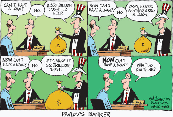
    We are in the dog-days of summer.  Perhaps it is a good time to travel, just so you are not tempted to watch the news.

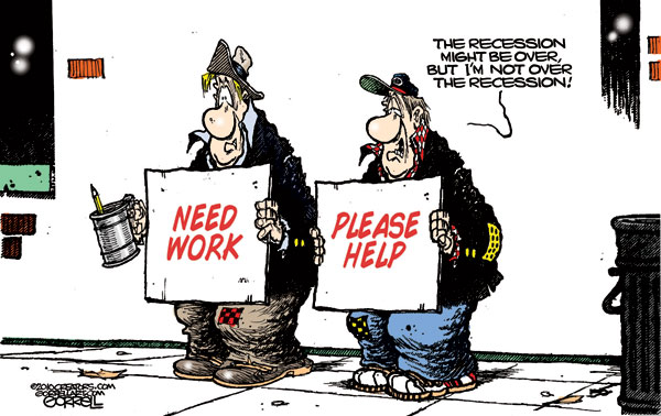
    100821 Recovery Status Cartoon - Stein

    Biggest Negative Fund Flow Out of U.S. Stocks Since During the Crisis.

    Money is flowing out of equity markets into the bond market.  According to the NYTimes, investors withdrew a staggering $33.12 billion from domestic stock market mutual funds so far this year.

    In the chart, below, the red bars represent fund flows for U.S. equity mutual funds, and the gray bars represent fund flows for bond mutual fund.  The data for this chart is based on the fund flow data of long term mutual funds tracked by the Investment Company Institute.

    100822 Money Moving Out of Stocks and Into Bonds

    Likewise, according to Rasmussen research, consumer & investor confidence has fallen to a 2010 low.

    The Consumer Metrics Institute's Growth Index.

    It's easy to get distracted by other data, but (for the most part) price is the primary indicator to use when analyzing a stock chart. Of course, it's still useful to try and get an early indicator of how a well-followed metric may perform.

    The chart below shows three different data points. The S&P 500 index, GDP, and the Consumer Metrics Institute's Growth Index.  Historically, the Growth Index has given an early indication of what GDP and the stock market are likely to do soon after. So, its recent decline might be an early indicator of continued weakness.

    100822 Consumer Metrics Growth Index
    This is something that bears watching.  If you're interested, here's a link from dshort.com that covers this topic in more detail.

    As more people worry that our economy is not changing as hoped; some things are changing … technology and legislation.

    How Does Technology Change the Investment Landscape?

    Duncan Niederauer, NYSE Euronext CEO, sat down with Maria Bartiromo at the "Techonomy Conference" in Lake Tahoe to talk about technological advancements and what they mean for the future of trading.


    My guess is that we are going to see a whole new round of cries for regulation of financial technology.

    Here is an Explanation of How Laws Are Made.

    For the past two years, Financial Reform has been in the news.  Here is is a link to a discussion of what it can accomplish. Now that the Dodd-Frank Bill has become law, I thought it might be helpful to show the path it had to take?  Here is an informative infographic put together by  Mike Wirth that lays out how a Bill becomes a Law.  Click the image to see a larger version.

    HowlawsmadeWIRTH2

    Business Posts Moving the Markets that I Found Interesting This Week:

    • Market Data Firm Spots the Tracks of Bizarre Robot Traders. (Atlantic)
    • Will the New Financial Reform Law Affect Big Bank Profits? (RollingStone)
    • Soros Flees Stocks, Yet Remains Bullish On 'The Ultimate Bubble' in Gold. (BI)
    • Rising Profits Are Good, But Sales Haven't Kept Pace. (NYTimes)
    • More M&A: Why Did Intel's Pay $7.68 Billion to Purchase of McAfee? (Newser)
    • Following Jobs Report, Consumer & Investor Confidence Falls to 2010 Low.
    • More Posts Moving the Markets.

    Lighter Ideas and Fun Links that I Found Interesting This Week:

    • Surprising Research on the Effect of Interruptions on Your Work. (BothSides)
    • 10 Amazing James Bond Gadgets That You Can Actually Buy. (BusinessInsider)
    • Big Brother is Watching: Judges Divided Over Growing GPS Surveillance. (NYTimes)
    • At Least It Wasn't Cancer: Doctors Find Pea Growing In Man's Lung. (NPR)
    • Class of 2014 Doesn't Know Cursive: Snapshot of a Generation. (Newser)
    • More Posts with Lighter Ideas and Fun Links.
    Enhanced by Zemanta

  • Capitalogix Commentary for the Week of 08/16/10

    Tracking the Hindenburg Omen: How Much Danger Is There?

    100815 Hindenburg Crash"Friday the 13th" got a little scarier than normal as warnings were heard from many corners of the financial blogosphere that the Hindenburg Omen triggered.

    What is it?  It is a fairly obscure technical analysis pattern, which supposedly gives an early warning of unstable market conditions (and even potentially stock market crashes).

    While the calculation is based on five factors, the primary conditions indicate that there is a big disagreement about market conditions.

    For example, two of the conditions are that a substantial number of stocks have to be at yearly highs, while a substantial number of stocks have to be at new annual lows.  Ultimately, it is hard for those two conditions to be met in a short period of time, unless there's uncertainty in the market.  Moreover, after a rally, uncertainty is often a precursor to a decline.

    In addition, technically (in order for the pattern to be complete), a second sighting of the five elements must occur within 36 days. Logically, lingering uncertainty is a momentum killer.

    While this pattern has correctly predicted every big stock market swoon of the past two decades, including the October 2008 decline (that set the global economic recession into motion), not every Hindenburg Omen has been followed by a crash. Resorting to a geometry analogy: All rectangles are squares, but not all squares are rectangles.

    Personally, I don't make trade decisions based solely on indicators like this. Nonetheless, it has a pretty good track record, seems to be based on reasonable theories, and might be useful as just another data point urging caution.

    Tough Week for World Markets.

    Taking a macro view, many markets around the world went down last week.  Notably, the NASDAQ was down 5%, the Nikkei was down 4%, and many other indices were down 3%.

    100813 Tough Week for World Markets

    Here in America, the Federal Reserve’s Open Market Committee startled financial markets by raising its terror alert level over the economy and declaring it would keep buying bonds to maintain its loose-money stance and fight deflation.  Despite the promise of help, the markets continued lower.

    Let's Look at a Chart of the S&P.

    What does a daily chart of the S&P 500 Index show?  Price has retreated from the resistance area (marked by the pink highlight).  In addition, price has gapped below the up-trend line (marked by the green line).  Combine that with a negative divergence in MACD momentum, and the picture is technically weaker than before.

    100815 SP500 Trend Break

    Bulls are looking for an oversold rally.  Bears are looking at the unfilled gaps as breakaway gaps.

    As always, it should be interesting.

    Business Posts Moving the Markets that I Found Interesting This Week:

    • Goldman Had 10 Days of Trading Losses in Q2. (WallSt&Tech)
    • The Options Market's Take On H-P: Frenzied Buying in Put Options. (Barrons)
    • Grand Tetons Possibly for Sale: Governor of Wyoming Says They Are Desperate. (Alternet)
    • How Far Should Google Go to Profit From the Data It Has About People's Activities? (WSJ)
    • Skype Files Plans for $100 Million IPO. (WSJ)

    Lighter Ideas and Fun Links that I Found Interesting This Week

    • Hedge Fund Predicts "Apple Will Sell 50 Million iPads A Year". (BusinessInsider)
    • Swarm Intelligence: Why Mimicking the Behaviour of Ants & Bees Is Smart. (Economist)
    • What Your Appetite Reveals About How Your Brain Works? (PsychologyToday)
    • BlackBerrys & Encryption – Spies, Secrets and Smart-Phones. (Economist)
    • Google Goggles Lets You Search the Web With Your Mobile Phone Images. (Kurzweil)
    Enhanced by Zemanta

  • Capitalogix Commentary for the Week of 08/09/10

    There is a solution to everything.  Of course, some solutions are better than others.

    100807 Tax Opinion Polls - Kelley

    The government's latest snapshot of the job market was bleak, with 14.6 million Americans still searching for work.  The disappointment is not limited to July; the report also included unfavorable revisions to data released in previous months.  It is becoming clear that the existing policy mix is not appropriate for the task at hand.

    Even though we've heard bad news, the market has continued to hold up well. And that is a decidedly bullish sign.  There are also a number of positive signs of market strength (like strong breadth, increased corporate spending, and lots of capital on the sidelines ready to be deployed).

    Market Commentary:  Let's Look Under the Covers.

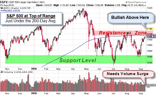
    The charts show a few challenges ahead, however.  First, the S&P 500 Index is sitting at a resistance zone in a rising wedge pattern.  From a technical analysis perspective, that pattern is often bearish (or the place traders look for a reversal).

    100808 SP500 at Resistance

    Bulls are looking for a sustained move above the 1140 level to make them comfortable.

    Second, the Dollar looks like it might be at a support level. Will it reverse here?  These two markets often move counter to each other.  So, having the Dollar at "support" while the S&P 500 Index is at "resistance" might increase the odds of a market turn here.

    100808 Dollar at Support
    Just something to keep your eye on.

    Finally, this is from late May; but it is making the rounds again … and I thought it was worth sharing.

    Steve Wynn Is Not a Shy Man With Few Opinions.

    In this video, Steve Wynn (a casino resort/real-estate developer who has been credited with spearheading the dramatic resurgence and expansion of the Las Vegas Strip) calls out the White House and talks about the Fall of America. Interesting perspective from a billionaire.


    Business Posts Moving the Markets that I Found Interesting This Week:

    • Newsweek Sells For $1 To 92-Year Old Stereo Equipment Mogul Sidney Harman. (BizInsider)
    • Cheap Money: IBM Just Borrowed $1.5B at 1%, Via a Three-Year Bond. (WSJ)
    • Do Bond Yields Below 3% Signal a Double-Dip Coming? (Economist)
    • Sobering Stats: What Are the Odds That the Economy Is In Good Shape? (Insider)
    • For Fed, No Easy Answers in Easy Money. (WSJ)

    Lighter Ideas and Fun Links that I Found Interesting This Week

    • Former CIA Chief Says U.S. Strike on Iran More Likely Than Ever. (Slate)
    • Who Knew? Merriam-Webster Ask the Editor Video on the Plural of Octopus. (MW)
    • The Google Wave Shut-Down Decision Shows Strong Innovation Management. (HBR)
    • Superman Saves Family From Foreclosure – After Homeowners Find $250K Comic (Newser)
    • Food For Thought: Meat-Based Diet Made Us Smarter. (NPR)
    Enhanced by Zemanta

  • Capitalogix Commentary for the Week of 08/02/10

    On the surface, July was a good month in the markets.  It sparked my curiosity about what insiders are doing.  Do their actions show that they see a sustained recovery coming?

    Insider Buying Has Dried Up Since May.

    Insider buying and selling behavior offers a unique insight on the prospects of a company, industry, economic sector, or even the stock market in general. By definition, Insiders have a deep knowledge and understanding of the company, exclusive information on the company's performance and prospects … and if they are risking their own money on the stock, you might expect that they have good reasons, especially when several insiders buy or sell at the same time.

    Well, since May, Insiders have certainly changed their buying habits. Here is a chart from Insidercow showing how bearish insiders are right now.

    100731 Insider Buying Has Disappeared

    Another sign I've been watching has been the performance of China.

    China's Shanghai Index Has Some Room to Move.

    China's Shanghai Index has been in a downtrend for a while. It has under-performed most of the major world markets recently. However, in early July it bounced nicely off the downtrend channel. At this point, it is sitting right at the resistance zone. A sustained move above the 2700 level will likely give the index plenty of room to rally. On the other hand, a failure at this level could send a signal to other world markets.

    100731 Shanghai Decision

    This next chart shows a weekly view of gold. This is a market that I don't pay close attention to, normally. Nonetheless, its chart caught my eye this weekend.

    Decision Time for Gold.

    The price of Gold is sitting at the bottom of the up-channel.  So, this where you'd expect to see buying come in from those expecting the up-trend to continue in Gold.  The chart speaks for itself.

    100731 Gold Decision

    We'll see what happens.  Hope you have a good week.

    Business Posts Moving the Markets that I Found Interesting This Week:

    • Where Does BP's $17B Loss Rank in the 25 Biggest Quarterly Losses in History? (Insider)
    • EconoPhysics – A Richter Scale for Studying Financial Earthquakes. (NYTimes)
    • Foreclosures Up In 75 Percent of Top U.S. Metro Areas. (Reuters)
    • Sign of the Times: Someone Just Bought the Pontiac Superdome for $500K. (BizWeek)
    • Goldman's Leading Indicator at 7-Month Low, Predicts ISM Collapse this Week. (Insider
    • More Posts Moving the Markets.


    Lighter Ideas and Fun Links that I Found Interesting This Week:

    • Chess Metaphors: Artificial Intelligence and the Human Mind. (NYBooks)
    • Despite Human Expectations, the Future May Not Resemble the Last 6 Months. (NYTimes)
    • Personal Details Exposed Via Biggest U.S. Websites. (WSJ)
    • Study Confirms the Existence of the "Cougar" & Why They Have More Fun. (The Week)
    • Neb. Town Giving Away Land for Free Hoping to Generate Tax Revenue. (Newser
    • More Posts with Lighter Ideas and Fun Links.
  • Capitalogix Commentary for the Week of 07/26/10

    It was a strong week for the markets.  Normally, to get a sense of what's happening, I focus on the U.S. equity markets.  This week, however, I thought it made sense to start with a look at emerging markets around the world.  These markets are often referred to as BRICs.

    Emerging Markets Lead Stock Rally.

    At this point, foreign stocks are leading the U.S. stock market higher. Here is a chart showing that Emerging Market iShares recently broke above its June high.  Moreover, after breaking above the down-trend since April, it successfully re-tested that line (from above) and bounced higher. From a technical analysis perspective, those are bullish signs.

    100726 Emerging Markets Move Higher 

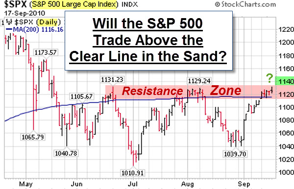
    Here in America, it is earnings season, and companies have been reporting better news than most expected.  The economic news hasn't been stellar; but the markets have held up well.  This chart shows the S&P 500 Index at the top of hotly contested resistance level.

    100726 SP500 at Resistance Level

    Many would take a sustained move above the 1120 level as a strong bullish sign.

    With that said, business expansion is dragging and slowing the economic recovery, and it
    seems everyone is searching for reasons.

    Debt Overhang.

    In his new paper, Federal Reserve Bank of Cleveland researcher Filippo Occhino says a contributing factor may be something called debt overhang. Simply put, when companies have too much debt it discourages them and their investors from taking on projects because the debt consumes any profits the investors might make, even in situations when the investment raises equity in the company.

    Watch the Debt Overhang Video from the Cleveland Fed.

    A different slant on the debt problem is illustrated below.

    100725 Zyglis Cartoon - Debt is Biggest Security Threat

    Business Posts Moving the
    Markets
    that I Found Interesting This Week
    :

    • What VIX Futures Tell Us About October: Is Something Really Scary Coming? (FT Alphaville)
    • Goldman Sachs' Global Leading Indicator Rolls Over. (PragCap)
    • Goldman Sachs $550 Million Fine Amounts to Only One Week's Trading Profits. (Citywire)
    • Indian Court Rules that Hindu Gods Can't Trade Shares. (CrossingWallSt)
    • What’s Really Going on in the VC Industry & What Does it Mean for Startups? (BothSides)
    • More Posts
      Moving the Markets
      .

    Lighter Ideas and
    Fun Links

    that I Found Interesting This Week

    • Microsoft Releases Beta of Upgraded Security Essentials. (PCWorld)
    • Are You Part of the Botnet Army? What You Can Do To Protect
      Yourself. (NewNewInternet)
    • Would You Eat Synthetic Meat? It Will Probably Taste Like Chicken. (The Week)
    • Perdue recalls 90,000 pounds of chicken nuggets that may contain pieces of plastic. (CNN)
    • Why a Scientist is Challenging Whether Gravity Exists. (NYTimes)
    • More
      Posts with Lighter Ideas and Fun Links
      .
    Enhanced by Zemanta
  • Capitalogix Commentary for the Week of 07/19/10

    If only everything could be fixed this easily.

    100717 iPhone 5 Cartoon Darkow 600p

    It is earnings season again.  However, note that the year-to-year
    comparison no longer refers to the recession. Instead, the comparisons
    get harder than last year. Moreover, the economic data has been ugly … and so has sentiment on quarterly earnings.  The question becomes: how tough will it be for Wall Street to battle back from the latest sell-off?

    Market Commentary

    The chart below shows a daily view of the Nasdaq composite index since January. Note, however, that this market has been making lower highs and lower lows since April. That is the classic definition of a downtrend.

    In addition, chart watchers often pay attention to a pattern called a Death Cross. This occurs when the short-term (50 day) moving average crosses beneath the longer-term (200 day) moving average. As you can see, a death cross happened last week.  It is highlighted in yellow and circled in orange. Since then, the market has fallen further.

    100718 NASDAQ Down Trend

    Is a Leading Indicator of Economic Activity Drying-Up?

    If you are looking for insight into global
    supply and demand trends, the Baltic Dry Index is one of the purest
    leading indicators of economic activity. It
    offers a real-time glimpse at global raw material and
    infrastructure demand,
    as well as the supply of ships available to move this type of cargo.

    According to Bloomberg, Commodity shipping rates ended their
    longest losing streak in almost
    15 years on speculation owners are refusing to offer vessels at
    current hire rates. 

    100718 Baltic Dry Index Down 60 Percent
    The index has had a particularly bad run of
    35 consecutive drops, the longest since November 1995,  during
    which the measure lost 60 percent of its value. Since
    making a short-term peak in late May (about a month after equity
    markets peaked), the index has declined about 60%.

    Just in case you wanted more fear fodder to chew on, Here is a chart that is making the rounds.

    De-Leveraging the Credit Bubble.

    It purports to show that the total leverage within the world financial system currently
    stands at 60 to 1, where we are leveraged 60 to the 1 of real reserves
    we actually have. 

    100716 usd-economic-bubble

    Christopher
    Laird
    explains this chart as follows:

    The point of emphasizing it's from
    the end of WW2 is that we are not talking merely about a banking crisis,
    or whatever. We are talking about the deleveraging of the greatest
    economic/finance bubble in history. Once the level of leverage reached
    60 to 1, it becomes impossible to stay ahead of the deleveraging, even
    for central banks. The implications are staggering. Every major economy
    in the world is involved. The outcomes of deleveraging this monster
    bubble, represented by the green oval, will be what I term Credit Crisis
    II. At 60 to 1 leverage, a loss of 1 to 2% wipes out the capital.

    Let's hope that doesn't happen.  On the other hand, there has been a lively debate about what the chart really means.  For further insight on this, check-out the comment section on the Business Insider's

    Chart of the Day post about this topic.

    Business Posts Moving the
    Markets
    that I Found Interesting This Week
    :

    • Ten Reasons to Be Bullish & One BIG Reason to Be Bearish. (TradersNarrative)
    • Behavioral Finance’s Smoking Gun: Probability Analysis Isn't
      Rationality. (PsyFi)
    • Jumping Back Into Bonds: Investing With an Eye on Absolute Return. (WSJ)
    • Insane Bulls And Bears – or – The Men Who Want to Be Roubini. (Forbes)
    • Mao Zedong's Creation, Agricultural Bank of China Raises $19 Billion
      in I.P.O. (NYTimes)
    • More Posts
      Moving the Markets
      .

    Lighter Ideas and
    Fun Links

    that I Found Interesting This Week

    Enhanced by Zemanta