Market Commentary

  • Markets at New Highs – So Why Hasn’t It Been Easy to Trade?

    While the US Equity Indices have broken out above recent highs to continue their up-trend, I hear traders complain that this hasn't been an easy market to trade.

    Here is a daily chart of the S&P 500 Index.
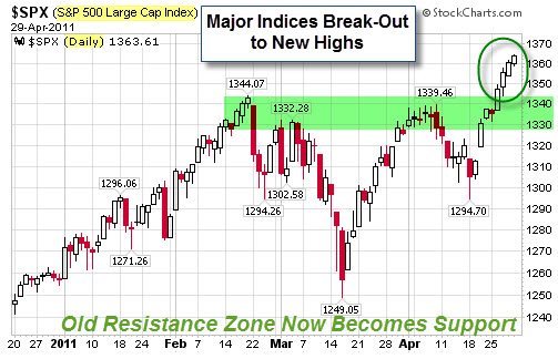
    110501 SP500 Index at New High
    On one hand, you'd think that a straight-shot bull run higher would feel as safe as the kiddie rides at the amusement park. On the other hand, sagging internal breadth, divergences, and the impending end of QE2 have triggered cautious instincts in many professional traders. As a result, many are selling strength, and end up under-invested during the next push higher.

    It's been even more challenging for the Bears, who keep trying to identify and sell a top in this market. However, there's been little selling follow-through. My guess is that because so few people are fully invested in the equity markets, each dip (no matter how small) seems like a buying opportunity to someone.

    So, how long can the markets continue to produce these straight up moves to new highs? While the answer would seem to be "indefinitely", we know that's not realistic either. This seems a lot like the market did from December through February, where we barely saw a red day; but you couldn't help wondering each day if this was the top.

    A Little Politics and Economic Policy.

    On a side note, Fed Chairman Bernanke held a press conference last week. It was the first ever press conference immediately following a Federal Reserve meeting.  Historically, the Fed has released minutes of their meetings about three weeks afterwards. Now, they expect to hold these sessions after every meeting.

    On the surface, Bernanke's comments reiterated that the Fed was resolute in their intent to stop QE2 and doesn't desire to reverse the current trend of inflation or a weakening dollar. What caught my eye, however, was how Gold and Silver spiked as he spoke.

    It is worth noting that the U.S. Dollar has fallen 31% so far this year compared to Gold. Likewise the Dollar has fallen 25% against the Swiss Franc (which many consider the gold standard of Fiat Currencies). For what it is worth, the Dollar Index is barely a percentage point above the all-time lows set before the financial panic in 2008.

    Enhanced by Zemanta

  • Markets at New Highs – So Why Hasn’t It Been Easy to Trade?

    While the US Equity Indices have broken out above recent highs to continue their up-trend, I hear traders complain that this hasn't been an easy market to trade.

    Here is a daily chart of the S&P 500 Index.

    110501 SP500 Index at New High
    On one hand, you'd think that a straight-shot bull run higher would feel as safe as the kiddie rides at the amusement park. On the other hand, sagging internal breadth, divergences, and the impending end of QE2 have triggered cautious instincts in many professional traders. As a result, many are selling strength, and end up under-invested during the next push higher.

    It's been even more challenging for the Bears, who keep trying to identify and sell a top in this market. However, there's been little selling follow-through. My guess is that because so few people are fully invested in the equity markets, each dip (no matter how small) seems like a buying opportunity to someone.

    So, how long can the markets continue to produce these straight up moves to new highs? While the answer would seem to be "indefinitely", we know that's not realistic either. This seems a lot like the market did from December through February, where we barely saw a red day; but you couldn't help wondering each day if this was the top.

    A Little Politics and Economic Policy.

    On a side note, Fed Chairman Bernanke held a press conference last week. It was the first ever press conference immediately following a Federal Reserve meeting.  Historically, the Fed has released minutes of their meetings about three weeks afterwards. Now, they expect to hold these sessions after every meeting.

    On the surface, Bernanke's comments reiterated that the Fed was resolute in their intent to stop QE2 and doesn't desire to reverse the current trend of inflation or a weakening dollar. What caught my eye, however, was how Gold and Silver spiked as he spoke.

    It is worth noting that the U.S. Dollar has fallen 31% so far this year compared to Gold. Likewise the Dollar has fallen 25% against the Swiss Franc (which many consider the gold standard of Fiat Currencies). For what it is worth, the Dollar Index is barely a percentage point above the all-time lows set before the financial panic in 2008.

    Enhanced by Zemanta

  • Here a Few Links for Your Weekend Reading Enjoyment

    My week flew by.  Meetings, site visits, too many business meals at restaurants seemingly conspiring to make a 300 pounder out of me.
     
    Here are some of the links that caught my eye or attention … hope you find something interesting.

    Business Posts Moving the Markets that I Found Interesting This Week:

    • Why Record Corporate Profits Might Not Be Good for the U.S. Economy. (Slate)
    • "Something's Brewing" Behind These Fascinating Financial Times. (HL)
    • 24 Signs Warning Something Is Wrong With Our Economy. (BusinessInsider)
    • Hong Kong & Singapore Closing in on NY as Dominant Hedge-Fund Hub. (efinance)
    • Creative Destruction: Japan and the Economics of Natural Disasters. (NewYorker)
    • More Posts Moving the Markets.

    Lighter Ideas and Fun Links that I Found Interesting This Week

    • Four Reasons Any Action Is Better than None. Makes Sense. (HBR)
    • Genetically Modified Cows Produce 'Human' Milk. (Telegraph)
    • College Grants for Vegans? Students Tap Unusual Sources for Financial Aid. (WSJ)
    • Why the Cloud Is Actually the Safest Place for Your Data. (Mashable)
    • Guess Who Doesn't Tweet? 87% name recognition, But Only 7% Use It. (MediaPost)
    • More Posts with Lighter Ideas and Fun Links.


  • Gold Has Been Glittering, But Silver Has Had a Stronger Move

    Gold continues to receive the headlines, yet silver is really moving.

    Bespoke posted a chart that highlights how remarkable silver's run has been.


    110424 Silver Gold and the SPX

    Had you invested $100 in silver ten years ago today, your investment would now be worth $1,037.  A $100 investment in gold would be worth about half that at $569, and a $100 investment in the stock market (S&P 500) would be worth just $107.48.

    Here is what Jim Rogers thinks about silver's move.


    For more on that, here is a link to an article where he reminds that parabolic moves always collapse.


    Enhanced by Zemanta

  • Some Thoughts on the Budget and Government Spending

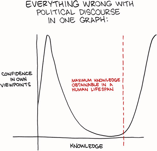
    This graphic highlights some of what is wrong with political discourse.


    110417 Everything Wrong With Politcs

    So, the government avoided a shut-down.  Is that a good or bad thing? 

    Understanding the Scope of the Budget Deficit.

    What were they really fighting about?

    Philip Greenspun puts the the budget deficit into easier-to-grasp context: just divide everything by 100,000,000.

    • We have a family that is spending $38,200 per year.
    • The family’s income is $21,700 per year.
    • The family adds $16,500 in credit card debt every year in order to pay its bills.
    • After a long and difficult debate among family members, keeping in mind that it was not going to be possible to borrow $16,500 every year forever, the parents and children agreed that a $380/year premium cable subscription could be terminated.
    • So now the family will have to borrow only $16,120 per year.

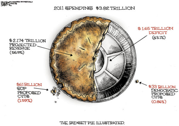
    If you are a visual thinker, here is different way to look at it.

    110417 The Budget Pie Chart Cartoon by Michael-Ramirez

    Government Shutdown Averted – Fiscal Crisis Assured!

    I saw this video and thought it made some interesting points .


    For a different perpective, you can watch the introduction video released by a new political movement called the Win+Win Revolution

    We do live in interesting times.
    Enhanced by Zemanta
  • Are Cracks Starting to Show in the Rally’s Foundation?

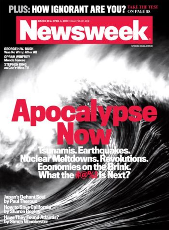
    Newsweek had a great cover:  "Apocalypse Now". Think about it, Tsunamis, Earthquakes, Nuclear Melt-Downs, Revolutions, Governments on the Verge of Shutting-Down …

    110410 Newsweek Apocalypse Now Cover

    And, yet, despite a cavalcade of horrors … the markets have held up well.

    Is This as Good as it Gets?

    Barron's notes:

    Having snagged its best first quarter since 1998, the U.S. stock market began April on a hopeful, if hesitant, note, encouraged by evidence that our economy is improving, but a little fearful that this may be as good as it gets.

    On Friday, the Dow Jones Industrial Average nudged briefly above its recent February peak to reach its highest level in nearly three years, effectively brushing aside recent concerns such as high oil prices, flailing European banks and disruptions in the wake of Japan's disaster that had so alarmed investors mere weeks earlier.

    Are Cracks Starting to Show in the Rally's Foundation?

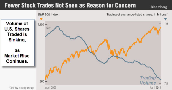
    Bloomberg posted a chart showing the bull market move put in by the S&P 500 Index.  Note, however, the dwindling volume of shares traded, especially since prices rebounded off lows earlier this year.


    110410 Trading Volume Down as Markets Rise

    Barry Ritholz notes "Fed induced rallies tend to be liquidity, not conviction driven. Thus, the anemic volume".

    Breadth is Starting to Show Signs of Fatigue as Well

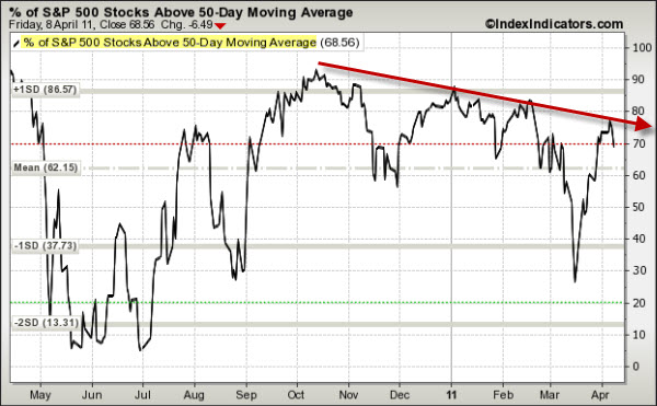
    The following chart shows the percent of stocks trading above their 50-Day Moving Averages.


    110410 SP500 Issues Above 50-Day Moving Average 
    In strong markets, this indicator goes up as price rises.  However, as the market rally loses momentum, this indicator starts tracing-out lower highs.

    So what do you do?  With the charts shown above and QE2 is supposedly ending in June … price is still the primary indicator.  Until sellers show up with conviction, the liquidity rally is likely to continue.

    Enhanced by Zemanta

  • With Business Confidence High and a Teflon Market, What’s The Fed’s Next Move?

    The Dow Jones Industrial Average kicked off a new quarter by touching the highest point since the summer of 2008.

    A strengthening job market has private payrolls and business confidence surging … and layoffs waning. 

    Large corporations, which have been sitting on record troves of cash, could be poised to start hiring again. Fifty-two percent of top CEOs said they plan to increase hiring the next six months, according to the Business Roundtable's first-quarter survey. That's up from 45% in the fourth quarter and the highest in the survey's eight-year history. 

    Results like this imply that corporations are more optimistic and likely to expand.

    Does That Mean the Fed Has Met Its Mandate?

    St. Louis Fed President James Bullard said “the economy is looking pretty good” and that the Fed should “see if we want to decide to finish the program or to stop a little bit short.”

    Bullard added that “it may be reasonable to send a signal to markets that we’re going to start withdrawing our stimulus, and I’d start by pulling up a little bit short on the QE2 program … We can’t be as accommodative as we are today for too long, we’ll create a lot of inflation if we do that.”

    Dallas Fed President Richard Fisher went even further, telling a European audience that “We’ve done enough” and “we’re at risk of doing too much.” Fisher even went so far as to say the Fed’s dual mandate of controlling inflation and boosting employment should be changed. He wants the Fed to have no responsibility for employment, and to focus solely on inflation.

    * Fed Chair Ben Bernanke has the potential to be even more market moving this month, at the April 26-27 Federal Open Market Committee meeting. Not only will this be the first meeting after these more hawkish remarks, but it will also be the first time the Fed holds a post-meeting press conference.

    Yes, you read that right … Rather than hide behind prepackaged statements, Ben Bernanke will stand in front of the microphone and explain the Fed’s actions. He’s going to do that several times a year going forward — with this year’s briefings scheduled for April 27, June 22, and November 2.

    If Bernanke shows any shift in policy, we could see some real market fireworks.  Just something to watch for.

    Enhanced by Zemanta

  • Comparing Chinese Provinces with Countries

    China is still a toddler from an economic perspective.  No doubt, It is growing quickly.  What will happen as it matures?

    110331 An Overgrown Toddler photo of toddler from Sun article.

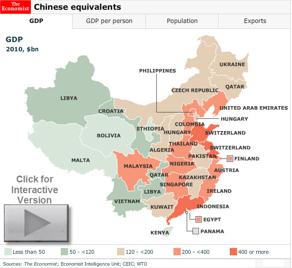
    Here is an infographic from the Economist that shows which countries match the GDP, population and exports of Chinese provinces.


    110331 Chinese Equivalents


    China is now the world’s second-biggest economy; but some of its provinces by themselves would rank fairly high in the global league.

    This map shows the nearest equivalent country. For example, Guangdong's GDP (at market exchange rates) is almost as big as Indonesia's; the output of both Jiangsu and Shandong exceeds Switzerland’s.

    They also produced an interactive country comparison to the US states.

    Enhanced by Zemanta