An analysis of VC deal activity at the internet angel and seed stages shows there has not been any sign of an investment slowdown. Not even close actually.
In fact, September 2011 angel & seed VC activity was up 172% since January 2010 and at the highest levels in the last seven quarters. You can see the actual trend based on real data here.
Also, last week, CB Insight's Q3's quarterly VC report came out which also showed that the sky clearly is not falling. Here are some of the headlines:
$7.9B invested in 790 deals in Q3 2011
NY overtook Massachusetts on deals AND dollars for 1st time. It's just one quarter, so we'll see how Q4 turns out
Healthcare VC keeps dropping – somebody call 911
Green Tech shows some life
Seed VC still growing – VCs continue to like the optionality that seed investments provide.
Of course, there is a lot more so go get the report here. It's free to download and 61 pages chock full of VC data goodness.
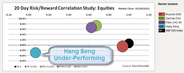
There is a slight, but potentially growing, disconnect between the S&P 500 Index and the Asian stock markets (specifically the Hang Seng).
On Friday the Hang Seng lost 1%. Moreover, looking at the recent price performance action … on a 20 day basis, the Hang Seng acting very different than other world markets.
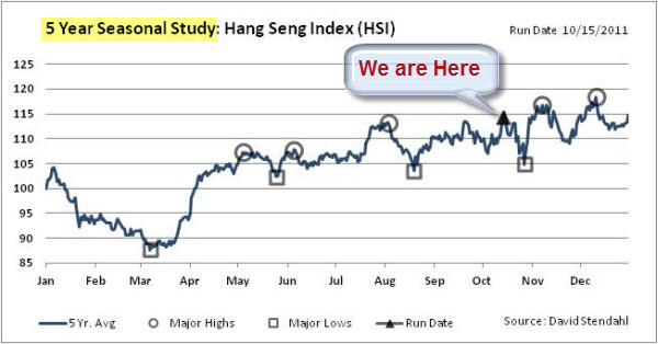
Signal Financial Group just updated their seasonal chart series for the Hang Seng Index. It indicates that we could be at a turning point, with little upside expected based on historical patterns.
A Little Risk/Reward Exercise in Portfolio Diversification.
If the S&P continues to the upside … the Hang Seng may not follow. Thus, over the next few weeks, some traders may look at a potential Long S&P and Short Hang Seng play.
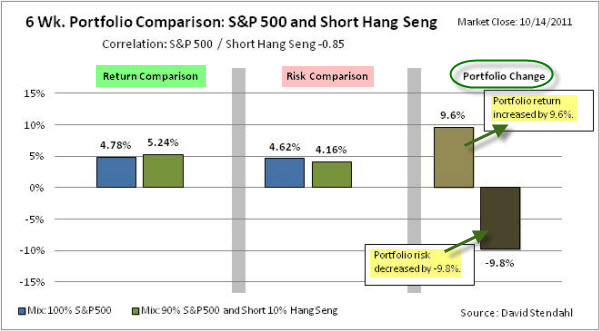
Just as an example, here is a quick look at a portfolio study covering 6 weeks, comparing the performance of a portfolio based solely on the S&P 500 Index versus a portfolio that is long the S&P (using 90% of capital) and short the Hang Seng (with 10% of capital).
Portfolio Allocation:
Equity Portfolio:
100% Long S&P 500 Index
Mixed Portfolio:
90% Long S&P 500 Index and 10% Short Hang Seng
The chart below provides a basic analysis, identifying the differences between the two portfolios. The chart is divided into three sections: return comparison, risk comparison and portfolio change. The first section shows the percent return figures for the portfolios over a recent six week period. The second section focuses on risk, which is defined as standard deviation of return, over the same six week time period. The final section shows the net percentage change to the portfolio's performance based on the small 10% allocation to Hang Seng.
The diversification helps the risk/reward ratio in the study. That looks like something to watch for in the coming weeks. Hope it helps.
The recent doom and gloom can make it seem like the Market has suffered potentially fatal setbacks. However, a glance at a monthly chart of the S&P 500 Index shows a pretty normal-sized correction, based on recent swings.
It is worth noting, however, that the market has had four down months, and the MACD Indicator looks like it is rolling over. So, a move up here would certainly help Bulls feel more confident.
Moving down to a weekly chart of the S&P 500 Index, it is easy to see that a similar pattern occurred last year. At that time, the Triangle pattern resolved upwards. However, Triangles are often considered continuation patterns … and last year's Triangle came during a big move up. Arguably, this year's Triangle comes after breaking last year's up-trend. As a result, some traders will assume that it is more likely for the pattern resolve downwards.
Zooming in a little closer to a daily chart … it shows a lot of movement with little real change. The magenta zigzag indicator highlights moves of at least 5%. Moreover, price has crossed the 1160 level about a dozen times during September.
That kind of price action can create whipsaws. However, the next chart shows that there is a clearly defined range; and when price finally makes an extended move beyond it, traders will likely look for an entry.
In technical trading, price is the primary indicator. The market will tell you what's working.
Walmart just re-instated its Layaway plan for cash-starved consumers. That sends an interesting message; but so did billionaire investor George Soros. Speaking on the sidelines of the International Monetary Fund meeting, Soros said that the crisis is worse than the global financial crisis in the wake of the collapse of Lehman Brothers in the fall of 2008.
Is It Really That Bad?
Thought this was helpful in setting context (sort of an "X" marks the spot; "we are here" graphic) for several key economic and market indicators.
Summary of Market indicators.
So, in general, corporate debt has moved to the high end of the historical range and the VIX has risen aggressively higher, just above the historical range. Interest rates remain in typical ranges. Meanwhile, mortgage delinquencies continue to come down slightly in second quarter 2011. Overall, U.S. equity markets continued to fall in August, with the Russell 3000® Index returning -6.0% for the month.
Yet, things might be getting a little bumpier.
Another Indicator Shows How Volatile Things Have Become.
We just saw the biggest weekly move in 30 year bond since Black Monday (which happened way back in 1987).
30-Year bond rates moved more than three standard deviations this week. Zero Hedge points out that this move can be looked at as a 7 standard deviations of a percentage move basis, given how low rates are at this point.
So much for stability.
Maybe this will make you feel better? Global economic policy-makers gathered, this weekend, for the annual meeting of the IMF. Publicly, they tried to sound united as they try to calm financial market concerns about European sovereign debt and the region’s fragile banks. Word is Europe would do “whatever is necessary” to resolve the crisis. Feeling better already; don't you?