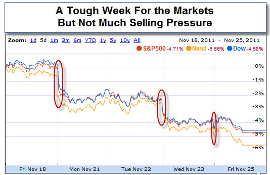
However, while last week was tough on the Markets, a quick glance shows that selling was relatively contained.
Without committed sellers, it won't take much to prop things up again. However, without the liquidity of organic buying, the Markets remain vulnerable to fear, uncertainty and doubt.
As you know, the news out of the Euro-zone has not been good. There are bank problems, an inability to agree on solutions, yields rising, and sentiment crumbling. As a result, traders worry that we'll miss this year's Santa Claus Rally. Nonetheless, conventional wisdom says not to short a dull market.
At a time when interest rates are historically low, we are seeing strong out-flows of cash from funds and almost no new money entering to buy stocks. At this point, it seems as though people are more interested in 'not losing' rather than worrying about how much they can make on their money.
This is when careful trading trumps hopeful seasonality. Consequently, expect traders to be on the look-out for short-term opportunities and diversification into other markets.
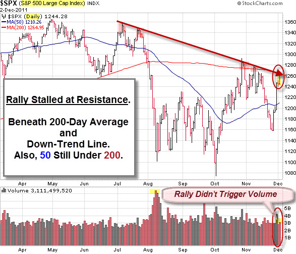
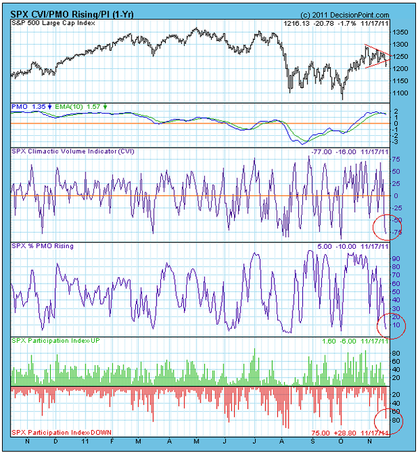
From a chartist's perspective, the S&P 500 Index broke out of its recent triangle pattern by moving lower. This was an unpleasant surprise for bulls, because triangles are most often considered a continuation pattern. As such, when the pattern ends, prices are normally expected to continue in the direction they were trending before the continuation pattern (consolidation) began.
In this case, the breakdown casts a bearish pall on a picture that been bullish since the October low.
A positive aspect to the price breakdown is that a number of ultra-short-term indicators hit climactic oversold readings the same day. On the chart, above, we can see how these oversold spikes generally coincide with the start of rallies of at least short-term duration.
Carl Swenlin at DecisionPoint explains that climaxes are often a sign of either initiation or exhaustion. An initiation climax signals that price will begin moving in the direction of the climax, while an exhaustion climax occurs at the end of a move. Immediately following a climax, prices can chop around for a day or two before the follow-through begins.
So, was the breakdown actually a shakeout, intended to turn people bearish just ahead of a rally?
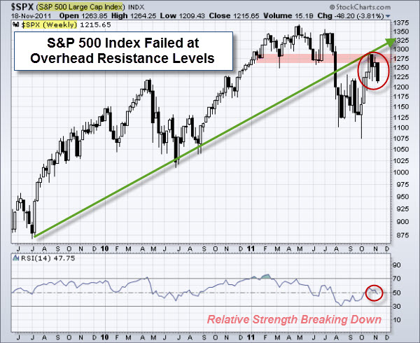
Unfortunately, we are still on a longer-term sell signal, which means things could be about to get nasty again. The following chart shows a weekly view of the S&P 500 Index. Notice that price could not get back above the up-trend line (marked by the green arrow) or the overhead support-resistance line (marked by the pink highlight).
Other clues? Historically, this is a seasonally bullish time. And trader talk is that markets may pop on a significant government intervention we are likely to see.
All-in-all, it points to another interesting week.
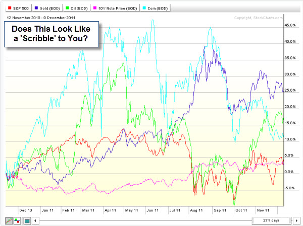
The good news is that the Markets have responded well to much uncertainty. Moreover, without committed sellers, it has been easier for prices to get pushed higher. The bad news is that the uncertainty comes from real issues.
I'm reminded of the phrase: "Just because you are paranoid, doesn't mean people aren't out to get you." Here are two things that to watch.
The Continued Risk of Default in Europe.
So far, none of the European austerity and bailout plans have not managed to stem the European debt crisis.
Some would claim that the severity of the crisis has only increased over time, given that Italy (the world's eighth largest and the euro zone's third largest economy) is now becoming the latest European nation threatening to require a bailout.
The following chart helps illustrate the risk of European debt by plotting out the 10-year government bond spread for all the PIIGS (i.e. Portugal, Italy, Ireland, Greece, and Spain) from 2007 to the present (versus the German Bund).
For example, (at the time this chart was constructed) the Greek 10-year government bond yield (light blue line) is currently a whopping 32.5 percentage points greater than that of the relatively stable German Bund. That is a far cry from where it was back in the summer of 2009 and shows the risk premium imposed based on the perceived likelihood of default.
Perhaps more important, however, is the status of Italy (dark-blue line). Italy has €1.9 trillion ($2.6 trillion) of debt outstanding. This level of debt is greater than that of all the other PIIGS combined. Due to the severity of the situation, the European Central Bank may ultimately be forced to do unpleasant things (like deciding to print a significant amount of euros – something they are very much ideologically opposed to doing).
The Relatively Poor Performance of Banks.
Banks often lead rallies higher. The logic is that banks make more money when they are lending, doing deals, and helping companies go public. In 2011, investors have been hesitant to buy into further gains in this sector.
Looking at the chart, below, notice that the S&P 500 Index (symbol: SPY) has been trending up since April 2010, while the Banking Index (symbol: $BKX) has been trending down since April 2010.
What Else Is Wrong With That Picture?
According to StockTiming.com, the Financials component on the S&P 500 is the second largest component representing 13.78% of the index.
Consequently, this chart implies that the "other components" (as a group) have been strong enough to overcome the huge weakness in the Banking sector.
Negative divergences like this cannot go on forever. For the S&P to continue trending up in the future, the non-financial sectors will have to stay strong, and stay strong enough for the Financials to start reversing its down trend.
So, while the markets have held up well through the recent negative sentiment and external risk factors, there are still some big challenges ahead. Perhaps all that means is that this is a more a trader's market than an investor's market. On the other hand, diversification seems like a good goal here.
The Texas governor is trying to turn his recent stumble into an opportunity. He is asking supporters to pitch in a few dollars for every agency they would abolish.
Here are two excuses Perry could use to explain what happened.
"Actually there were three reasons I messed up last night. One was the nerves, two was the headache and three was, and three, uh, uh. Oops."
"I had a five-hour energy drink six hours before the debate."
For more, here is a link to Rick Perry's 'Letterman' Appearance: GOP Presidential Candidate Reads List Of 'Top 10 Rick Perry Excuses'.
Here are some of the posts that caught my eye. Hope you find something interesting.