Current Affairs

  • Capitalogix Commentary 12/27/09

    Since I'm spending the holidays in Asia, I thought I'd share a few lighter things this week.

    First up is the Elf-Yourself site from JibJab.  And my wife says I can't dance.

    Send your own ElfYourself eCards

    Click here to make one yourself.

    Second, here is something I look forward to each year.  Uncle Jay sings the year in review.

    Market Commentary.

    At the end of each year, the big financial media outlets typically conduct roundtables to get outlooks from key players in the financial markets.  Over the past few years, the individuals that run the best financial blogs and websites have become key players in their own rights, and their opinions are highly regarded by millions of loyal readers.  This year, Bespoke asked twelve popular financial blogs/websites to respond to the same 25 questions regarding their 2010 outlooks as well as their take on 2009. 

     091226 Bespoke Roundtable

    The responses were thought-provoking, and hopefully they will help you form your opinions on what is to come for financial markets in the year ahead. 

    Best Wishes for a happy holiday season and for a prosperous New Year.

    Business Posts Moving the Markets that I Found Interesting This Week:

    Lighter Ideas and Fun Links that I Found Interesting This Week

  • Capitalogix Commentary 12/20/09

    091218-John-Mauldin-and-Geo John Mauldin and George Friedman
    were in Dallas this week.  Several hundred people came out to hear
    their thoughts on the world and the economy. 

    For what it's worth, Freidman's Stratfor service and Mauldin's Thoughts from the Frontline and are both terrific reads.

    I take it as a bullish
    sign that so many people made time, in the middle of the day, for an
    event like this. 

    While the mood in the room was that the
    easy money has already been made in the equity markets, people were
    looking for places to put money to work. 

    Sentiment Soaring …

    Up-and-Down … the ride continues.  Still, sentiment is quite bullish.  How bullish?  AAII's weekly survey showed the fewest bears since April 30th. That was just about the time the Russell 2000 rolled-over to start an 8% correction.

    091213 Bull and Bear Coaster

    Market Commentary.

    Here is a daily chart of the Dow Jones Industrial Average.  It shows the market at a decision-point.  The month-long consolidation has taken the market to a place just above major support and resistance level … And back to the upwards sloping trendline.  

    091220 Dow at Decision Point

    Traders expect a big move after periods of compressed range (like the one we are in now).  Bollinger Bands are often used to represent volatility. You can construct by plotting bands two standard deviations on either side of the 20-period moving average (note the pink bands in the chart above).  One of the indicators I keep an eye on, is the band-width of these Bollinger Bands (it is plotted in the bottom pane of the chart shown above). When it gets narrow for an extended period, that "squeeze" puts me on alert for expanding volatility. 

    What do you do?  You watch price.  This is the classic buy point in an up-trend.  On the other hand, there's everything else.

    Insight: Price is the Primary Indicator.

    What do you think is the most bullish indicator of our markets?  It's not a trick question; the answer is "price".

    The
    markets have held-up nicely, throughout this rally, despite lots of bad
    news about the economy. And that, in-and-of-itself, is bullish.

    It
    doesn't matter what technical analysis indicator you use (increasing
    negative divergences and selling on down days … or less positive
    momentum and market breadth), the markets have given us a clear message
    recently. Price is the primary indicator, and it has stayed above
    support. 

    While there will likely be a bearish divergence when
    the trend finally ends, it is clear that a strong uptrend trumps most
    bearish divergences.

    The Implications of America's Rapidly Expanding Debt.

    Here is a video from Consuelo Mack's WealthTrack, about the lessons of history. Best selling author and historian Niall Ferguson talks about the seismic global economic and market shifts of recent years mean for our future, particularly the longer term implications of America's exploding debt.

    Here is the transcript.

    Business Posts Moving the Markets that I Found Interesting This Week:

    • Volcker: No Growth Besides What the Fed's Pouring Into the Economy. (BusinessInsider)
    • M&A Activity: Google Buying Start-ups Again. (BusinessInsider)
    • A Start-Up Jokingly Touted a $100 Billion Valuation. Now VCs are Calling. (Forbes)
    • Wal-Mart's Web War Against Amazon Risks Little. (WSJ)
    • What's Glittering Isn't Always Gold – Other Metals Doing Well.(WSJ)
    • Thoughts on the Market's Recent Gap Activity. (Quantifiable Edges)
    • More Posts Moving the Markets.

    Lighter Ideas and Fun Links that I Found Interesting This Week

    • A Glimpse at the Future from Microsoft's Lead Tech Visionary. (CNet)
    • Forbes Gave Ken Auletta’s ‘Googled’ a Great Book Review. (Forbes)
    • Milken Institute's Journal of Economic Policy Worth a Look. (Milken)
    • Craziest Google Street View Shots. (HuffingtonPost)
    • Jewish Delis Are Dwindling, Traditions and All. (NYTimes)
    • MIT's Next Bionic Breakthrough … Stepping Beyond Human. (Forbes)
    • More Posts with Lighter Ideas and Fun Links.
  • Palin and Shatner’s Strange Word War

    Words alone, won't do this justice.  You should watch for yourself.

    Sarah Palin and William Shatner channel something strangely reminiscent of beatnik poetry or Haiku.

    Enjoy.

    It is like a competitive poetry performance, except they are reading each other's words out of context.

    Other Resources:


  • Capitalogix Commentary 12/13/09

    It was a slow news week, as long as you weren't Tiger Woods.  Numbers and charts can tell only so much of a story.

    Problems Comparison Between Tiger Woods and Jay Z

    Market Commentary.

    Why has the market stayed so strong?  The first thing that comes to mind is massive government intervention.  The next thing that comes to mind is that there have been more buyers than sellers.  That is not a pun.  Perhaps it is more telling to say there hasn't been a lot of committed short sellers.  Recently, however, there hasn't been a lot of committed buyers either.  The result has been a month-long, narrow trading range.

    Here is an intra-day chart of Dow Jones Industrial Average. It is easy to see the trading range that has constrained prices for the past month.  Notice how many times price has turned-down off the highs, and bounced off the lows.  The question is, will it happen again?

    091213 Trading Range for the Dow

    Technical traders will see this as a likely time to turn back down.  The Dow is at the top of its recent trading range and has several negative divergences (like the MACD shown at the bottom of the chart).  However, markets aren't known for rewarding the "easy" trade.

    In addition, big moves often happen after tight ranges.  So, the next move might be a big one.

    For a clue as to the direction of the next move, it may help to look to the Financial Sector.

    Financials are Often Early Indicators of the Broader Market.

    Here is a chart of Goldman Sachs. It is going through a downside correction, beneath its 50-day moving average, and is testing support.  A sustained move above this level could be a very bullish early indicator for the U.S. Equity markets.  A further break-down, from here, would also be telling.

    091213 Goldman Sachs at Support Level

    Business Posts Moving the Markets that I Found Interesting This Week:

    Lighter Ideas and Fun Links that I Found Interesting This Week

    • Time Magazine's The 50 Best Inventions of 2009. (Time)
    • Loneliness is Contagious: Even If That Sounds like an Oxymoron. (Slate)
    • Six Social Media Trends for 2010. (Leader)
    • Learning From Porn: Lessons from the Cutting-Edge Of Technology. (MediaPost)
    • Dissecting the Dollar's Re-Design Project. Is This Re-Branding? (Mint)
    • More Posts with Lighter Ideas and Fun Links.
  • Capitalogix Commentary 12/06/09

    It looks like the economy is taking off.  Of course, a jobless recovery would weigh things down. 

    091206 Jobless Recovery - KAL from Economist

    We saw more favorable (or at least less negative) jobs report this week.  We'll see if this marks a turning point for this important measure.  In any event, the Markets have continued to hold up well.

    The Big Picture.

    Here is a three-year look at the NASDAQ Composite Index.  The good news is that price broke above the blue-dashed trend-line, and has been able to hold its position and make new highs.  That was bullish.  Traders notice that momentum is slowing, and that price is mired in a key resistance zone.  This area (marked in pink) is seen as a support-and-resistance zone and also marks the 61.8% retracement level (which traders often look at a reversal trigger).

     091206 NASDAQ Decision

    Consequently, a sustained move above this cluster of resistance would be bullish for the market.

    Let's Zoom-In for a Closer Look.

    As noted, though, upwards momentum has slowed.  The next chart is an intra-day chart of the S&P 500 Index.  For most of November, you can see trading ranges alternating above and below a "Disagreement Zone" (which is highlighted by the gray zone).  Think of this as an arm-wrestling match.  Currently, there is no clear winner.  Each push in one direction, has been met with an equal push in the opposite direction.  In addition, many of the moves are the result of overnight gaps. These are marked by the orange circles. You can click the chart below to see a larger version.

    091206 S&P500 100 Days Back 75 min 800p

    This chart also implies that it would be bullish for the markets to sustain its move above this "Disagreement Zone" level.  It is a pretty clear "line-in-the-sand".

    Let's Look Under the Surface at Market Breadth.

    This chart looks at NSYSE stocks making new 52-week highs, and subtracts the number of NYSE stocks making new 52-week lows . That means we get more Net New Highs when the markets are doing better. As it stands, A lot of NYSE stocks are making highs for the year.  Yet, there are less Net New Highs than we saw in October. While this is a little picky, it does constitute a negative divergence. Consequently, I'm watching what happen in this measure as a potential early indicator of market change.

    091206 Fewer New Highs

    Hope you have a good week.

    Business Posts Moving the Markets that I Found Interesting This Week:

    • Respecting the Recovery: Do the Pouting Pundits of Pessimism have it Wrong? (Forbes)
    • Too Big to Ignore: Unease Over Banks' $1 Trillion of Cash Reserves. (WSJ)
    • Roubini: A Tale of Two American Economies. (RGE Monitor)
    • M&A Is Back — But This Time, It's Different. (Wharton)
    • Shoppers Are Winning at Chicken, Waiting for Discounts. (WSJ)
    • More Posts Moving the Markets.

    Lighter Ideas and Fun Links that I Found Interesting This Week

  • Capitalogix Commentary 11/29/09

    091129 Dubai Landmark Black Friday came in several ways this year.  Yes, there was shopping.  However, the markets had a dark few days, too, as the world markets quaked at the news of Dubai's sovereign debt default.

    I've always believed that you can tell a lot about the current character of the market based on how it responds to news. Sometimes markets go up on good news, and go down on bad news. That seems normal. On the other hand, I take it as a bearish sign when markets sell-off after good news. Likewise, I take it is a bullish sign when markets go up, despite bad news.

    So, it wasn't surprising that markets reacted negatively to the largest sovereign debt default since Argentina. It was, however, somewhat bullish that the US equity indices went down as little as they did. Yes, I know that our markets were closed on Thursday (when most of the damage was done globally) because of our Thanksgiving holiday. And I also realized that Friday was a half day and had relatively light volume. Nonetheless, it could have been worse; much worse.

    Here is a link to a post I wrote that I think is worth reading at this point in the markets. I called it "What My Dogs Can Teach Us about Markets".  It's really about how perceived danger puts us on alert; and why the second perceived danger often receives an even greater response. The point is that the world is now on alert, and I'm watching how calmly (or not) the market reacts to news.

    Market Commentary.

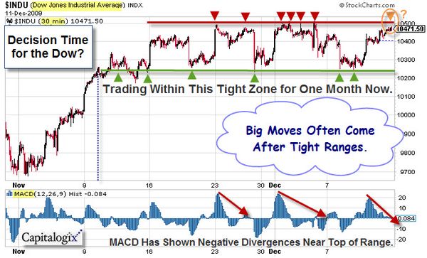
    The markets continue to hold up well on the surface.  Underneath, I'm seeing signs of weakness (poor breadth, weak up-volume, fewer new highs, more negative divergences, etc.).  Nevertheless, price has stayed above important levels.

    With that said, here are some patterns worth watching.  This chart uses 15-minute bars to get an intra-day look at the S&P Mid-Cap Index throughout November. The most notable thing I see is a character change in mid-month.  The Bullish Break-Away Gaps seen at the beginning of the month are followed by two Bearish Island Reversal patterns (marked by the yellow boxes) in the second half of the month.  This type of pattern can be seen at market tops.  It starts with a gap-up (shown by the green circle) and ends with an exhaustion gap (shown by the red circle). You can click this chart to see a full-size version.

    091128 EMD_15min_Nov
    To understand what this pattern shows, you can think of it as the last buyers
    rushing to get in (pushing-up price so fast that it creates a
    break-away gap), only to find that there are no new buyers (causing a
    price drop and the resulting exhaustion gap).  This gap down can signal
    the beginning of a change in trend. Two of them in a row makes me more watchful.

    David Corna reminded me that this pattern shows-up differently on a higher time-frame. For example, on a daily candlestick chart, the intra-day Island Reversal manifests as two classic reversal patterns, a Hanging Man followed by an Evening Star. Their very names are onomatopoetic to their meaning. These candlestick formations will almost always be found at the end of a trend and the beginning of a reversal.

    Chart.ly from StockTwits is a Good Source of Ideas.

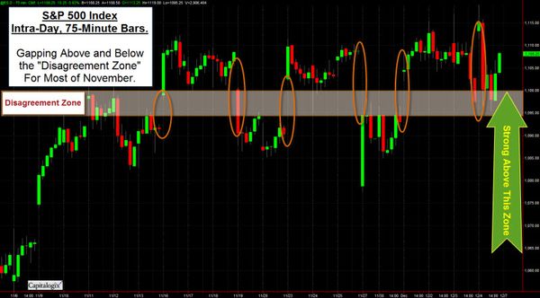
    Many traders use charts and technical analysis to gain insight and perspective on what's happening in the markets.  I'm always looking for resources that help me do that.  Recently, I've found a lot of good content on the Chart.ly website.  It is part of StockTwits, and has a strong user community.  Here is an example of a chart I found there this week.

    091129 SP500 Since July

    I like the analysis, and concur that the bottom trend-line (and the area on the far right of the chart marked by the blue circle) points to a key price area.  Staying above that is important for the rally to continue.

    How bullish has the rally been in real economic terms?

    What the Dow Priced in Gold Tells You?

    This chart shows the Dow Jones Industrial Average priced in Gold.  In other words, how many ounces of gold does it take to buy the Dow's price?  So, for example, when the Dow is at 10,000 and Gold is $1,000 per ounce, it would take 10 ounces.

    091129 Dow Priced in Gold Since 1900

    Here is a similar chart, limited to the past ten years.

    091129 Dow Priced in Gold Since 2000

    As you can see, it took over 40 ounces of Gold to pay for Dow in early 2000.  It now takes around 8.75 ounces. From this perspective, it looks like the Dow lost 80% of its value. That seems significant, even though the Dow's price is back close to the levels traded in the year 2000.

    I don't normally put too much stock in charts that show one asset priced in another.  If it was supposed to be priced that way, it would be … However, this comparison seems more relevant to me because gold is a form or currency.  Also, as people decide what to invest in lost opportunity cost is a factor.

    How is the Economy Doing?

    Here is a chart from Russell Investments that identifies a few key economic and market indicators to help assess the current economic health and trend.  Click the chart for an interactive version.

    091129 State of the Economy

    Business Posts Moving the Markets that I Found Interesting This Week:

    Lighter Ideas and Fun Links that I Found Interesting This Week

    • Alpha Males Must Trade on More than Machismo. (FT)
    • America's Healthiest and Unhealthiest States. (MSN Health)
    • In Tough Economy, Tighter Belts Mean Thicker Waists. (WSJ)
    • Man in ‘Coma’ Heard Everything for 23 years. (MSNBC)
    • Clicker's Online TV & Movie Guide Impresses. (Newser)
    • Answers to 15 More Google Interview Questions that Will Make You Feel Stupid. (Insider)
    • More Posts with Lighter Ideas and Fun Links.