Current Affairs

  • Capitalogix Commentary for the Week of 07/26/10

    It was a strong week for the markets.  Normally, to get a sense of what's happening, I focus on the U.S. equity markets.  This week, however, I thought it made sense to start with a look at emerging markets around the world.  These markets are often referred to as BRICs.

    Emerging Markets Lead Stock Rally.

    At this point, foreign stocks are leading the U.S. stock market higher. Here is a chart showing that Emerging Market iShares recently broke above its June high.  Moreover, after breaking above the down-trend since April, it successfully re-tested that line (from above) and bounced higher. From a technical analysis perspective, those are bullish signs.

    100726 Emerging Markets Move Higher 

    Here in America, it is earnings season, and companies have been reporting better news than most expected.  The economic news hasn't been stellar; but the markets have held up well.  This chart shows the S&P 500 Index at the top of hotly contested resistance level.

    100726 SP500 at Resistance Level

    Many would take a sustained move above the 1120 level as a strong bullish sign.

    With that said, business expansion is dragging and slowing the economic recovery, and it
    seems everyone is searching for reasons.

    Debt Overhang.

    In his new paper, Federal Reserve Bank of Cleveland researcher Filippo Occhino says a contributing factor may be something called debt overhang. Simply put, when companies have too much debt it discourages them and their investors from taking on projects because the debt consumes any profits the investors might make, even in situations when the investment raises equity in the company.

    Watch the Debt Overhang Video from the Cleveland Fed.

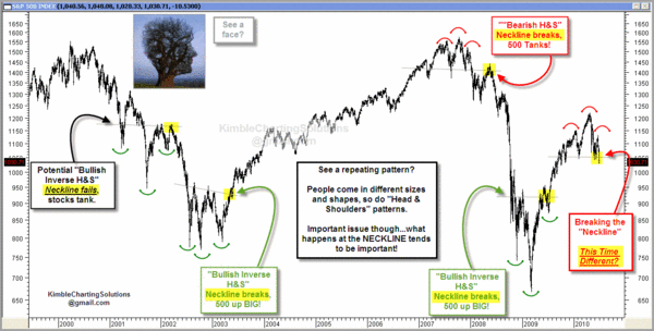
    A different slant on the debt problem is illustrated below.

    100725 Zyglis Cartoon - Debt is Biggest Security Threat

    Business Posts Moving the
    Markets
    that I Found Interesting This Week
    :

    • What VIX Futures Tell Us About October: Is Something Really Scary Coming? (FT Alphaville)
    • Goldman Sachs' Global Leading Indicator Rolls Over. (PragCap)
    • Goldman Sachs $550 Million Fine Amounts to Only One Week's Trading Profits. (Citywire)
    • Indian Court Rules that Hindu Gods Can't Trade Shares. (CrossingWallSt)
    • What’s Really Going on in the VC Industry & What Does it Mean for Startups? (BothSides)
    • More Posts
      Moving the Markets
      .

    Lighter Ideas and
    Fun Links

    that I Found Interesting This Week

    • Microsoft Releases Beta of Upgraded Security Essentials. (PCWorld)
    • Are You Part of the Botnet Army? What You Can Do To Protect
      Yourself. (NewNewInternet)
    • Would You Eat Synthetic Meat? It Will Probably Taste Like Chicken. (The Week)
    • Perdue recalls 90,000 pounds of chicken nuggets that may contain pieces of plastic. (CNN)
    • Why a Scientist is Challenging Whether Gravity Exists. (NYTimes)
    • More
      Posts with Lighter Ideas and Fun Links
      .
    Enhanced by Zemanta
  • Cartoon: Woo-Hoo! We’ve Stopped the Oil!!

    100716 We Stopped the Oil Cartoon from Heller
    Is the glass half-empty, or is the glass half full?

    It's easy for cartoonists to make fun of how long it took to stop the oil leak.

    Nonetheless, it will certainly be a lot easier to clean up the mess now that were not making more of it.

    Here's to progress.

  • Capitalogix Commentary for the Week of 07/19/10

    If only everything could be fixed this easily.

    100717 iPhone 5 Cartoon Darkow 600p

    It is earnings season again.  However, note that the year-to-year
    comparison no longer refers to the recession. Instead, the comparisons
    get harder than last year. Moreover, the economic data has been ugly … and so has sentiment on quarterly earnings.  The question becomes: how tough will it be for Wall Street to battle back from the latest sell-off?

    Market Commentary

    The chart below shows a daily view of the Nasdaq composite index since January. Note, however, that this market has been making lower highs and lower lows since April. That is the classic definition of a downtrend.

    In addition, chart watchers often pay attention to a pattern called a Death Cross. This occurs when the short-term (50 day) moving average crosses beneath the longer-term (200 day) moving average. As you can see, a death cross happened last week.  It is highlighted in yellow and circled in orange. Since then, the market has fallen further.

    100718 NASDAQ Down Trend

    Is a Leading Indicator of Economic Activity Drying-Up?

    If you are looking for insight into global
    supply and demand trends, the Baltic Dry Index is one of the purest
    leading indicators of economic activity. It
    offers a real-time glimpse at global raw material and
    infrastructure demand,
    as well as the supply of ships available to move this type of cargo.

    According to Bloomberg, Commodity shipping rates ended their
    longest losing streak in almost
    15 years on speculation owners are refusing to offer vessels at
    current hire rates. 

    100718 Baltic Dry Index Down 60 Percent
    The index has had a particularly bad run of
    35 consecutive drops, the longest since November 1995,  during
    which the measure lost 60 percent of its value. Since
    making a short-term peak in late May (about a month after equity
    markets peaked), the index has declined about 60%.

    Just in case you wanted more fear fodder to chew on, Here is a chart that is making the rounds.

    De-Leveraging the Credit Bubble.

    It purports to show that the total leverage within the world financial system currently
    stands at 60 to 1, where we are leveraged 60 to the 1 of real reserves
    we actually have. 

    100716 usd-economic-bubble

    Christopher
    Laird
    explains this chart as follows:

    The point of emphasizing it's from
    the end of WW2 is that we are not talking merely about a banking crisis,
    or whatever. We are talking about the deleveraging of the greatest
    economic/finance bubble in history. Once the level of leverage reached
    60 to 1, it becomes impossible to stay ahead of the deleveraging, even
    for central banks. The implications are staggering. Every major economy
    in the world is involved. The outcomes of deleveraging this monster
    bubble, represented by the green oval, will be what I term Credit Crisis
    II. At 60 to 1 leverage, a loss of 1 to 2% wipes out the capital.

    Let's hope that doesn't happen.  On the other hand, there has been a lively debate about what the chart really means.  For further insight on this, check-out the comment section on the Business Insider's

    Chart of the Day post about this topic.

    Business Posts Moving the
    Markets
    that I Found Interesting This Week
    :

    • Ten Reasons to Be Bullish & One BIG Reason to Be Bearish. (TradersNarrative)
    • Behavioral Finance’s Smoking Gun: Probability Analysis Isn't
      Rationality. (PsyFi)
    • Jumping Back Into Bonds: Investing With an Eye on Absolute Return. (WSJ)
    • Insane Bulls And Bears – or – The Men Who Want to Be Roubini. (Forbes)
    • Mao Zedong's Creation, Agricultural Bank of China Raises $19 Billion
      in I.P.O. (NYTimes)
    • More Posts
      Moving the Markets
      .

    Lighter Ideas and
    Fun Links

    that I Found Interesting This Week

    Enhanced by Zemanta
  • Capitalogix Commentary for the Markets – 07/12/10

    It was a strong week in the markets, all over the world.  Here is a graphic that will show you how well everyone did.  It comes from FT.

    100711 World Market Performance Last Week

    So, while things are looking better, let's look at a chart of what's happening on the Dow Jones Industrial Average.

    Dow's Down-trend Is Still Clear.

    May and June were volatile months for the stock market. The Dow moved within a 1400 point range in May and an 800 point range in June. Over the last seven days, the Dow moved from 10136 to 9614 and back to 10136. Basically, we saw two 500 point swings in seven trading days.

    The Dow's daily Rate-of-Change is shown int the indicator below the main chart,. It illustrates another form of volatility. Moves outside of the -2% to 2% range (marked by the blue line) were rare
    from August to April. Notice how the Rate-of-Change dipped above 2% and below 2% numerous times since early May (marked by the pink highlight).

    100711 Dow Rally within Down-Trend

    On the price chart, a falling wedge is taking shape. According to Arthur
    Hill
    , these patterns sometimes denote a correction within a bigger
    uptrend. However, they are clearly bearish as long as they fall. In
    other words, the trend is down as long as the wedge falls. The Dow needs
    to clear the April trend-line first, and then the June high, to reverse
    this downtrend.

    Business Posts Moving the
    Markets
    that I Found Interesting This Week
    :

    • Did Dykstra Secretly Sell Access to Cramer & Stock Endorsements
      on TheStreet? (TDB)
    • For Small Companies, the Credit Crunch Hasn't Gone Away. Here's Why.
      (WSJ)
    • The Pendulum Swings Toward Austerity. Goodbye Big Government? (NYTimes)
    • Greece Starts Putting Island Land Up For Sale to Save Economy. (Guardian)
    • Rewriting the Rules of Wall Street: a Good Start to Financial
      Reform. (Economist)
    • More Posts
      Moving the Markets
      .

    Lighter Ideas and
    Fun Links

    that I Found Interesting This Week

    Enhanced by Zemanta
  • Starting to See More IPO and Merger & Acquisition Activity

    Initial Public Offerings are an indicator of market health. Well, here is some good news.  More venture-backed companies have had IPOs this
    year than there were in the last two years combined.

    The bad news is that the market has not been kind to these newly
    public companies. Scott Austin at the WSJ notes that only six of this year's
    venture backed IPOs are above their first day of trading.

    100702 
chart-of-the-day-vc-backed-ipos-2002-2010

    For example, a recent IPO with a lot of "buzz" was Tesla.  The enthusiasm generated for Tesla's stock during its first day on the market has waned. After reaching almost $30, Tesla faded fast. It's back down to $17.40.  Here is the chart.

    Tesla

    Nonetheless, I'm starting to see more articles about M&A activity too.  I take the increase in IPO and M&A activity as a positive economic sign.  What about you?

    Enhanced by Zemanta
  • Capitalogix Commentary for the Markets – 07/5/10

    It seems like there is a mighty long fuse on the real economic recovery.  We might be in for a longer wait than the recent rally led some to believe.

    100704 There is a Long Fuse on the Economic Recovery

    A record drop in pending home sales and a slowdown in the construction
    market contributed to a sluggish outlook for the economy last week, and highlighting the significance of government stimulus measures and job
    growth.

    Market Commentary

    The Nasdaq Composite Index is showing a well-formed Head and Shoulders topping pattern.  Price has broken beneath the neckline, which means it has triggered.  Unless it can move back above that level, the pattern's target is the distance from the top of the head (2500) to the neckline (2100), which is 400 points lower.

    Supporting the bearish case, new 52-week lows are expanding on the Nasdaq while new 52-week highs are drying up. Net New Highs (new 52-week highs less new 52-week lows) is an easy way to assess the battle for new 52-week extremes. An uptrend is unlikely as long as Net New Highs remain
    negative.

    100702 Nasdaq Head and Shoulders
    Technical Analysis is often easy to see after the fact.  Here is a look at several Head and Shoulder top and bottom patterns.  Click the image to see a bigger version.

    100704 multiple necklines

    Here's Something That Will Show-Up On Lots of Radar Screens.

    On some level, Technical Analysis is a self-fulfilling prophecy because "everyone" is looking at the same thing.  While lots of people are worried about the Head and Shoulders pattern, I suspect that far more are watching the "Death Cross" or "Dark Cross" that is being formed on our indices as the 50-day moving average falls below the 200-day moving average.

    While I see the bearish implications, some trader's will be looking for the head-and-shoulders and death-cross patterns to fail because of a short squeeze.  Failed patterns often result in bigger moves than the patterns that didn't work.  Here is an explanation about why that happens.

    The OOPs Trade

    When a well-known pattern fails, the response is often dynamic. This often happens with obvious, high profile situations like a "Head-and-Shoulders"
    pattern, a move through big Round
    Numbers
    (like Dow 10,000), crossing
    the 200-Day Moving Average, or violating a clear Price Channel. Just for the record, several of those are in-play at this price level.

    An often violent reversal happens when the crowd realizes that it was wrong, and people rush to cover their painful losing positions.  As the price of the stock increases, more short sellers feel driven to
    cover their positions.  This is very similar to a short squeeze;
    and the move is often violent and prolonged.

    The markets are
    oversold here; lots of people know that we just made new lows, and we
    have been bombarded with bad news recently.  So, I'm not predicting that
    the market will reverse here. I am just suggesting that it is
    possible and something to watch.

    Business Posts Moving the
    Markets
    that I Found Interesting This Week
    :

    • Why the Year's First-Half Performance Says Little About the Second. (MarketWatch)
    • John Hussman: A Recession Warning. (InvestmentNews)
    • Summer Internships: Unpaid Positions Gaining Popularity At Small
      Firms. (LATimes)
    • Apple iPad Sales Hit Three Million in 80 Days. (WSJ)
    • Cost of Fannie Mae & Freddie Mac Rising; May Exceed Banking
      Rescue. (NYTimes)
    • More Posts
      Moving the Markets
      .

    Lighter Ideas and
    Fun Links

    that I Found Interesting This Week

    Enhanced by Zemanta