Current Affairs

  • Gold Has Been Glittering, But Silver Has Had a Stronger Move

    Gold continues to receive the headlines, yet silver is really moving.

    Bespoke posted a chart that highlights how remarkable silver's run has been.


    110424 Silver Gold and the SPX

    Had you invested $100 in silver ten years ago today, your investment would now be worth $1,037.  A $100 investment in gold would be worth about half that at $569, and a $100 investment in the stock market (S&P 500) would be worth just $107.48.

    Here is what Jim Rogers thinks about silver's move.


    For more on that, here is a link to an article where he reminds that parabolic moves always collapse.


    Enhanced by Zemanta

  • Here a Few Links for Your Weekend Reading Enjoyment

    Looking for something to read?  Here are some ideas.

    Business Posts Moving the Markets that I Found Interesting Recently:

    • Man vs. Machine on Wall Street – How Computers Beat the Market. (Atlantic)
    • 5 Lies That Economists Are Feeding Us. (Money)
    • If Regulation Didn't Kill IPOs … What Did?  (Fortune)
    • Don’t Believe the Chart – Is the US Dollar Dropping Like a Stone? (ZeroHedge)
    • NSA Investigating Nasdaq Hack. Was a Nation-State Involved?  (Wired)
    • More Posts Moving the Markets.

    Lighter Ideas and Fun Links that I Found Interesting Recently:

  • Some Thoughts on the Budget and Government Spending

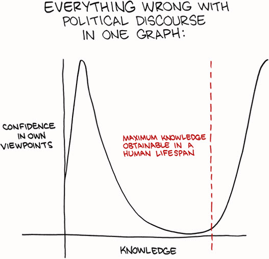
    This graphic highlights some of what is wrong with political discourse.


    110417 Everything Wrong With Politcs

    So, the government avoided a shut-down.  Is that a good or bad thing? 

    Understanding the Scope of the Budget Deficit.

    What were they really fighting about?

    Philip Greenspun puts the the budget deficit into easier-to-grasp context: just divide everything by 100,000,000.

    • We have a family that is spending $38,200 per year.
    • The family’s income is $21,700 per year.
    • The family adds $16,500 in credit card debt every year in order to pay its bills.
    • After a long and difficult debate among family members, keeping in mind that it was not going to be possible to borrow $16,500 every year forever, the parents and children agreed that a $380/year premium cable subscription could be terminated.
    • So now the family will have to borrow only $16,120 per year.

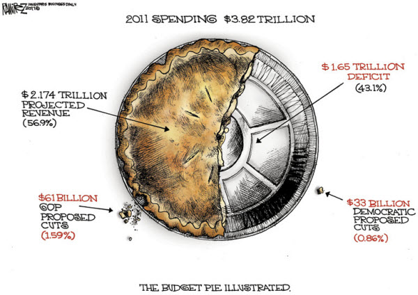
    If you are a visual thinker, here is different way to look at it.

    110417 The Budget Pie Chart Cartoon by Michael-Ramirez

    Government Shutdown Averted – Fiscal Crisis Assured!

    I saw this video and thought it made some interesting points .


    For a different perpective, you can watch the introduction video released by a new political movement called the Win+Win Revolution

    We do live in interesting times.
    Enhanced by Zemanta
  • Video Captures Obama’s Favorite Catch-Phrases

    ‘Make no mistake,’ Obama is a big fan of his own catchphrases.

    This video shows that there’s no mistaking it: “Make no mistake” is President Obama’s favorite catchphrase.
      

    Statistics gathered by the Global Language Monitor reveal that Obama has said it 2,924 times since he was sworn into office more than two years ago.

    Other signature Obama sayings include: "Win the future" (1,861 times),  “Here’s the deal” (1,450 times), and “Let me be clear,” (1,066 times). In a nod to the tough financial times he has faced, the president’s fifth most popular motto is “It will not be easy” (1,059 times).

     
    Enhanced by Zemanta

  • Here a Few Links for Weekend Reading

    Business Posts Moving the Markets that I Found Interesting This Week:

    • ETFs to Top 2nd $ Trillion in 3 Years; it took 18 years to get the 1st. (STM)
    • Market Confidence, Tricks and Placebos. (PsyFiTec)
    • Is Apple On Target For Its First $100 Billion Revenue Year? (Forbes)
    • McDonald's to hire 50,000 workers, starting April 19th. (Money)
    • Data Guru Warns of Future 'Bots Hacking the Markets. (Barrons)
    • More Posts Moving the Markets.

    Lighter Ideas and Fun Links that I Found Interesting This Week

  • Are Cracks Starting to Show in the Rally’s Foundation?

    Newsweek had a great cover:  "Apocalypse Now". Think about it, Tsunamis, Earthquakes, Nuclear Melt-Downs, Revolutions, Governments on the Verge of Shutting-Down …
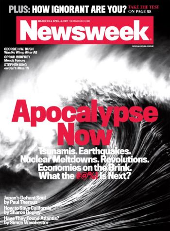
    110410 Newsweek Apocalypse Now Cover

    And, yet, despite a cavalcade of horrors … the markets have held up well.

    Is This as Good as it Gets?

    Barron's notes:

    Having snagged its best first quarter since 1998, the U.S. stock market began April on a hopeful, if hesitant, note, encouraged by evidence that our economy is improving, but a little fearful that this may be as good as it gets.

    On Friday, the Dow Jones Industrial Average nudged briefly above its recent February peak to reach its highest level in nearly three years, effectively brushing aside recent concerns such as high oil prices, flailing European banks and disruptions in the wake of Japan's disaster that had so alarmed investors mere weeks earlier.

    Are Cracks Starting to Show in the Rally's Foundation?

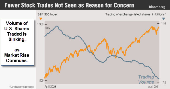
    Bloomberg posted a chart showing the bull market move put in by the S&P 500 Index.  Note, however, the dwindling volume of shares traded, especially since prices rebounded off lows earlier this year.
     

    110410 Trading Volume Down as Markets Rise

    Barry Ritholz notes "Fed induced rallies tend to be liquidity, not conviction driven. Thus, the anemic volume".

    Breadth is Starting to Show Signs of Fatigue as Well

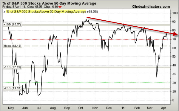
    The following chart shows the percent of stocks trading above their 50-Day Moving Averages.
     

    110410 SP500 Issues Above 50-Day Moving Average 
    In strong markets, this indicator goes up as price rises.  However, as the market rally loses momentum, this indicator starts tracing-out lower highs.

    So what do you do?  With the charts shown above and QE2 is supposedly ending in June … price is still the primary indicator.  Until sellers show up with conviction, the liquidity rally is likely to continue.

    Enhanced by Zemanta

  • Are Cracks Starting to Show in the Rally’s Foundation?

    Newsweek had a great cover:  "Apocalypse Now". Think about it, Tsunamis, Earthquakes, Nuclear Melt-Downs, Revolutions, Governments on the Verge of Shutting-Down …

    110410 Newsweek Apocalypse Now Cover

    And, yet, despite a cavalcade of horrors … the markets have held up well.

    Is This as Good as it Gets?

    Barron's notes:

    Having snagged its best first quarter since 1998, the U.S. stock market began April on a hopeful, if hesitant, note, encouraged by evidence that our economy is improving, but a little fearful that this may be as good as it gets.

    On Friday, the Dow Jones Industrial Average nudged briefly above its recent February peak to reach its highest level in nearly three years, effectively brushing aside recent concerns such as high oil prices, flailing European banks and disruptions in the wake of Japan's disaster that had so alarmed investors mere weeks earlier.

    Are Cracks Starting to Show in the Rally's Foundation?

    Bloomberg posted a chart showing the bull market move put in by the S&P 500 Index.  Note, however, the dwindling volume of shares traded, especially since prices rebounded off lows earlier this year.


    110410 Trading Volume Down as Markets Rise

    Barry Ritholz notes "Fed induced rallies tend to be liquidity, not conviction driven. Thus, the anemic volume".

    Breadth is Starting to Show Signs of Fatigue as Well

    The following chart shows the percent of stocks trading above their 50-Day Moving Averages.


    110410 SP500 Issues Above 50-Day Moving Average 
    In strong markets, this indicator goes up as price rises.  However, as the market rally loses momentum, this indicator starts tracing-out lower highs.

    So what do you do?  With the charts shown above and QE2 is supposedly ending in June … price is still the primary indicator.  Until sellers show up with conviction, the liquidity rally is likely to continue.

    Enhanced by Zemanta

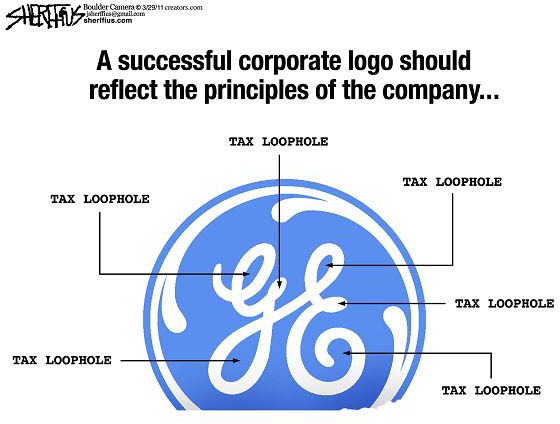
  • Cartoon Shows How GE’s Logo Reflects Its Corporate Values

    GE has been in the news recently because of its clever use of tax loopholes.


    110331 GE Logo Reflects Corporate Values

    Clever.

    Enhanced by Zemanta