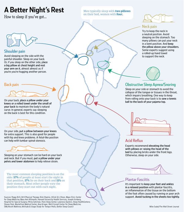
Front, Back or Side … What's Your Perfect Sleep Position?
Instead of a good night's sleep, it may be hurting you.
Here is an infographic from the WSJ that lays it out for you.

Related articles
Front, Back or Side … What's Your Perfect Sleep Position?
Instead of a good night's sleep, it may be hurting you.
Here is an infographic from the WSJ that lays it out for you.

Related articles
Is 'Smart Money' Becoming 'Dumb Money'?
The Merrill Lynch Fund Managers Survey shows growing confidence and risk-taking. A quick glance revealed a number of interesting charts and insights. For example, the chart below shows what has happened, historically, when liquidity conditions hit the levels they are at now.
Retail investors love the good days, but traders suspect that the end is near when it gets like this. Click here to see more from the Survey.
Keep in mind, Price is the primary indicator. You've got to trade the
conditions as they are … not assuming that they are better or worse
than they really are.
What bothers you most about someone else is often a clue about what you don't like about your own circumstances … or, a political cartoonist could point it out instead.

Here are some of the posts that caught my eye. Hope you find something interesting.
Are you happy how you spend your day?
Do you ever think about how most people choose to spend their time?
As you might guess, average Americans spend 8 hours at work, maybe half an hour in traffic, a few hours watching TV in the evening.
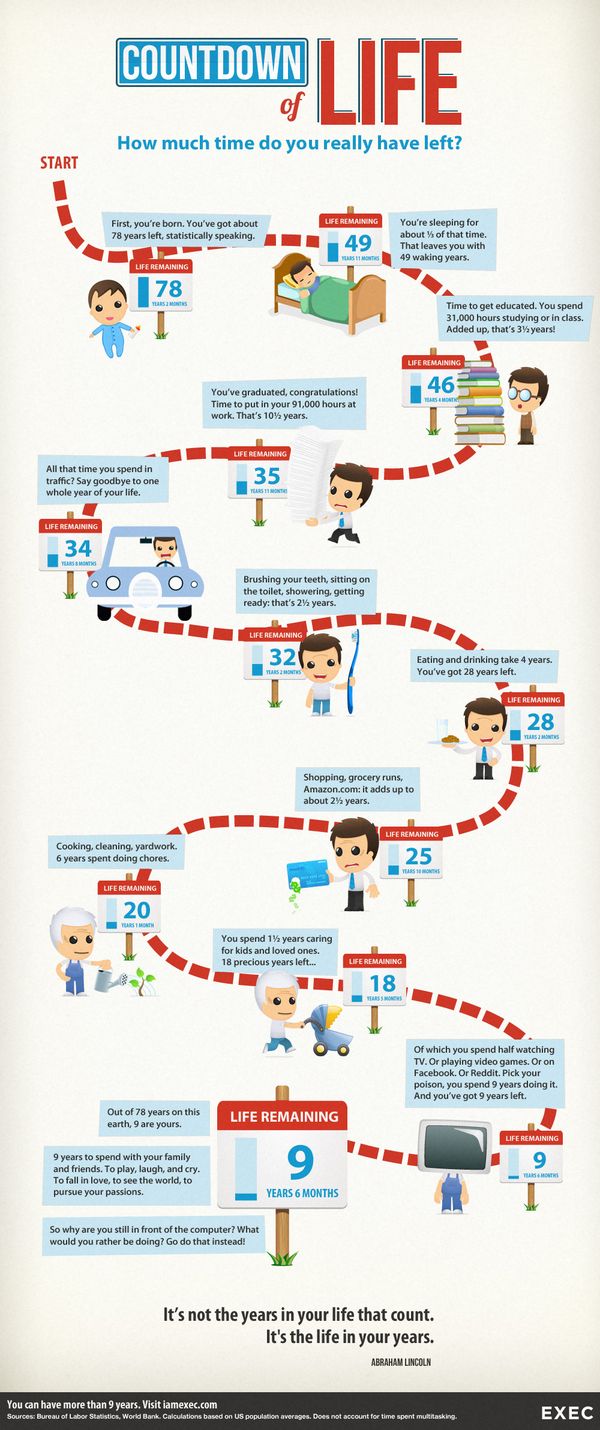
But what if you looked at it another way – what if you added up all those hours over the course of your whole life? The following infographic shows the tally.

That half an hour in traffic adds up to over a year of your life. And those innocent hours of TV? They add up to 9 years for the average American.
"It's not the years in your life that count … It's the life in your years." ~ Abraham Lincoln
Are you giving time to the things you really care about?
Have you been waiting around to "buy the dip" on this latest stock market rally?
If so, you have been waiting a long time. And I'm not just talking about the recent 10-day winning streak.
The Dow surpassed its all-time high and the S&P 500 is not that far from the tops of 1553 on March 24, 2000 and 1576 on October 9, 2007.
How Strong is the Trend?
The chart below compares each of the equity markets. If a market is
shown to be at 100%, then it's currently at a new three year equity
high. If not, then the percentage number indicates how close it is to
reaching a new equity high.
Also visit the Drawdowns Metric page to view historic equity high watermark charts.
Similar to 2000 and 2007, the economic, valuation and political background does not seem to support the budding euphoria.
But, as Citigroup's CEO said in 2007: “… as long as the music is playing, you’ve got to get up and dance. We’re still dancing.” Remember how well that turned-out?
So there is a new Pope. They probably didn't pick him this way.
Here are some of the posts that caught my eye. Hope you find something interesting.
It is easy to get lost in the admistrivia of day-to-day life. Here is a quick antidote for that.
International Space Station astronaut Don
Pettit lived on the station for about a year, and took many pictures while up there. The results of his innovative photographic work and passion have changed
the way we see earth from space.
Next, astrophotographer Christoph Malin took thousands of Pettit's individual photos and animated them, adding clips of Pettit giving a talk about his stay aboard
the ISS and his photography there. He also set it to music, creating a simply stunning time-lapse video.
The result is certainly worth watching. So, set aside 16
minutes of your busy day, sit back, and soak this in: “The ISS Image Frontier”.
"Making the invisible visible" – the ISS Image Frontier from Christoph Malin on Vimeo.
The video presents an interesting perspective of our planet.
Many astronauts, even from back in the Apollo days, talk
about an incredible feeling they get after a few days in space. As they gaze on
the Earth from above, they lose their feeling of borders and nationality. The
Saudi astronaut Sultan bin Salman Al-Saud, who flew on the Space Shuttle in
1985, commented on this, saying ,
“The first day or so we all pointed to our countries. The third or fourth day
we were pointing to our continents. By the fifth day, we were aware of only one
Earth.”
On a different note, the technique where they create a composite view of a visual time series is facinating. It makes the invisible visible … and has many uses in the big data space as well. Very cool!
Wait, you don't care … neither do a lot people.
Why? Pick your poison:
1. Distribution days are piling up.
2. Short-term volatility and correlation are picking up.
3. Dividend-paying, defensive stocks (consumer staples) are leading the market.
4. The deterioration among momentum stocks as a group has accelerated. 5. Momentum divergences are showing up in charts. 6. Or, perhaps, it is because Central Banks are propping things up.
Regardless, things have been moving higher … and that is the market you have to trade.
Hold on; that isn't true. While there have been lots of headlines about the Equity Markets, that hasn't been the whole story this year. There are lots of other markets to trade.
The chart shows the top-ten performing markets, ranked by weekly performance, for the past few months. The data is color coded based on sector. The first column posts the current week's open performance followed by six columns of the most recent weekly market performance.
Click this link to view monthly, quarterly, and yearly views of this data.
Here are some of the posts that caught my eye. Hope you find something interesting.
Watch this video. Lots of it is amazing … Some of it is inspiring.
You will witness flips, jumps, catches and feats that defy imagination (and certainly logic).
What type of person thinks, 'I want to do that' ?
To see which of the segments might be fake, click here.