The "Chart Of The Century" in 2023: A Look At Consumer Price Inflation
This post considers the “Chart of the Century” created and named by Mark Perry, an economics professor, and AEI scholar. This chart has gotten a lot of attention because it’s loaded with information regarding the challenges faced by the Fed and other Washington policymakers.
VisualCapitalist put together the most recent version of this chart. The most current version reports price increases from 1998 through the end of 2022 for 14 categories of goods and services, along with the average wage and overall Consumer Price Index.
It shows that prices of goods subject to foreign competition — think toys and television sets — have tumbled over the past two decades as trade barriers have come down worldwide. Costs of so-called non-tradeable items — hospital stays and college tuition, to name two — have surged.
From January 1998 to June 2019, the CPI for All Items increased by approximately 74% (up from 59.6% in 2019 when I last shared this chart). The graph displays the relative price increases for 14 selected consumer goods and services and average hourly earnings.
Lines above the overall inflation line have become functionally more expensive over time, and lines below the overall inflation line have become functionally less expensive.
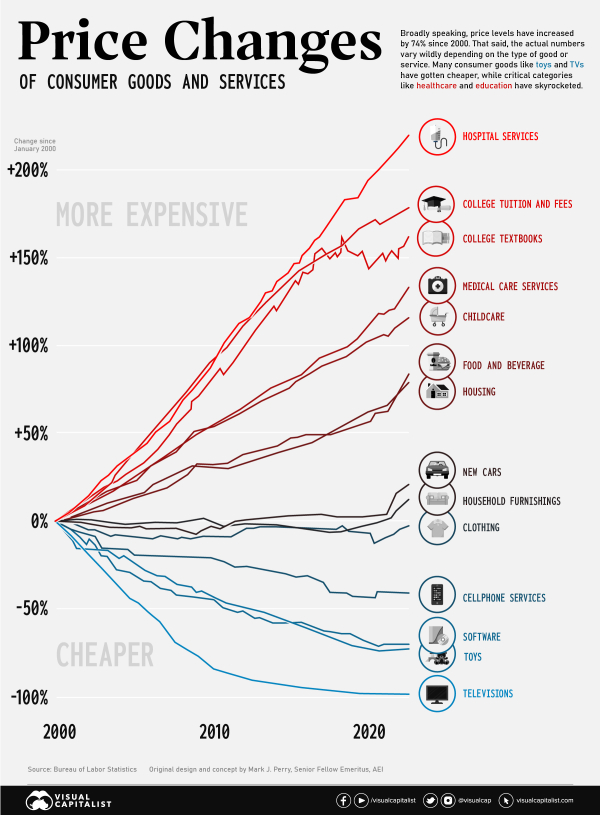
At the beginning of 2020 (when I shared the 2019 post), food & beverages and housing were in line with inflation. They’ve now skyrocketed above inflation - which helps to explain the unease many households are feeling right now.
There are a lot of ways to take this chart. You can point to items in red - whose prices have exceeded inflation as government-regulated or quasi-monopolies. You can point to items in blue as daily commodities that have suffered from ubiquity, are subject to free-market forces, or as goods that are subject to foreign competition and trade wars. Looking at the prices that decrease the most, they’re all technologies. New technologies almost always become cheaper as we optimize manufacturing, components become cheaper, and competition increases. From VisualCapitalist, at the turn of the century, a flat-screen TV would cost around 17% of the median income ($42,148). In the early aughts, though, prices began to fall quickly. Today, a new TV will cost less than 1% of the U.S. median income ($54,132).
Compare “tradable” goods like cell phones or TVs (with lots of competing products) to less tradable “goods” like hospital stays or college tuition, and unsurprisingly they’ve gone in opposite directions. In 2020, I asked what the Coronavirus would do to prices ... and the answer was less than I would expect. If you don’t look at the rise in inflation, but instead the change in trajectories, very few categories were affected heavily. While hospital services have skyrocketed since 2019, they were already skyrocketing.
There are a lot of complex economic relationships displayed in this chart, and we’ve only covered the basics.
What did you take from the chart?
Comments
The "Chart Of The Century" in 2023: A Look At Consumer Price Inflation
This post considers the “Chart of the Century” created and named by Mark Perry, an economics professor, and AEI scholar. This chart has gotten a lot of attention because it’s loaded with information regarding the challenges faced by the Fed and other Washington policymakers.
VisualCapitalist put together the most recent version of this chart. The most current version reports price increases from 1998 through the end of 2022 for 14 categories of goods and services, along with the average wage and overall Consumer Price Index.
It shows that prices of goods subject to foreign competition — think toys and television sets — have tumbled over the past two decades as trade barriers have come down worldwide. Costs of so-called non-tradeable items — hospital stays and college tuition, to name two — have surged.
From January 1998 to June 2019, the CPI for All Items increased by approximately 74% (up from 59.6% in 2019 when I last shared this chart). The graph displays the relative price increases for 14 selected consumer goods and services and average hourly earnings.
Lines above the overall inflation line have become functionally more expensive over time, and lines below the overall inflation line have become functionally less expensive.
At the beginning of 2020 (when I shared the 2019 post), food & beverages and housing were in line with inflation. They’ve now skyrocketed above inflation - which helps to explain the unease many households are feeling right now.
There are a lot of ways to take this chart. You can point to items in red - whose prices have exceeded inflation as government-regulated or quasi-monopolies. You can point to items in blue as daily commodities that have suffered from ubiquity, are subject to free-market forces, or as goods that are subject to foreign competition and trade wars. Looking at the prices that decrease the most, they’re all technologies. New technologies almost always become cheaper as we optimize manufacturing, components become cheaper, and competition increases. From VisualCapitalist, at the turn of the century, a flat-screen TV would cost around 17% of the median income ($42,148). In the early aughts, though, prices began to fall quickly. Today, a new TV will cost less than 1% of the U.S. median income ($54,132).
Compare “tradable” goods like cell phones or TVs (with lots of competing products) to less tradable “goods” like hospital stays or college tuition, and unsurprisingly they’ve gone in opposite directions. In 2020, I asked what the Coronavirus would do to prices ... and the answer was less than I would expect. If you don’t look at the rise in inflation, but instead the change in trajectories, very few categories were affected heavily. While hospital services have skyrocketed since 2019, they were already skyrocketing.
There are a lot of complex economic relationships displayed in this chart, and we’ve only covered the basics.
The "Chart Of The Century" in 2023: A Look At Consumer Price Inflation
This post considers the “Chart of the Century” created and named by Mark Perry, an economics professor, and AEI scholar. This chart has gotten a lot of attention because it’s loaded with information regarding the challenges faced by the Fed and other Washington policymakers.
VisualCapitalist put together the most recent version of this chart. The most current version reports price increases from 1998 through the end of 2022 for 14 categories of goods and services, along with the average wage and overall Consumer Price Index.
It shows that prices of goods subject to foreign competition — think toys and television sets — have tumbled over the past two decades as trade barriers have come down worldwide. Costs of so-called non-tradeable items — hospital stays and college tuition, to name two — have surged.
From January 1998 to June 2019, the CPI for All Items increased by approximately 74% (up from 59.6% in 2019 when I last shared this chart). The graph displays the relative price increases for 14 selected consumer goods and services and average hourly earnings.
Lines above the overall inflation line have become functionally more expensive over time, and lines below the overall inflation line have become functionally less expensive.
via VisualCapitalist
At the beginning of 2020 (when I shared the 2019 post), food & beverages and housing were in line with inflation. They’ve now skyrocketed above inflation - which helps to explain the unease many households are feeling right now.
There are a lot of ways to take this chart. You can point to items in red - whose prices have exceeded inflation as government-regulated or quasi-monopolies. You can point to items in blue as daily commodities that have suffered from ubiquity, are subject to free-market forces, or as goods that are subject to foreign competition and trade wars. Looking at the prices that decrease the most, they’re all technologies. New technologies almost always become cheaper as we optimize manufacturing, components become cheaper, and competition increases. From VisualCapitalist, at the turn of the century, a flat-screen TV would cost around 17% of the median income ($42,148). In the early aughts, though, prices began to fall quickly. Today, a new TV will cost less than 1% of the U.S. median income ($54,132).
Compare “tradable” goods like cell phones or TVs (with lots of competing products) to less tradable “goods” like hospital stays or college tuition, and unsurprisingly they’ve gone in opposite directions. In 2020, I asked what the Coronavirus would do to prices ... and the answer was less than I would expect. If you don’t look at the rise in inflation, but instead the change in trajectories, very few categories were affected heavily. While hospital services have skyrocketed since 2019, they were already skyrocketing.
There are a lot of complex economic relationships displayed in this chart, and we’ve only covered the basics.
What did you take from the chart?
Posted at 04:08 PM in Business, Current Affairs, Ideas, Market Commentary, Trading, Trading Tools | Permalink
Reblog (0)