Main Street and Wall Street are often at odds. Terms like "retail" and "professional" or "smart money" and "dumb money" highlight the difference in perspective and access to tools, processes, and even information.
The biggest disparities happen at turning points. Today, many companies are posting record profits, but markets are volatile, gas is expensive, and inflation is high. So, we're getting some mixed signals.
It may be too soon to say we're in a recession, but we are experiencing a downturn.
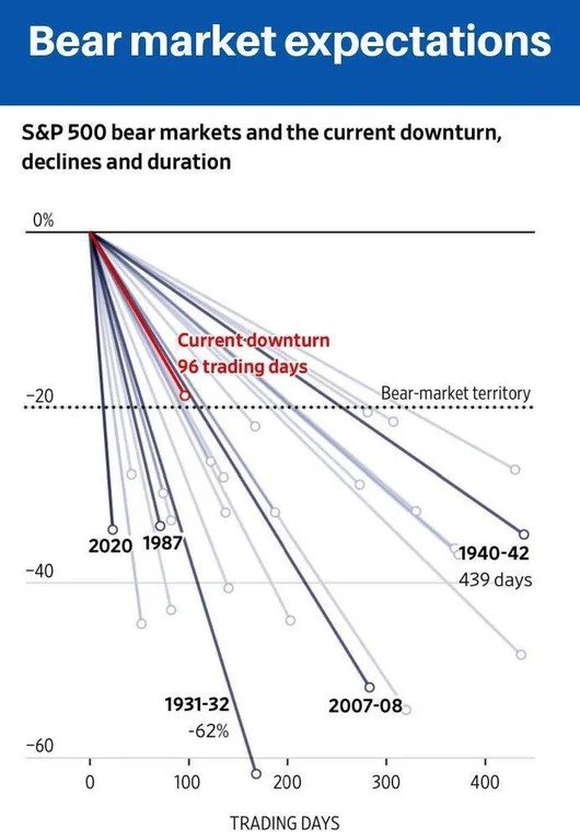
Here is a comparison of recent market corrections showing each decline's intensity and duration.
 via Reddit (Dow Jones Market Data & the WSJ)
While this chart is a week or two old, it shows some interesting data. While there are a few shorter drops, most were longer and deeper than where we currently are.
Thus, we could have further to go … but it could also be a sign that we're responding better to market issues than in the past.

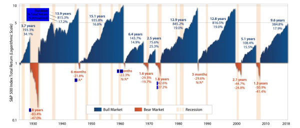
via Cascade Financial Strategies
How are you feeling about the markets and our economy?

Leave a Reply