Good data visualizations are few and far between. Bad data visualizations spread lies, misrepresent content, or are sometimes just plain unreadable.
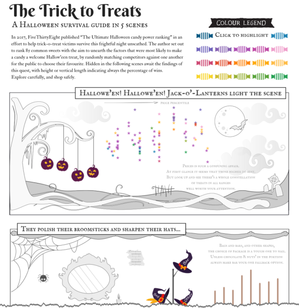
In honor of Halloween, here's an example of a fun data visualization put together by Mariona Banyeres based on FiveThirtyEight's "The Ultimate Halloween candy power ranking." Compared to simpler charts it may be harder to read, but it's interactive, it's themed, and if you hover over points, it will add extra context. Click to go to Mariona's interactive Tableau DataViz.
Mariona Banyeres via FiveThirtyEight
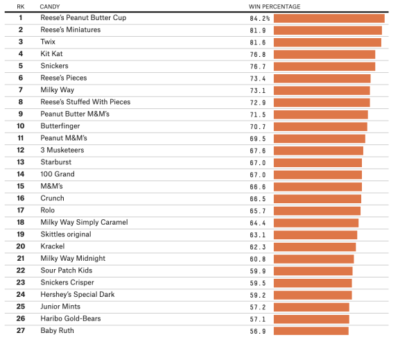
To skip the data visualization, here are the results of FiveThirtyEight's competition.
 via FiveThirtyEight
Hope you have a Happy Halloween.


Leave a Reply