June 2015

  • The Economic Roller Coaster

    Where do you believe major economies are in their economic cycle?

    Here is a chart that tries to make sense of current economic data and trends in growth rates.


    150620 The Economic Roller Coaster

     via Financial Sense.

    It shows the Eurozone, Japan, and India in the beginning phase of an expansion, the US and the UK near the peak; Australia and Canada decelerating, and China, Russia, and Brazil near a trough.

    Although this chart uses the metaphor of a roller coaster in terms of the ups and downs, peaks and troughs, of an economic cycle … it should be noted that these are slow moving trends that typically last for years.

    Moreover, unlike a roller coaster where each car is separated on the track and moving at the same speed (thankfully, to prevent collision), there is no predictable or constant velocity for each nation as they move from one phase to another.

    It also pays to remember that the market doesn't equal the underlying economy. 

  • What Languages are the Most Spoken – The Results Might Surprise You

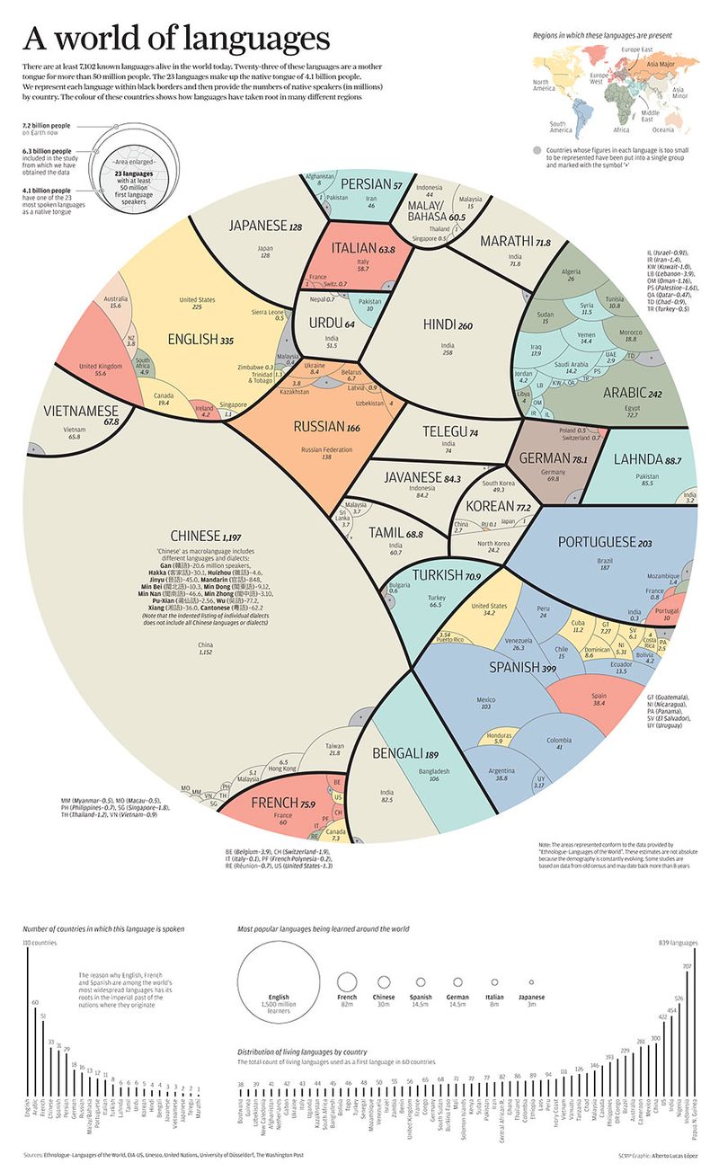
    There are over 7,100 known languages actively spoken in the world today. Of those, just twenty-three of them act as a mother tongue for more than 50 million people.  Collectively, those 23 languages make up the native tongue of more than half the world (4.1 billion people).

    This infographic represent each language within black borders and then provide the numbers of native speakers (in millions) by country. The coloring shows how the languages have taken root in many different regions.


    150620 A World of Languages

     via Alberto Lucas López .


    As you can see, Chinese is by far the most dominant language on the planet right now, with almost 1.2 billion people speaking dialects. Comparatively, pretty much every other language on Earth is an also-ran: Spanish (399 million speakers), English (335 million), Hindi (260 million), and Arabic (242 million) take up the next four positions. Only when you add them up do they come close to the reach Chinese has.

    Although Chinese is the most popular language on Earth, it's worth noting that its influence wanes greatly outside of Asia.

    If you take the geographic diversity of where a language is spoken into account, English, Spanish, French, and Portuguese are the most influential languages on Earth, because of colonialism.

    For more, here is a link to the Washington Post's article: The world’s languages, in 7 maps and charts.

  • How Big Is America? So Big!

    Sometimes it helps to employ unconventional perspectives when thinking about the size of things.

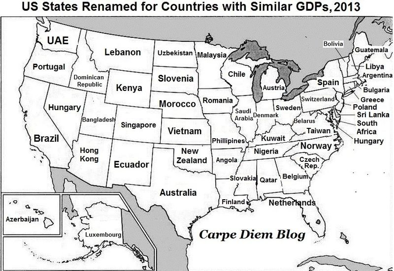
    Here's a map that shows how massive and productive America's $16.7 trillion economy is on a global scale.

    The map compares the gross domestic product of each US states with the national GDPs of other nations.

    America's largest state economy is California. For 2013, the Golden State's GDP was about $2.05 trillion, roughly the same as Brazil's GDP ($2.25 trillion). But Brazil's population is about 200.4 million, while California's is just 38.8 million — meaning California produces about the same as Brazil with about 80% fewer people.

    To put it in a global perspective, if California were its own country in 2013, it would have been the 10th-biggest economy in the world, close behind Russia, whose GDP was $2.096 trillion that year.

    Check out the rest of the states in the map below:


    150613 State GDPs vs Country GDPs

     via Business Insider.

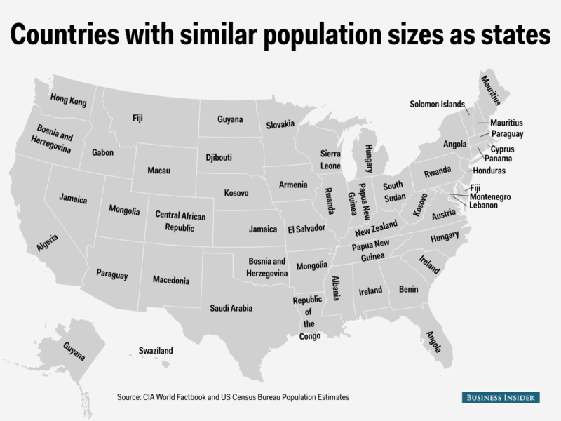
    Based on population, the US is the third-largest country in the world.

    To put that in perspective, below is a a map that renames each state with the country that has the closest population to it.


    150613 Countries and States by Population

    via Business Insider.


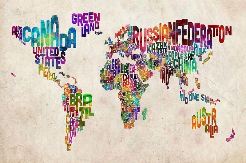
    The map, below, is interesting in a different way.  I'm sure you've heard that "a picture is worth a thousand words."  Here, a couple dozen words capture the world.


    150613 The World In Words

    by Michael Tompsett via Fine Art America.

  • This Happens In an Internet Minute: The Astounding Growth of Web Content

    To put some perspective on this explosion of content and web traffic here are the facts on the growth of content and the internet.

    Compared to 2008 here is what's happened with social networks:

    • The number of people online has more than doubled from 1.4 billion to over 3 billion
    • Facebook has gone from 80 million users to more than 1.4 billion
    • Twitter had 2 million accounts and now it is 300 million and counting.
    • The number of smartphones was 250 million in 2008 and today there are more than 2 billion. That is an 800% increase!

    Today this is what happens every minute on the web.

    • 4 million search queries on Google
    • Facebook users share 2.46 million pieces of content
    • Email users send 204 million messages


    150530 Web-in-a-minute-infographic

    Source: Aci.info via Jeff Bullas.

    And this is just the beginning.