The unemployment rate dropped to 7.0% (from 7.3%) while the U.S. economy added 203,000 jobs in November. In addition, the labor force participation rate rose to 63.0% (from 62.8%). These numbers were stronger than expected.
Nonetheless, the U.S. labor market remains below its pre-recession employment numbers.
Calculated Risk posts a monthly chart that puts the current jobs recovery into perspective. It is often referred to as the "Scariest Chart Ever". It shows the job losses from the start of the employment recession, in percentage terms, compared to previous post WWII recessions.
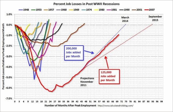
This chart shows the depth of the recent employment recession — worse than any other post-war recession — and the relatively slow recovery due to the lingering effects of the housing bust and financial crisis.
If things continue as they have been, it appears payrolls will exceed the pre-recession peak in mid-2014.
Currently, there are about 1.3 million fewer payroll jobs than before the recession started; and at the recent pace of job growth it will take about 7 months to reach the previous peak.
Given the circumstances, I think the chart shows we've made good progress. Talk about Qualitative Easing, coordinated actions by global Central Banks ... or a pretty visible 'unseen hand' all you want ... but the Economy and Market seem to have adapted well to change.
Comments
A Jobs Chart That Means Something
The unemployment rate dropped to 7.0% (from 7.3%) while the U.S. economy added 203,000 jobs in November. In addition, the labor force participation rate rose to 63.0% (from 62.8%). These numbers were stronger than expected.
Nonetheless, the U.S. labor market remains below its pre-recession employment numbers.
Calculated Risk posts a monthly chart that puts the current jobs recovery into perspective. It is often referred to as the "Scariest Chart Ever". It shows the job losses from the start of the employment recession, in percentage terms, compared to previous post WWII recessions.
This chart shows the depth of the recent employment recession — worse than any other post-war recession — and the relatively slow recovery due to the lingering effects of the housing bust and financial crisis.
If things continue as they have been, it appears payrolls will exceed the pre-recession peak in mid-2014.
Currently, there are about 1.3 million fewer payroll jobs than before the recession started; and at the recent pace of job growth it will take about 7 months to reach the previous peak.
Given the circumstances, I think the chart shows we've made good progress. Talk about Qualitative Easing, coordinated actions by global Central Banks ... or a pretty visible 'unseen hand' all you want ... but the Economy and Market seem to have adapted well to change.
A Jobs Chart That Means Something
The unemployment rate dropped to 7.0% (from 7.3%) while the U.S. economy added 203,000 jobs in November. In addition, the labor force participation rate rose to 63.0% (from 62.8%). These numbers were stronger than expected.
Nonetheless, the U.S. labor market remains below its pre-recession employment numbers.
Calculated Risk posts a monthly chart that puts the current jobs recovery into perspective. It is often referred to as the "Scariest Chart Ever". It shows the job losses from the start of the employment recession, in percentage terms, compared to previous post WWII recessions.
via CalculatedRisk.
This chart shows the depth of the recent employment recession — worse than any other post-war recession — and the relatively slow recovery due to the lingering effects of the housing bust and financial crisis.
If things continue as they have been, it appears payrolls will exceed the pre-recession peak in mid-2014.
Currently, there are about 1.3 million fewer payroll jobs than before the recession started; and at the recent pace of job growth it will take about 7 months to reach the previous peak.
Given the circumstances, I think the chart shows we've made good progress. Talk about Qualitative Easing, coordinated actions by global Central Banks ... or a pretty visible 'unseen hand' all you want ... but the Economy and Market seem to have adapted well to change.
Posted at 10:22 AM in Business, Current Affairs, Market Commentary, Trading, Trading Tools | Permalink
Reblog (0)