August 2009

  • Capitalogix Commentary 08/30/09

    The market is strong right now.  How do I know?  Aside from the near-audible moan of bears, Price going up is a pretty good primary indicator. 

    Kidding aside, other indicators are worth looking at here too.  One of them is the NYSE High-Low line. 

    The following chart shows this market breadth indicator.  It is calculated at the end of each day by taking the number of NYSE stocks making New 52-week Highs and subtracting the number of stocks making New 52-week Lows. What is important to notice is the shape of the line – up is strong (or bullish), down is weak (or bearish).  Sometimes a picture is worth a thousand words.

    090830 NYSE New Highs - New Lows

    You can view updated versions of this chart anytime on StockCharts.com at this link. For some context, after clicking the link, scroll down to see the weekly version of that chart.  For additional context, this link will show you what it looked like last November.

    Our Rally Isn't Just Our Rally.

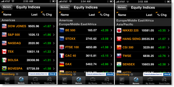
    Below are a series of iPhone screen captures showing the daily performance of World Equity Market Indices from Bloomberg.  The thing to notice is that while the news media in America made a big deal about the market being up because of positive news in the housing market … a quick glance around the world showed equal or bigger gains. This type high correlation continues to attract my attention.

    090830 World Equity Indices

    How Far Have We Come?

    Here is a chart showing Fibonacci retracement lines drawn from the high back in late 2007 to the low in November of 2009.  We are barely back to the second major retracement level … and still a considerable distance from the 50% mark.
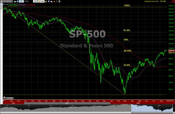
    090830 SP500 Decline Retracement

    There is art and science involved in drawing Fibonacci retracements and extensions.  For example, where do you start and end?  Would it be better to have started from the highs in May or September of 2008 instead?  Click here for more Fibonacci Commentary.

    Early Warning Signs?

    Here are a few signs that the rally is getting a little worn-out.  There has been more volatility lately, and that can be a bearish early indication.  For the past few months markets have gone up, even on bad news (like the recent bank closings); however, this past week saw the first hints of markets selling-off after good news.  And we are coming into September, which is historically a week month for markets.

    The trend is your friend, until it turns. 

    A Little Humor.

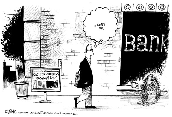
    Thought this cartoon about the Cash-for-Clunkers program ending was worth posting.

    090830 Cash for Clunkers Ends

    Business Posts Moving the Markets that I Found Interesting This Week:

    Lighter Ideas and Fun Links that I Found Interesting This Week

  • Augmenting Reality

    090830 Minority-Report UI Sometimes new technology seems like science fiction. Other times, science fiction introduces us to new technology.

    I remember watching Minority Report and having a sense that I was watching a future closer than it seemed. There's a scene where Tom Cruise is walking through a shopping area and each time he passes a store there is a personalized ad; and in other scenes there is a "Terminator-Like" text that overlays the physically real world. That is called "Augmented Reality". 

    Well, your phone may not be as cool as that, yet; however it's getting there pretty quickly.

    The next picture doesn't look like much; but it's using the iPhone's built-in camera and GPS unit to recognize highly rated restaurants in real time. The application doing this is Yelp. This feature is
    currently hidden by default; but you can turn it on by shaking your
    phone vigorously, until the "Monocle" feature activates.

    090830 Augmented Reality

    Soon, I imagine this will be enhanced further with a discount coupons and the
    ability to place orders before you walk in the door. Nonetheless, it's
    an example of what's coming.

    Where Else Will This Be Useful?

    Imagine what this could do to the real-estate industry (as price per square foot, tax rates, etc. overlay the properties as you drive by). Or, imagine traders looking at a chart displaying the most relevant indicators, patterns, setups, and triggers for the company or market they are analyzing.  It gives a whole new meaning to real-time business intelligence.

  • TechTracker is Worth a Look

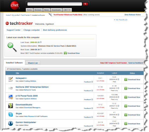
    090830 TechTracker Logo Staying up-to-date just got a little easier.  CNet launched a new service that scans your PC and checks your installed programs to see if updates are available to you.

    I tried TechTracker and found it to be fast, accurate and helpful.  They are coming out with a Mac version soon.  Here is an example screenshot showing what it alerted me to update.

    090830 TechTracker Scan

    Other Info:

    I use a few other services, like this, that are worth a look also.

  • Using Time and Price to Trade the Markets

    090830 HMG and Carolyn Boroden 216pIt is good to get a fresh perspective on the markets.

    I spent some time with Carolyn Boroden this week. I've been following her work for the past six or seven years. She has an interesting trading style, using Fibonacci retracements and extensions as well as market symmetry.  Here is some of what she shared.

    Carolyn measures various market swings, and projects likely areas of support and resistance based on where these retracement and extension levels overlap most frequently. By taking readings from various swings sizes, she is effectively incorporating multiple time frames and trading styles in her analysis.

    She is a frequent speaker at industry events, and she has a website and live trading room where she provides market commentary.

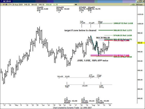
    Here is an example of her work on a daily chart of the Gold Market. 

    090830 Gold Chart
     
    Here's what she says about that chart.  Click here to watch a video she made of the analysis.

    The low in this chart was made at the confluence of a .618 retracement, 1.618 extensions and two 100% price projections  (Alternate price projections  or APP's on chart)   Now we are at a decision on the way up….to fail or not to fail….If this area of resistance is cleared…the initial upside target for gold is at the 986 area….If we fail at the listed resistance…it's a low risk sale…

    Also, click this link to watch a recent video she did explaining where she saw support and resistance off the March lows.

    Further Info:

  • Capitalogix Commentary 08/23/09

    Impressive action in the markets this past week.  While the markets climb a wall of worry, the bottom-line is that every time it has looked like a sell-off, recently, the market moves back up and punished the short-sellers.

    I'm hearing talk of traders expecting a rally in the dollar.  I take that as "code" that they are expecting a downwards correction for the general market, but have been wrong about the rally ending for long enough to call it something different.

    Put me in that camp too.  While I'm impressed by the strength and stamina this rally has shown, I am keeping a vigilant eye on the charts.

    Here are three things that caught my eye this week.

    1. Stocks Are Expensive Again.

    Perhaps because of the rosy picture the recent rally paints, few notice the plunge in S&P 500 earnings. The chart below, from Chart of the Day, illustrates how this plunge in earnings has impacted the current valuation of the stock market as measured by the price to earnings ratio (PE ratio).

    Generally speaking, when the PE ratio is high, stocks are considered to be expensive. When the PE ratio is low, stocks are considered to be inexpensive. From 1936 into the late 1980s, the PE ratio tended to peak in the low 20s (red line) and trough somewhere around seven (green line). The price investors were willing to pay for a dollar of earnings increased during the dot-com boom (late 1990s) and the dot-com bust (early 2000s).

    As a result of the recent plunge in earnings and the 5-month stock market rally, the PE ratio has spiked to 144 – a record high, and is currently at a still lofty 129.

    090822 PE High Stocks Expensive

    Click here for a different perspective on the use of PE Ratios.

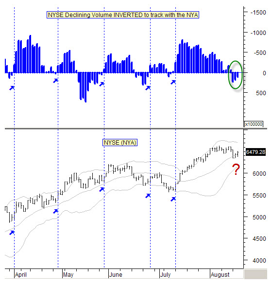
    2. Declining Volume May Be Signaling Another Leg Up in the Rally.

    I subscribe to Marty Chenard's StockTiming site.  He often has an interesting perspective on what's happening.  It is worth a look.  This is straight from his site.

    To really understand what the market is doing, one must observe many different sets of data.  It is like a puzzle … it isn't until you have enough pieces fitted together that you can get an idea of what the picture is going to be.  There are always key pieces that add especially critical information.

    The stock market is no different … there is enough different kinds of available data for a person to drown in confusion.  It is why focusing on smaller amounts of key data is important.

    For instance … the amount of, and the trend of Declining Volume on the New York Stock Exchange can be a critical piece of data.  

    Take a look at today's chart which shows the Declining Volume of the NYSE.   You know, that if Declining Volume is increasing, then it would make sense for the stock market to move lower.

    So, in other words, they move opposite to each other.   I always like to see charts where the information flows in the same direction, so we invert our Declining Volume charts. 

    In this way, we see the stock market's action relative to what the Declining Volume's action should be telling us about what to expect. 

    So here is our inverted, NYSE Declining Volume data chart.   Take note of the vertical lines and how the NYSE's daily movements correlate with the Declining Volume's action.   Pretty neat data, isn't it?

    090822 Is Declining Volume is Declining Again

    * Note: The data presented is as of the close this past Wednesday.  Do notice, that although negative, the Declining Volume has been improving by decreasing during the past few days. 

    3. Wolfram Alpha Has Some Helpful Data for Traders.

    Here is a screen capture from Wolfram Alpha's new stock comparison feature.  This compares many things about the two companies; in this case IBM and Accenture.  Obviously, you can compare other companies.  This was just to give you an idea of what it can do for you.

    090823 Wolfram Alpha to Compare Stocks

    I have been using Wolfram Alpha more recently.  They keep adding new things; check it out. 

    Business Posts Moving the Markets that I Found Interesting This Week:

    • Is Liquidity the New Volatility as a Timing Tool? (BigTrends)
    • Professor Buffett's Tongue-in-Cheek Butterfly Effect Lesson. (Street)
    • Are We in a Bull Market Yet? Why Technicians Say "No." (Barrons)
    • U.S. to End Clunker Rebates This Week. (Reuters)
    • In New Phase of Crisis, Securities Sink Banks. (WSJ)
    • Starbucks Lowers Price Of Some Drinks To Stimulate Demand. (Reuters)
    • More Posts Moving the Markets.

    Lighter Ideas and Fun Links that I Found Interesting This Week